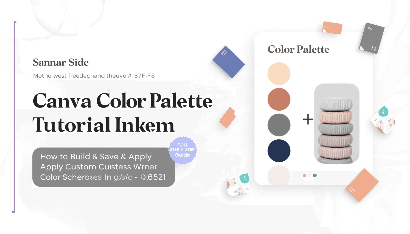
Color is one of the most powerful communication tools in design. The right palette can make a brand feel trustworthy, a social post feel vibrant, or a presentation feel polished. But for many designers and marketers, building cohesive color schemes from scratch remains one of the trickiest parts of the creative process.
That is where Canva steps in — and where a reliable Canva color palette tutorial becomes invaluable. Whether you are a small business owner putting together branded content or a professional designer looking to streamline your workflow, understanding how to generate and apply color palettes inside Canva can transform the way you work.
This guide walks you through every step of the process, from understanding the fundamentals of color palettes to applying advanced techniques and avoiding the most common mistakes designers make.
What Is a Color Palette and Why Does It Matter in Design?
A color palette is a curated set of colors selected to work harmoniously together within a visual composition. In design, a well-defined palette ensures consistency, strengthens brand recognition, and creates emotional resonance with an audience.
According to research published by the Institute for Color Research, people make a subconscious judgment about a product within 90 seconds of first viewing it, and up to 90% of that assessment is based on color alone. That statistic alone underscores why color decisions deserve serious attention.
A color palette typically includes:
A primary color (the dominant brand or design color)
One or two secondary colors (supporting tones)
Accent colors (used sparingly for contrast and emphasis)
Neutral tones (whites, grays, and beiges that balance the composition)
When these elements are chosen thoughtfully and applied consistently, they form a visual identity that audiences recognize instantly. You can explore curated examples across a wide range of styles at Coloraccy's palette showcase, which features professionally assembled collections for every design context.
Why Use Canva for Color Palette Creation?
Canva has grown from a simple drag-and-drop design tool into a full-featured creative platform used by more than 135 million users worldwide. Its color tools are particularly accessible for non-designers, while still being functional enough for professionals.
Here is why Canva works well for building color schemes:
It provides a built-in color picker with hex, RGB, and HSL input support
It offers brand kit functionality for saving and reusing palettes
It integrates with uploaded images, allowing automatic color extraction
It supports real-time palette previewing directly within design templates
That said, Canva has limitations when it comes to deep color exploration. For generating custom palettes beyond what Canva offers natively, tools like the Coloraccy color palette explorer provide a much broader and more nuanced library organized by mood, style, and theme.
Step-by-Step: How to Generate a Color Palette in Canva
Step 1: Open Canva and Start a New Design
Log into your Canva account and click "Create a design." Choose the format that fits your project — whether it is a social post, presentation, or branded document. The canvas size does not affect the palette-building process, but starting with your actual deliverable in mind helps you visualize how colors will appear in context.
Step 2: Access the Color Picker
Click on any element within your design — a shape, text box, or background — and then click the color swatch that appears in the top-left toolbar. This opens Canva's color panel, where you can manually input hex codes, adjust sliders, or browse from a set of suggested colors.
For building a palette systematically, click "Add new color" at the top of the color panel to start saving individual swatches. You can also use Coloraccy's color picker to identify and refine specific hex values before importing them into Canva.
Step 3: Use the Photo Color Extraction Feature
One of Canva's most useful palette features is its ability to pull colors directly from an uploaded image. Here is how to use it:
Upload an image that represents the mood or aesthetic you are targeting
Click on the image within the canvas
Open the color panel and look for the "Photo colors" section
Canva will display the dominant colors extracted from that image
This is an excellent starting point for building a palette around a photograph, illustration, or brand asset. For more precise extraction, the Coloraccy image color extractor gives you detailed hex values and generates a full palette from any uploaded image.
Step 4: Build Your Brand Color Kit
If you are designing for a business or ongoing project, Canva's Brand Kit feature is essential. It allows you to store your palette and apply it across every design automatically.
To set it up:
Go to "Brand Kit" in the left sidebar (available on Canva Pro and team accounts)
Click "Add a color" under the brand colors section
Input each hex code from your palette
Save the kit — these colors will now appear at the top of your color picker in every design
For businesses building a comprehensive visual identity, the Coloraccy brand color kit tool offers an additional layer of refinement, helping you establish primary, secondary, and accent tones that hold up across digital and print formats.
Step 5: Apply Color Harmony Principles
Generating a set of colors is only part of the process. The real skill lies in selecting colors that work together. Canva does not explicitly teach color theory, but understanding the underlying principles will elevate every palette you build.
The most reliable harmony models include:
Complementary: Colors opposite each other on the color wheel (high contrast, energetic)
Analogous: Colors adjacent on the wheel (cohesive, calming)
Triadic: Three evenly spaced colors (balanced yet vibrant)
Monochromatic: Variations of a single hue (elegant, minimal)
To identify complementary and harmonious pairings before finalizing a palette in Canva, the Coloraccy complementary color finder is a practical resource that calculates these relationships automatically.
Step 6: Test and Refine Your Palette in Context
Never finalize a palette in isolation. Apply it to your actual design and evaluate how it reads at different sizes, on different backgrounds, and under different lighting conditions (for print work). Look for:
Sufficient contrast between text and background colors
Balance between warm and cool tones
Consistency with the emotional tone of the project
Use the Coloraccy shade and tint generator to create lighter or darker variations of any hue, giving you more flexibility without introducing entirely new colors into the palette.
Exploring Color Palette Styles: What Works for Different Projects
Not every project calls for the same type of palette. Understanding which aesthetic direction fits your content helps you make faster, more confident color decisions.
Aesthetic Palettes for Lifestyle and Social Content
Aesthetic color schemes — soft, muted, and carefully balanced — are extremely popular for lifestyle brands, wellness content, and personal blogs. If you are building content in this space, exploring aesthetic palette collections can save considerable time in the ideation phase.
Abstract and Artistic Palettes
For creative projects, brand campaigns, and artistic portfolios, abstract palettes offer more expressive and unconventional combinations. The abstract palette library on Coloraccy presents bold and unexpected color relationships that can make design work stand out.
Academic and Professional Palettes
Professional environments — law firms, universities, corporate offices, and financial institutions — tend to benefit from structured, authoritative palettes that communicate credibility. The academia palette collection offers refined combinations suited to formal and institutional design contexts.
Cultural and Regional Palettes
Design projects targeting specific cultural audiences benefit enormously from region-relevant color choices. Colors carry different cultural associations, and getting them right builds trust. The African palette collection is one example of how culturally grounded palettes can inform more resonant and authentic design work.
Advanced Tools to Complement Your Canva Workflow
Canva is a strong design environment, but pairing it with dedicated color tools unlocks significantly more creative control.
Random Color Generation for Inspiration
When you are stuck or looking for unexpected starting points, the Coloraccy random color generator produces fresh combinations that can spark new directions. Use these as raw material, then refine within Canva.
Color Format Conversion
Working across different tools and formats often requires converting between hex, RGB, HSL, and CMYK values. The Coloraccy color format converter handles these conversions instantly, keeping your workflow smooth when moving between Canva, Photoshop, Figma, or print-ready files.
Acrylic and Textured Palette Inspiration
For projects that call for rich, textured aesthetics — packaging design, editorial work, or fine art prints — acrylic palette references offer dense, saturated combinations that translate beautifully into both digital and physical media.
Canva Color Schemes: Choosing the Right Approach for Your Brand
Canva color schemes are the structural foundation of consistent brand design. A well-built scheme should cover every common scenario your brand faces: dark backgrounds, light backgrounds, on-photography treatments, and monochrome applications.
When building Canva color schemes professionally, consider the following framework:
Primary palette: 2–3 core brand colors used in the majority of designs
Extended palette: 3–5 supporting colors for variety without losing coherence
Type-safe colors: Designated text colors that maintain WCAG accessibility standards
Do-not-use list: Colors that clash with the palette or undermine the brand tone
This structured approach ensures that everyone working with the brand — from in-house designers to external contractors using Canva — stays visually consistent.
The full color palette library at Coloraccy is organized to support exactly this kind of systematic exploration, with hundreds of curated options spanning every industry and aesthetic direction.
Custom Palette Canva: Going Beyond Default Options
The phrase "custom palette Canva" captures one of the most common design challenges: Canva's default color suggestions are generic and unlikely to match a specific brand or project vision. Building a truly custom Canva experience requires intentional input.
Here is how to make Canva's color tools genuinely custom:
Research your industry and target audience before selecting any colors
Extract a starting palette from a reference image using either Canva or the Coloraccy image color extractor
Refine the palette using a shade and tint generator to find ideal lightness levels
Validate harmony using a complementary color tool
Input finalized hex codes into Canva's Brand Kit for consistent application
The difference between a generic Canva design and a polished, professional one often comes down entirely to the quality of the custom palette Canva receives as input.
Practical Tips for Better Color Palette Decisions
Experienced designers consistently apply a set of principles that beginners overlook. Here are the most actionable ones:
Start with three colors, not six. Complexity is the enemy of cohesion. A strong three-color palette is more powerful than six colors fighting for attention.
Check contrast ratios. Every color combination used for text must meet a minimum contrast ratio of 4.5:1 for normal text (per WCAG 2.1 guidelines). This is a legal requirement for public-facing digital content in many jurisdictions.
Use the 60-30-10 rule. Allocate 60% of your design to the dominant color, 30% to a secondary color, and 10% to an accent. This ratio reliably produces visually balanced designs.
Test on multiple screens. Colors render differently on OLED, LCD, and print surfaces. What looks sophisticated on your monitor may look washed out on a phone screen.
Study competitor palettes critically. Understanding what others in your space are using helps you either align with category conventions or deliberately differentiate.
For branded environments — commercial offices, hotel interiors, retail spaces, or mall signage — these principles apply with even greater force, because color decisions must hold up across both digital screens and physical materials simultaneously.
Common Mistakes to Avoid When Building Color Palettes in Canva
Even experienced designers make these errors. Knowing them in advance saves time and redesign cycles.
Using too many colors. More than five colors in a palette almost always creates visual noise. Pare down ruthlessly.
Ignoring accessibility. Low-contrast color combinations are a failure on two fronts — they exclude users with visual impairments and often look amateurish. Always verify contrast ratios before finalizing.
Choosing colors based on personal preference alone. Design serves an audience, not the designer. Colors should be chosen based on what resonates with the target demographic, not what the creator personally likes.
Skipping neutral tones. Every strong palette includes a neutral anchor — a white, off-white, gray, or warm beige — that gives the eye a place to rest. Without it, bold palettes feel overwhelming.
Not saving palettes before closing. This is a Canva-specific workflow issue. Always save custom colors to the Brand Kit immediately. Canva does not automatically preserve manually entered colors between sessions.
Relying entirely on Canva's built-in suggestions. Canva's default color recommendations are algorithmically generated and rarely reflect a nuanced brand strategy. Use external resources — such as the curated collections at Coloraccy — to inform your decisions before touching Canva's controls.
Bringing It All Together
Creating a strong color palette in Canva is equal parts strategy and craft. You need a systematic process — starting from research and inspiration, moving through generation and refinement, and ending with consistent, accessible application across your designs.
This Canva color palette tutorial has covered the full arc of that process: from understanding what color palettes are and why they matter, to step-by-step instructions for building and saving custom palettes, to advanced tips and the most common mistakes to avoid. Along the way, the role of external color tools — particularly those available through Coloraccy — has been a consistent thread, because Canva works best when it is paired with purpose-built color resources.
Coloraccy offers one of the most comprehensive collections of curated color palettes, generators, and design tools available online. Whether you need an abstract palette for a creative campaign, a brand color kit for a new business identity, or a shade and tint generator to refine an existing scheme, the platform is built to support professional color decisions at every stage of the design process.
Visit Coloraccy today to explore the full library of color tools and start building palettes that elevate every design you create in Canva and beyond.