Most brand color decisions are made backwards. A founder picks a color they like, a designer builds around it, and six months later the brand feels slightly off — not wrong enough to fix, but not quite right either. The colors work in isolation and fall apart in application.
Choosing brand colors is not about finding colors you find beautiful. It is about selecting a small set of colors that can carry your brand's personality, work across every touchpoint you use, and remain recognizable at any size and in any context — from a favicon to a billboard. That is a systems problem as much as an aesthetic one, and it requires a structured approach.
This guide walks through the complete process: from understanding what your brand actually needs to communicate, through the mechanics of palette structure, to testing and finalizing colors you can commit to for years. By the end, you will have a clear framework — not just inspiration.
Why Brand Colors Matter More Than Most People Realize
Color is processed faster than language. Before a potential customer reads a single word on your website, social media profile, or packaging, color has already created an impression — and that impression is remarkably difficult to override with copy or design.
Research consistently shows that color increases brand recognition by up to 80%, and that the majority of consumers name color as a primary reason they choose one product over another in a crowded category. These numbers are widely cited because they reflect something real: color communicates meaning at a speed and depth that other brand elements cannot match.
For small businesses and startups, this dynamic cuts both ways. The right brand color palette creates instant recognition and communicates values without requiring explanation. The wrong one creates subtle friction — a sense that something does not quite add up about a brand — that potential customers cannot always articulate but absolutely feel.
Understanding brand color psychology is the first thing worth doing before you open a single color tool. The associations different colors carry — and how those associations shift across industries and audiences — form the foundation for every decision that follows.
Step 1: Define What Your Brand Needs to Communicate
Before you pick a single color, you need clarity on what that color needs to do. Start by answering these questions honestly:
What does your brand stand for? Not your product features — your brand character. Are you reassuring or energizing? Traditional or disruptive? Precise or warm? Premium or accessible?
Who is your audience? Different audiences have different color expectations. A brand targeting young creative professionals in a design-forward category can make bolder, less conventional color choices than one targeting institutional buyers in a conservative industry. Neither is right or wrong — they are different jobs.
What does your competitive landscape look like? Spend an hour looking at the color choices of your five closest competitors. Note the patterns. Every category has default color conventions — healthcare defaults to blue and white, organic food defaults to green and earth tones, fintech defaults to navy and teal. Knowing the conventions gives you a choice: use them to signal category membership, or deliberately deviate to signal differentiation.
What do you want to be remembered for? After someone encounters your brand and moves on, what single impression should remain? That impression — not your product specification — is what your color needs to carry.
Write down three to five words that capture your brand character. These become your filter for every color decision that follows. A color that does not serve those words has no place in your palette, regardless of how beautiful it is.
Step 2: Understand Basic Color Psychology
Color psychology is not a rigid system — cultural context matters enormously, and the same color can carry different associations in different markets. But some patterns are consistent enough across Western and global audiences to be useful starting points.
Blue — trust, reliability, precision, calm. The dominant color in banking, healthcare, technology, and logistics. Universally safe, which is also why overused brands reaching for differentiation are increasingly moving away from it.
Green — nature, growth, health, sustainability. Dominant in organic food, wellness, and environmental brands. Has broadened significantly in recent years — muted, sophisticated greens now appear in luxury, finance, and tech without the sustainability-brand association of earlier years.
Red — energy, urgency, passion, appetite. Used in food, retail, and entertainment for its stimulating qualities. Demands attention but fatigues quickly — better as an accent than a dominant brand color in most contexts.
Yellow — optimism, warmth, accessibility, clarity. Harder to control than other colors because its luminosity creates legibility challenges. Works powerfully when paired with dark text and used with restraint.
Orange — friendly, enthusiastic, approachable, affordable. Often used in consumer brands targeting broad audiences. Can read as informal — a deliberate choice for some brands, a problem for others.
Purple — creativity, luxury, mysticism, wisdom. Has a long history of premium brand association. Also appears in wellness, beauty, and spirituality-adjacent categories.
Black and near-black — sophistication, authority, precision, premium. The default anchor for luxury brands. Warm off-blacks are becoming increasingly prevalent as pure black falls slightly out of favor in refined brand contexts.
Warm neutrals — approachability, craft, sustainability, material quality. Creams, warm linens, and warm beiges are functioning as brand colors in their own right for artisan, lifestyle, and sustainable product brands — a significant shift from their previous role as background-only tones.
The color theory basics guide on Coloraccy covers the underlying relationships between color families — useful for understanding not just individual color psychology but how hues work together in a palette system.
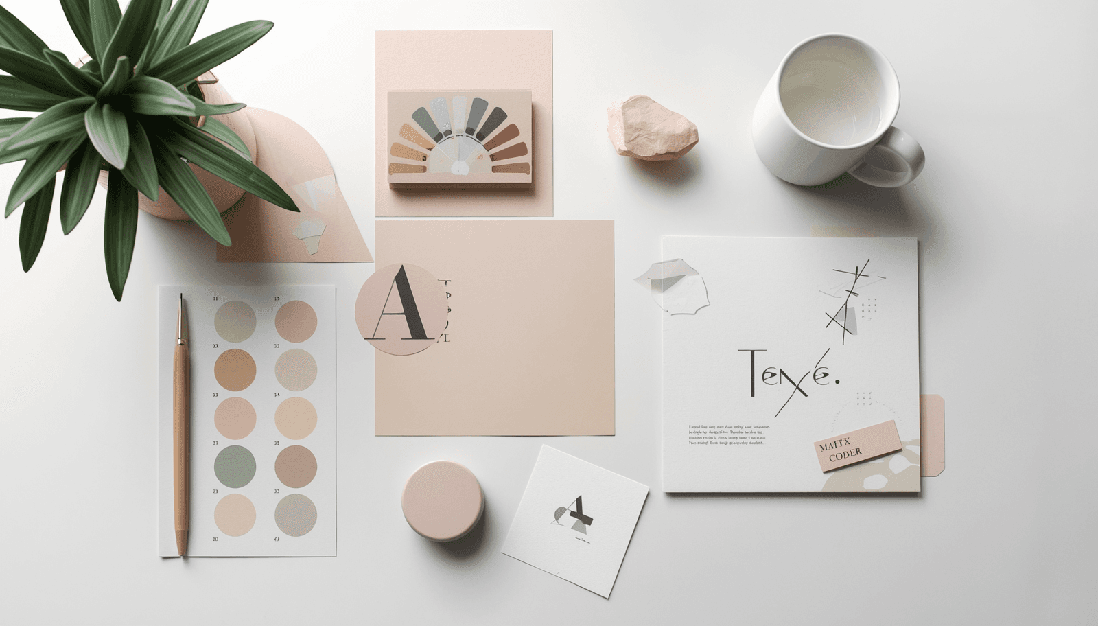
Step 3: Understand Palette Structure Before Choosing Colors
The most practical thing you can learn about brand color selection is that a palette is a system, not a collection. Every color in your palette needs a defined role — and knowing the roles before choosing the colors makes the selection process far more structured.
A standard brand color palette contains:
Primary color — the color most strongly associated with your brand. Appears in your logo, primary CTAs, and dominant brand applications. This is the color people think of when they think of your brand.
Secondary color(s) — one or two colors that support and complement the primary. Used in supporting graphic elements, secondary UI components, and brand extensions. Should feel related to the primary without competing with it.
Neutral(s) — your background and text colors. At minimum, a light neutral (for backgrounds and surface areas) and a dark neutral (for text and structural elements). Many brand systems use three to five neutrals spanning from near-white to near-black.
Accent color — an optional fourth color used sparingly for maximum impact. Highlights, special campaign elements, hover states. Its effectiveness depends entirely on appearing rarely — overused, it becomes another neutral.
Most brands need three to five colors total. More than that, and the system becomes difficult to apply consistently. Fewer than three, and you may not have enough range for complex brand applications.
Step 4: Choose Your Primary Color
With your brand character words defined and your palette roles understood, you are ready to choose your primary color. Here is a practical approach:
Start with the color family, not the specific color. Based on your brand character and competitive landscape, identify one or two color families that feel directionally right. Do not pick a specific shade yet — just a direction.
Explore within that family. Within your chosen color family, there is enormous variation. Blue can be warm or cool, bright or muted, light or dark. Each of these variables carries different connotations and creates a different impression.
Check it against your brand character words. Once you have a candidate's primary color, test it. Does it feel like the three to five words you defined in Step 1? Show it to people outside your organization and ask what it communicates. Their first impressions are more useful than considered opinions.
Assess your competitive landscape. Is your candidate's primary clearly differentiated from your main competitors? Similarity is not always a problem — sometimes category conventions exist because they work — but it should be a conscious choice, not an oversight.
Step 5: Build Your Full Palette
With a primary color chosen, build the rest of the palette around it.
Finding Your Secondary Colors
Secondary colors should complement your primary without competing with it. There are several reliable harmonic relationships to draw from:
Analogous — colors adjacent to your primary on the color wheel. Creates a cohesive, gentle palette. Good for brands that want a unified, calm visual impression.
Complementary — the color directly opposite your primary. Creates visual contrast and energy. Use with significant value or saturation variation to avoid the simultaneous contrast vibration effect.
Split-complementary — the two colors adjacent to your primary's complement. Offers visual interest with slightly less tension than a direct complementary pair.
Triadic — three evenly spaced colors around the wheel. Produces vibrant, balanced palettes — requires careful saturation control to avoid visual chaos.
Building Your Neutral Scale
Your neutrals should be temperature-matched to your primary and secondary colors. Warm primaries (red, orange, yellow) feel most at home with warm neutrals (cream, warm white, warm gray). Cool primaries (blue, purple, blue-green) sit better with cool neutrals (pure white, cool gray, blue-gray).
Finding Your Accent
Your accent color should be visually distinct from your primary and secondary — enough contrast that it reads as a different color category rather than a variation. It also needs to be highly versatile: an accent that only works in one context is not an accent; it is a specialty color.
Step 6: Test Your Palette Before Committing
A palette that looks right in swatches needs to be tested in real applications before you commit to it. Run it through these checks:
Contrast and accessibility. Every text-on-background combination in your planned applications needs to meet WCAG AA contrast requirements (4.5:1 for normal text, 3:1 for large text). This is non-negotiable for any public-facing digital application. Use the color format converter to prepare your values for contrast checking tools.
Screen to print. If your brand will appear in print — packaging, business cards, signage — test your colors in print before finalizing. RGB colors designed for screens do not always translate accurately to CMYK print, and some highly saturated screen colors cannot be accurately reproduced in standard print processes.
Multiple screen types. View your palette on a consumer laptop, a mobile phone, and your design monitor. What looks perfectly balanced on a calibrated wide-gamut display may look slightly off on a standard consumer screen—test before committing.
At multiple sizes. A subtle, sophisticated color distinction that works beautifully at poster scale may disappear entirely at icon size. Your primary brand color needs to be readable and recognizable at the smallest size it will appear.
In grayscale. Converting your palette to grayscale reveals the value relationships among colors. If two colors in your palette convert to similar gray values, they will have insufficient contrast when placed adjacent to each other.
Step 7: Document and Systematize
Once your palette is finalized and tested, document it comprehensively. A brand color guide that your team and external partners can reference consistently is as important as the colors themselves.
Your documentation should include:
HEX values for all digital applications
RGB values for digital production
CMYK values for print
Pantone references for premium print, merchandise, and physical brand applications
Named roles for each color (primary, secondary, background, etc.)
Approved usage combinations with contrast ratios noted
Prohibited combinations that fail accessibility requirements
The brand color kit on Coloraccy provides a structured format for assembling and sharing this documentation — useful for presenting to clients or distributing to production and development teams.
Common Brand Color Mistakes (And How to Avoid Them)
Choosing colors you personally love. Your job is to choose colors that serve your audience and communicate your brand values — not colors that reflect your personal taste. The two sometimes overlap, but they are not the same exercise.
Using too many colors. A palette of eight colors sounds comprehensive. In practice, it is unmanageable — too many combinations, too little consistency, too much visual noise. Three to five is almost always enough.
Skipping the competitive analysis. Accidentally matching your primary competitor's brand color is a real risk, and it is entirely avoidable. Spend the hour.
Ignoring color in context. A color that looks ideal as a swatch on a white background may look completely different on your website, against your photography, or printed on your packaging material. Always test in context.
Treating the palette as permanent from day one. Brands evolve. Most established brands have refined their color palette at least once. Document your choices, commit to them long enough to build recognition, but do not treat them as unchangeable.
Conclusion
Choosing brand colors is one of the highest-leverage decisions in brand building — done right, it creates instant recognition and communicates values without a word. Done wrong, it creates subtle friction that undermines everything else your brand is trying to do.
The process outlined here — defining your brand character, understanding color psychology, structuring your palette by roles, building harmoniously, and testing rigorously before committing — produces decisions you can defend and colors you can commit to. Not because they are fashionable, but because they are doing a specific, well-understood job.
Coloraccy provides every tool you need to move from this framework into a finished palette. Explore the full palette showcase, build and test your combinations, and document your final brand colors in a format your whole team can use — all at coloraccy.com.