Color Blog
Stay updated with expert insights on color accessibility, contrast compliance, WCAG guidelines, and accessible UI/UX design for modern websites and digital products.
10 Color Tools Every Web Designer Needs in 2026 And Why One Platform Has Them All
Discover the 10 essential color tools professional web designers use daily — from palette generators to WCAG contrast checkers. See how Coloraccy replaces them all in one free platform.
Best Free Color Palette Generator for Web Designers in 2026 — Why Coloraccy Is the Smarter Choice
If you have spent any time designing websites, mobile apps, or brand identities, you already know how much time disappears into color decisions. Should this button be #3B82F6 or a shade darker? Does your background-text contrast actually pass WCAG AA? Does your palette feel cohesive or just accidental? These are not small questions — they are the difference between a product that feels polished and one that looks like it was assembled in a hurry.
How to Choose Brand Colors That Actually Work (Complete Guide)
Most brand color decisions are made backwards. A founder picks a color they like, a designer builds around it, and six months later the brand feels slightly off — not wrong enough to fix, but not quite right either. The colors work in isolation and fall apart in application.
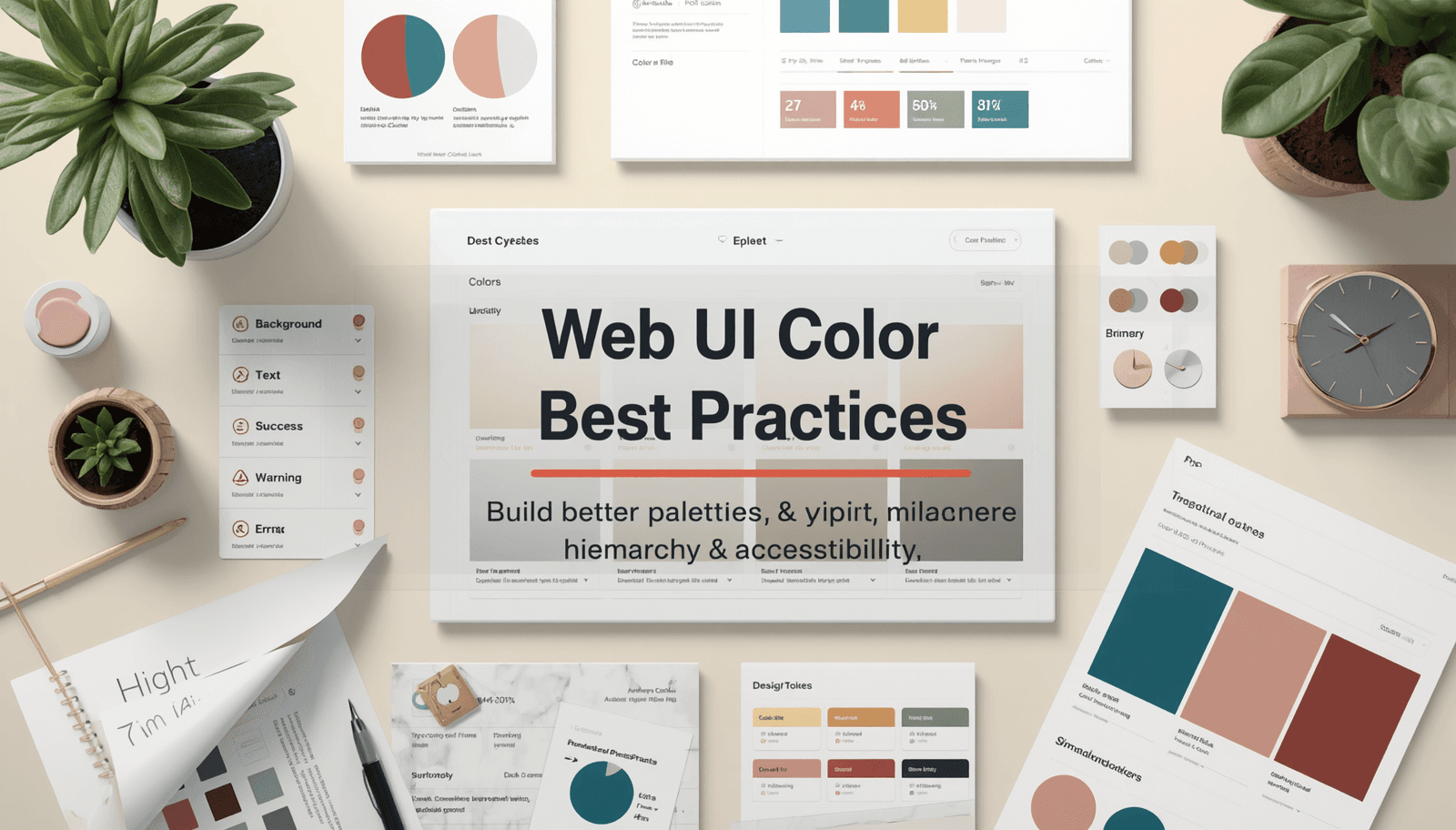
How to Use Color Palettes in Web UI (Best Practices)
Most color mistakes in web UI are not taste problems. They are structural problems. The designer picked good colors — a warm cream, a deep teal, a muted coral — but without a clear system for how those colors relate to each other and which roles they play, the interface ends up feeling inconsistent, visually noisy, or simply hard to use.
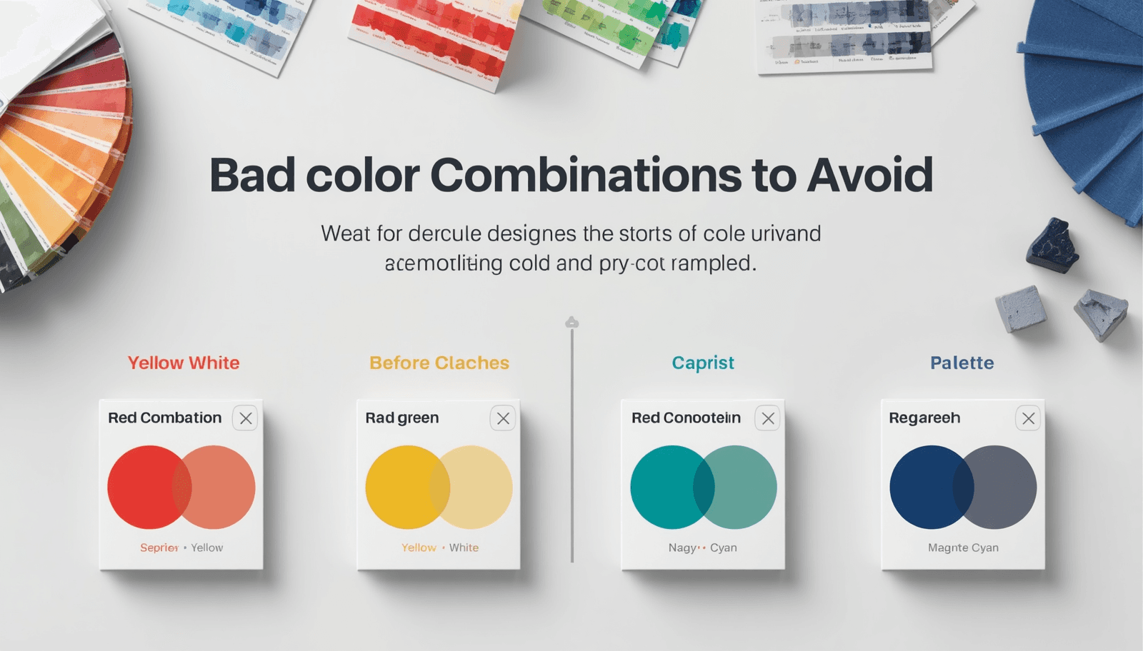
20 Vibrant Color Combos to Avoid (and Why)
Every designer has made a color mistake they could not unsee. You finish a layout, step back, and realize that something about the color combination is actively working against you — the text is hard to read, the palette feels aggressive, or two colors are fighting each other so loudly that nothing else in the design registers.
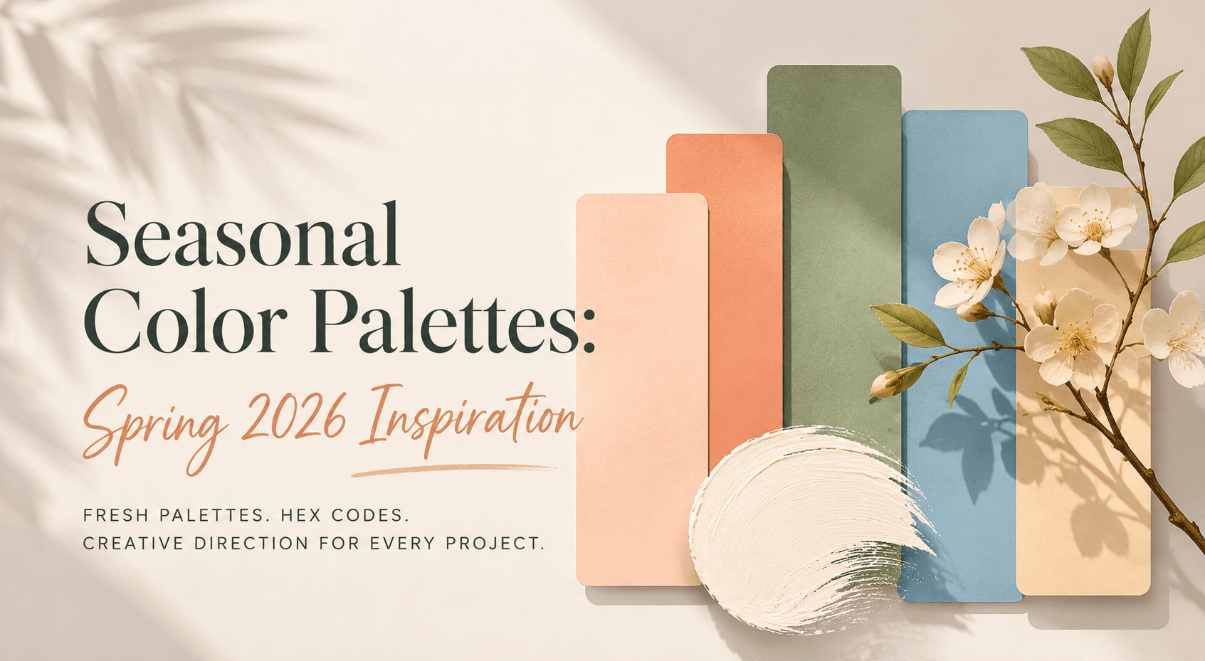
Seasonal Color Palettes: Spring 2026 Inspiration
There is a particular quality to spring light that no other season quite replicates. It is soft but clear, warm but not heavy — the kind of light that makes colors look like they are lit from within rather than lit from above. Every spring, designers respond to that shift, and the palettes that feel most resonant this season reflect something the broader culture is quietly reaching for: freshness without brightness, warmth without heaviness, color with enough confidence to be felt without being stated.
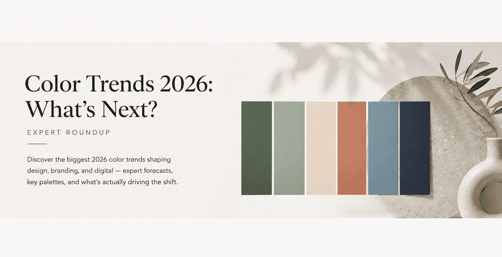
Color Trends 2026: What's Next? (Expert Roundup)
Every few years, something shifts in the collective visual mood. It is not one person's decision or one brand's campaign — it is a convergence of cultural tension, technological change, and a shared, almost unconscious need for something different. That shift is happening right now, and the 2026 color trends reflect it clearly.
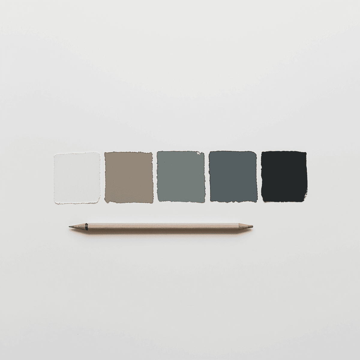
Best Minimalist Color Palettes for 2026 Design
Explore the best minimalist color palettes for 2026 design — simple color schemes and minimal web colors for clean, modern digital and brand work.
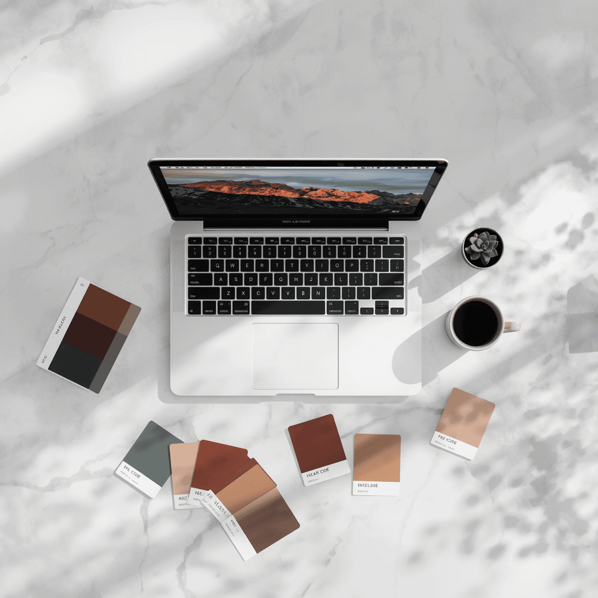
Step-by-Step: Create a Palette from a Photo (Coloraccy)
There is a specific kind of frustration that every designer knows. You find a photograph — a moody forest shot, a sun-drenched Moroccan alley, a perfectly styled flat lay — and the color story in that image is exactly what your project needs. But the colors are trapped inside the pixels. You can see them, feel them, but you cannot use them until you know their values.
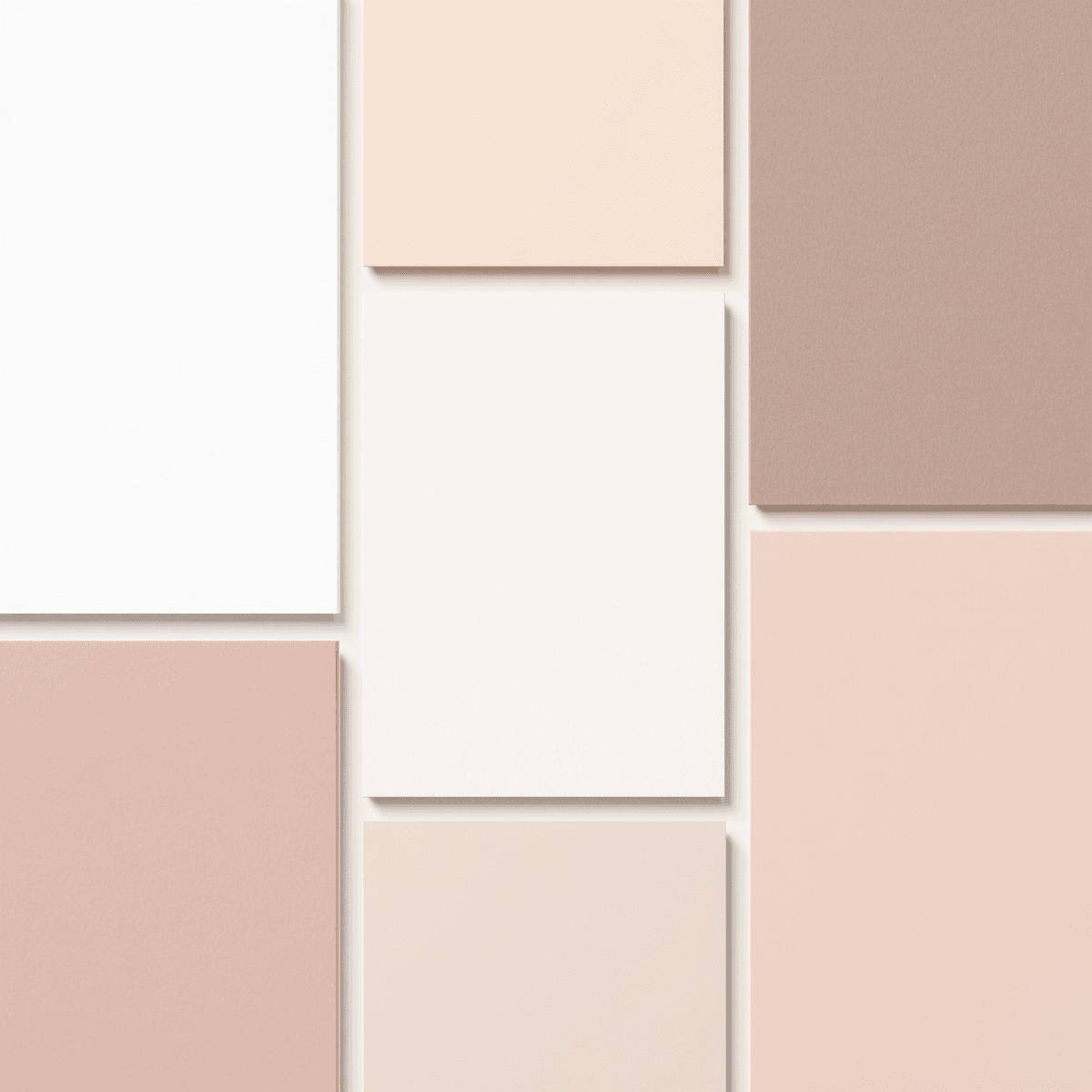
12 Aesthetic Color Palettes for Pinterest Boards
Some boards stop you mid-scroll. The colors feel so cohesive, so intentional, that you pin the image before you have even processed what it is. That is not luck — it is palette work. The right combination of hues creates a visual mood so consistent that every new pin feels like it belongs, like it was always meant to be there.
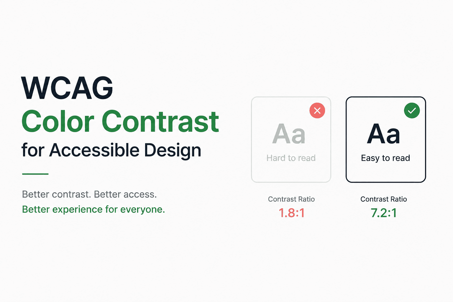
Guide to WCAG Color Contrast for Accessible Design
Imagine landing on a website where the light gray text sits on a white background. You squint, tilt your screen, and still struggle to read it. Now imagine that experience for someone with a visual impairment — or an aging user in bright sunlight on a mobile screen. This is not a hypothetical.
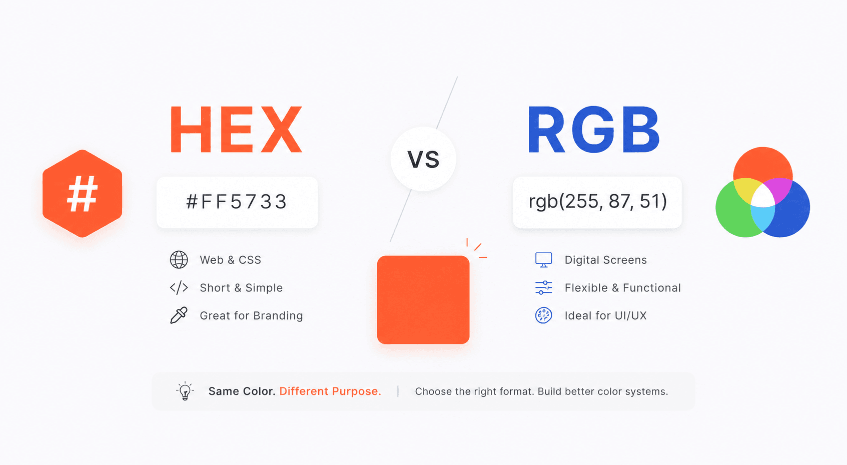
Using HEX vs RGB: When and Why (Expert Guide)
Every designer, developer, or brand strategist has faced the same quiet dilemma: should this color be written as #FF5733 or rgb(255, 87, 51)? Both values describe the same orange, yet the choice between them carries real consequences for how your project renders, scales, and communicates.
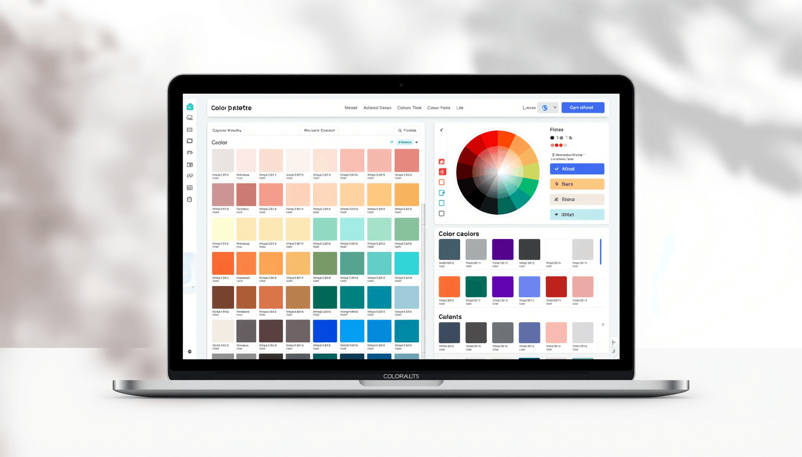
10 Free Color Palette Generators for Designers (That Are Actually Worth Using)
Color is one of the first things people notice — and one of the hardest things to get right consistently. Whether you are designing a brand identity, building a UI, or putting together a social media template, working without a structured color system almost always creates problems down the line.
10 Free Color Palette Generators for Designers (Compared for 2026)
Every great design starts with the right colors. Whether you are building a brand identity, designing a mobile app, or refreshing a website, choosing colors without a reliable system leads to inconsistency and wasted hours. That is exactly why a dependable color palette generator, a free tool, is one of the most practical assets a designer can have.
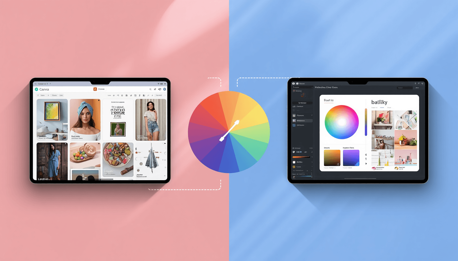
Canva vs Procreate: Which One Actually Wins for Color Palettes?
Discover how Canva vs Procreate colors stack up for palette creation, digital design, and illustration — and which tool fits your creative workflow best.
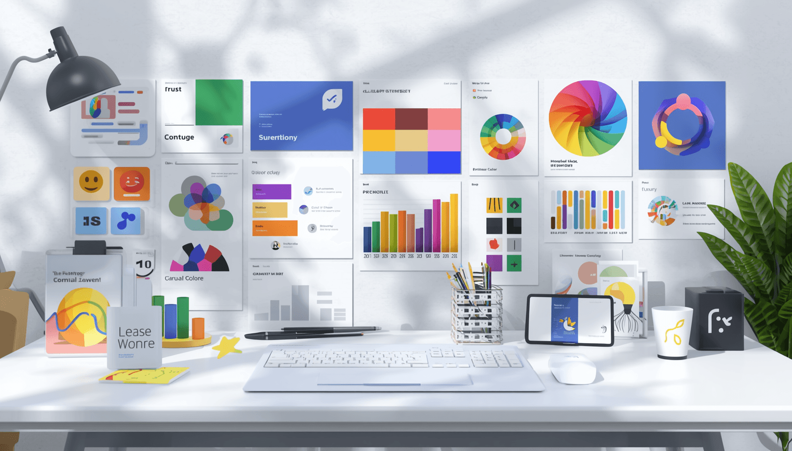
Choosing Brand Colors: A Guide to Color Psychology
Master brand color psychology to build a memorable identity. Learn how color meaning in branding shapes perception and drives real results.
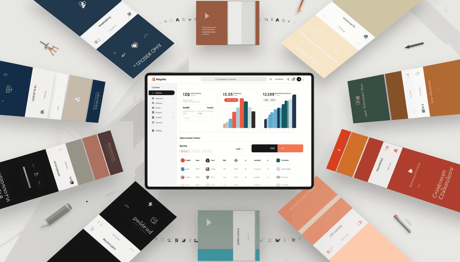
Shopify Store Color Palettes: 8 Schemes That Convert
Color is the first thing shoppers notice — and the last thing most store owners optimize. Studies show that up to 90% of snap-purchase judgments are based on color alone, yet most Shopify merchants still choose colors based on personal preference rather than conversion data. If your store is not selling as well as it should, your Shopify color palettes might be the hidden culprit.
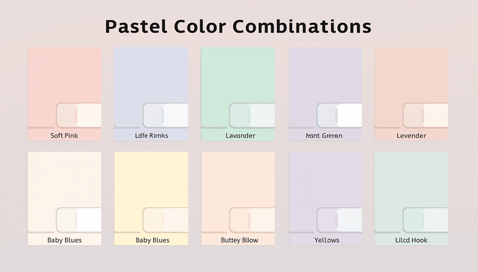
Top 7 Pastel Color Combinations for Digital Art
There is something about pastels that feels effortlessly right. Soft, luminous, and endlessly versatile, they have dominated digital illustration, UI design, and brand identity work for years — and show no sign of slowing down. But working with pastels is not as simple as picking light colors at random. The difference between a palette that feels dreamy and one that looks washed out often comes down to which specific pastel color combinations you choose and how you pair them.
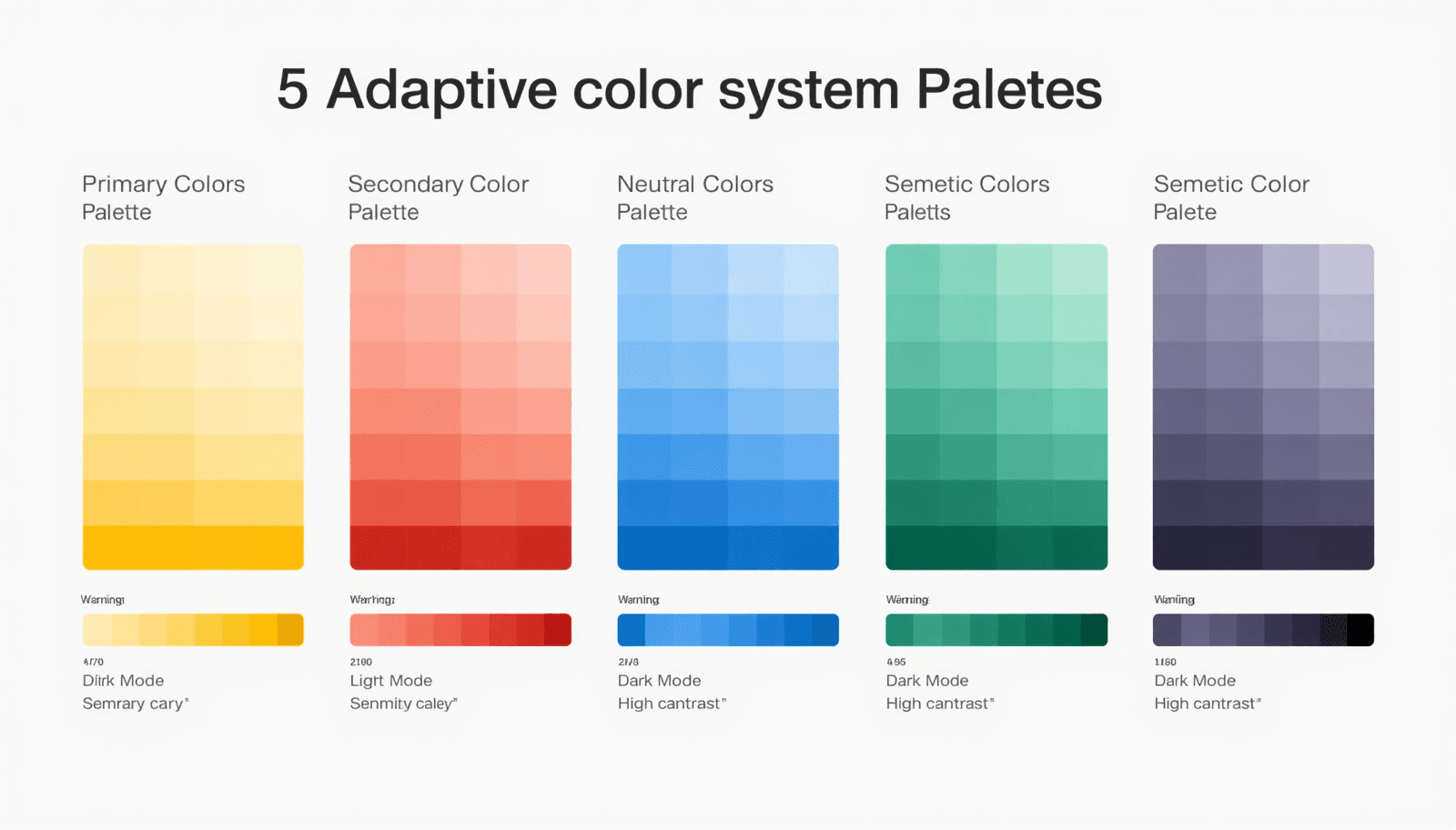
5 Adaptive Color System Palettes for Modern UI
Most designers pick colors once and move on. But modern interfaces live across dozens of contexts — dark mode, light mode, high-contrast accessibility settings, mobile screens, large monitors, and everything in between. A single static palette cannot serve all of them well.
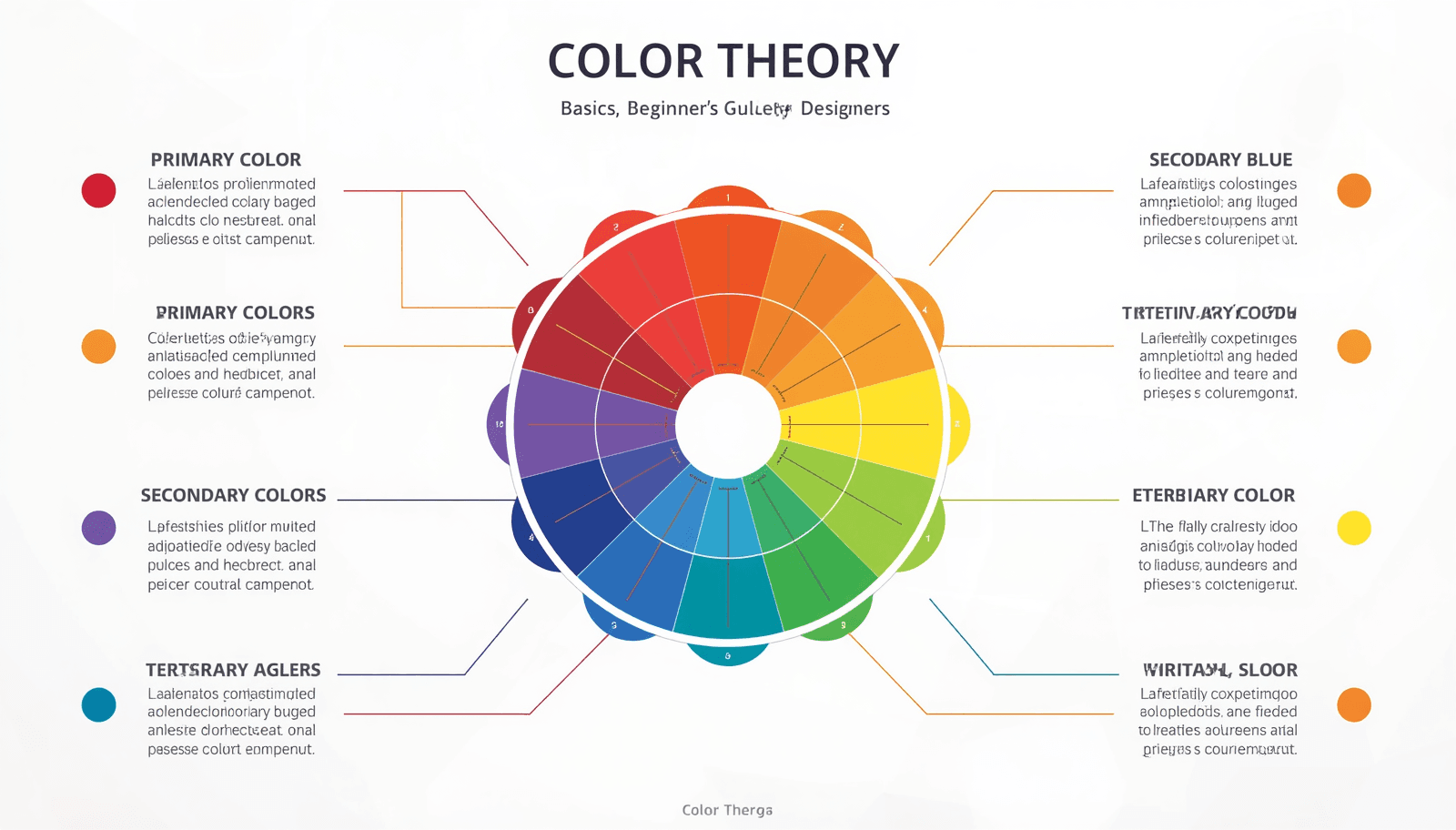
Color Theory Basics: A Beginner's Guide for Designers
Color is one of the most powerful tools a designer has — and one of the most misunderstood. Whether you are building a brand identity, designing a website, or choosing paint for a room, understanding color theory basics can transform your work from ordinary to extraordinary. The difference between a design that feels cohesive and one that clashes often comes down to a single principle: knowing how colors relate to one another.
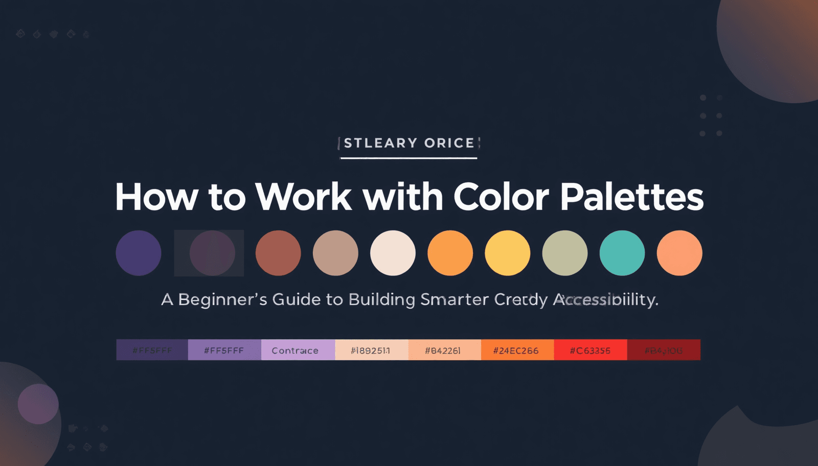
How to Work With Color Palettes by Color palettes
Learn how to work with color palettes using simple steps, accessibility checks and Coloraccy tools for better UI and branding.

10 Monochrome Color Palettes for Minimalist UI Design
Discover 10 stunning monochrome color palettes for minimalist UI design. Build cleaner, more elegant interfaces with expert color strategy.
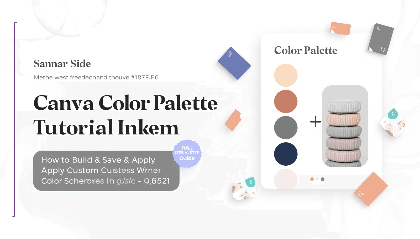
How to Generate Color Palettes in Canva (Step-by-Step Guide)
Learn step-by-step how to create stunning color palettes in Canva with this Canva color palette tutorial — perfect for designers and brands.
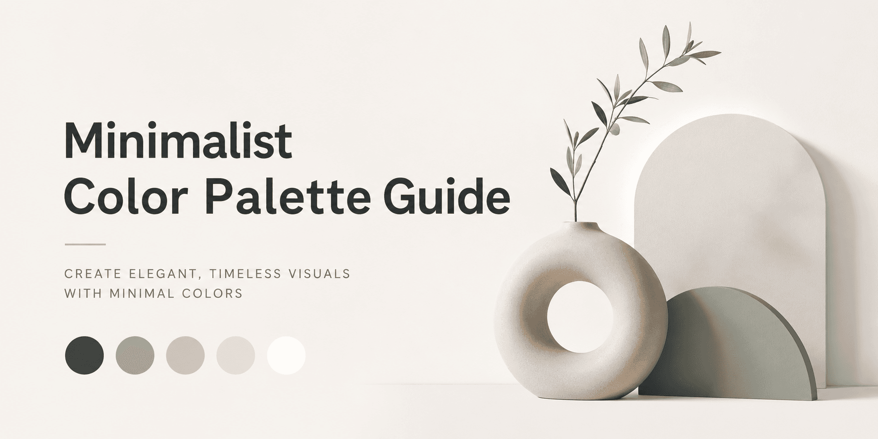
Minimalist Color Palette Guide
It’s no coincidence that some visuals make you pause scrolling. These don’t shout. They don’t fight for your attention with a whole bunch of other colors. They simply are — clean, purposeful, and completely confident. The thing about such visuals is that there is often one key element behind their success – a smartly selected, minimalistic color scheme.
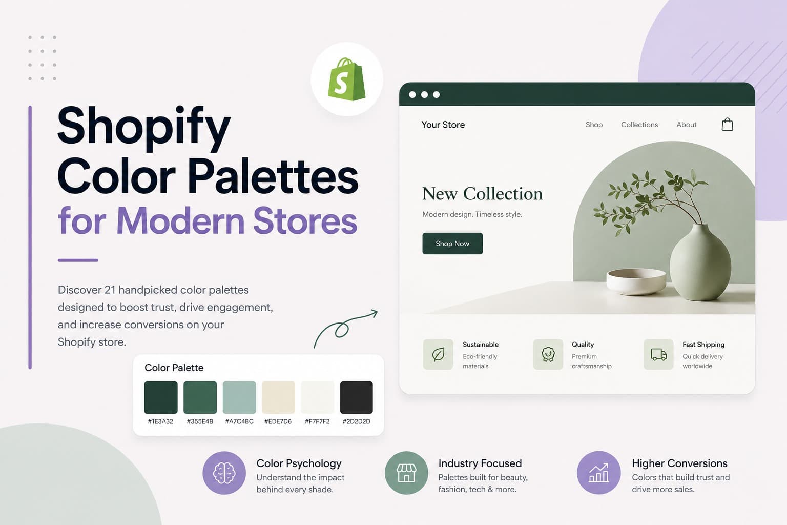
Shopify Color Palettes for Modern Stores
Color is not decoration. It is a decision. Before a visitor reads a single word on your Shopify store, they have already formed an impression — and that impression is built entirely on color. Studies consistently show that up to 90% of snap judgments about products are based on color alone. That means your Shopify color palettes are doing more selling than your copy, your product photos, or your pricing strategy combined.
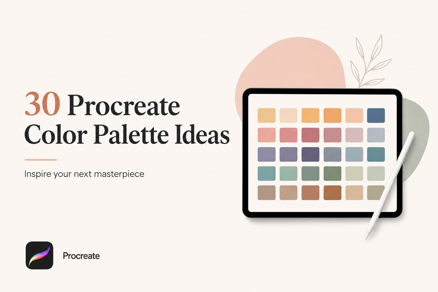
30 Procreate Color Palette Ideas
There is a specific kind of frustration that only digital artists understand. You open Procreate, you have time to paint, you are in the mood — and then nothing. The canvas just sits there. You drag a few colors around, nothing clicks, and twenty minutes later, you have closed the app without making a single mark.
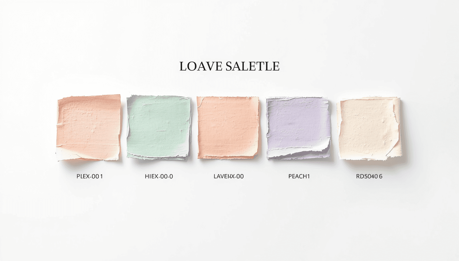
Pastel Color Palette Generator
Color is the mute language of design. Even before a reader sees any text or presses any buttons, color has already formed their emotions. For designers, marketers, UI programmers, and digital artists around the world, choosing the perfect colors is not only a matter of creativity but also of strategy. And for soft, classic, and adaptable hues, nothing beats the effect of pastel colors.
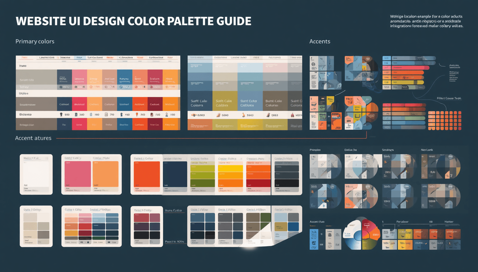
Choose a Color Palette for Website UI Design
Color will be the very first thing that greets the eyes of a website visitor even before they start reading anything. It sets the mood for them, instills confidence, and conveys brand value in split seconds. However, despite all of its significance, selecting a color palette is often overlooked by designers.
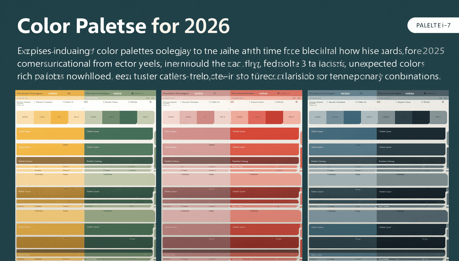
7 Color Palettes for 2026
Color is the very first feeling we experience before seeing anything else consciously. No matter if you're creating a branding strategy, updating your website, or designing an interior space, the color palettes you select set the tone instantly. In the year 2026, designers all over the world are leaving the tried-and-true behind in favor of something more daring and emotionally impactful.
Free Color Code Converter Online
Color plays a critical role in digital design, branding, and user experience. Whether you are a web designer, developer, marketer, or content creator, working with accurate color formats is essential for maintaining visual consistency and accessibility. A reliable color code converter helps you seamlessly switch between different color formats such as Hex, RGB, HSL, and CMYK without errors.
Pastel Color Palettes
In the world of design, color sets the tone, evokes emotion, and guides user interaction. Among the most versatile and visually soothing options are pastel color palettes. Whether you are designing websites, user interfaces, or branding materials, pastels offer a unique way to engage audiences worldwide. In this all-encompassing Coloraccy guide, we are going to cover everything you need to know about pastel color palettes ranging from how they are made and selected through their application and optimization.
Bring Your Designs with Summer Color Palettes
Summer isn’t just a season, it’s an experience of warmth and brightness, energy. For designers, it’s the prime time to play with summer color palettes that turn heads and stir feelings. When it comes to web design, product branding or social media visuals — the right color combination can instantly take your work to the next level.
50+ Procreate Color Palettes
Irrespective of whether you are an experienced digital artist who works on their illustrations using an iPad or a novice who is venturing into the digital art realm, there is one undeniable truth for everyone: The choice of color palettes is essential to take your art to the next level.

Seasonal Color Palettes 2026
Color is the primary language of visual communication. Prior to reading any word and touching any item, color communicates. The discussion regarding seasonal color palettes in 2026 has never been more vibrant, meaningful, and internationally conscious. If you are a designer, branding consultant, home decorator, or just somebody whose outfits need some life in the coming year, being familiar with seasonal changes is an incredibly powerful source of information for you.
Minimalist Color Palette Generator
Creating without excess is an art form. You may be a graphic designer, a web developer, a branding expert, or someone just having fun creating, but knowing which colors to use could make all the difference. That is why a Minimalist Color Palette Generator has become one of the most sought-after tools in the modern design workflow — and why millions of creatives worldwide are turning to platforms like Coloraccy to simplify the process.
Why Color Is the Silent Language of Every Brand
Colors are the very first things users see and the very last things that come to their mind. Before they even start reading any text on the web page or brand identity, colors have done a lot of things for them already: created emotions, generated trust, or on the contrary, provoked mistrust, and built overall perception.
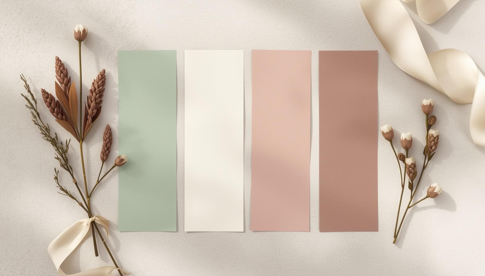
Your Wedding Colors Matter More Than You Think
Wedding planning is one of the most thrilling and intricate processes that an individual will ever experience. When making plans for their big day, couples have to think about numerous things, ranging from the venue, catering services, invitations, flowers, among others. One factor that couples should not overlook when making plans for their weddings is color.
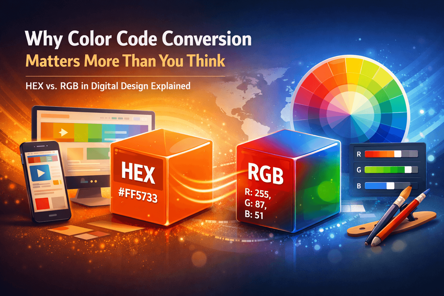
Why Color Code Conversion Matters More Than You Think
The truth is that each pixel on each screen around the globe carries some sort of color identity. Regardless of whether you’re creating your corporate website, crafting the user interface of your mobile application, or simply improving your digital artwork, the choice of colors is crucial. Two of the most commonly used color models when it comes to digital creation are HEX and RGB.
Free Aesthetic Color Palettes
Even before the reader sets their eyes on any text, be it your blog or social media page or even product packaging, an impression would have been formed by them. The impression is mostly generated based on color. Research done by the Institute for Color Research shows that in 90 seconds of seeing a product, an unconscious judgement is made by the individual, and up to 62 to 90% of that is determined purely by the color.
Why Spring 2026 Is Redefining How Designers Think About Color
Spring is always a fresh start. Everything begins blooming; daylight returns; the design industry as a whole takes a deep breath after the heaviness of the winter season. However, spring of 2026 is more than just another change in seasons – it signifies an important pivot in the approach to using color in graphic design, branding, interior design, fashion, and digital UI/UX design.

Why Color Conversion Is a Daily Challenge for Designers and Developers
If you've ever had to look at a hex code in your design document and wanted to convert it to RGB for your CSS file, or conversely, then you know exactly what the issue is. You simply cannot convert color codes just by looking at them. A misplaced hex code could take your brand color from navy blue to grey and doing manual conversions between all the various colors is both wasteful and inefficient.
Why Color Accuracy Starts With the Right Tool
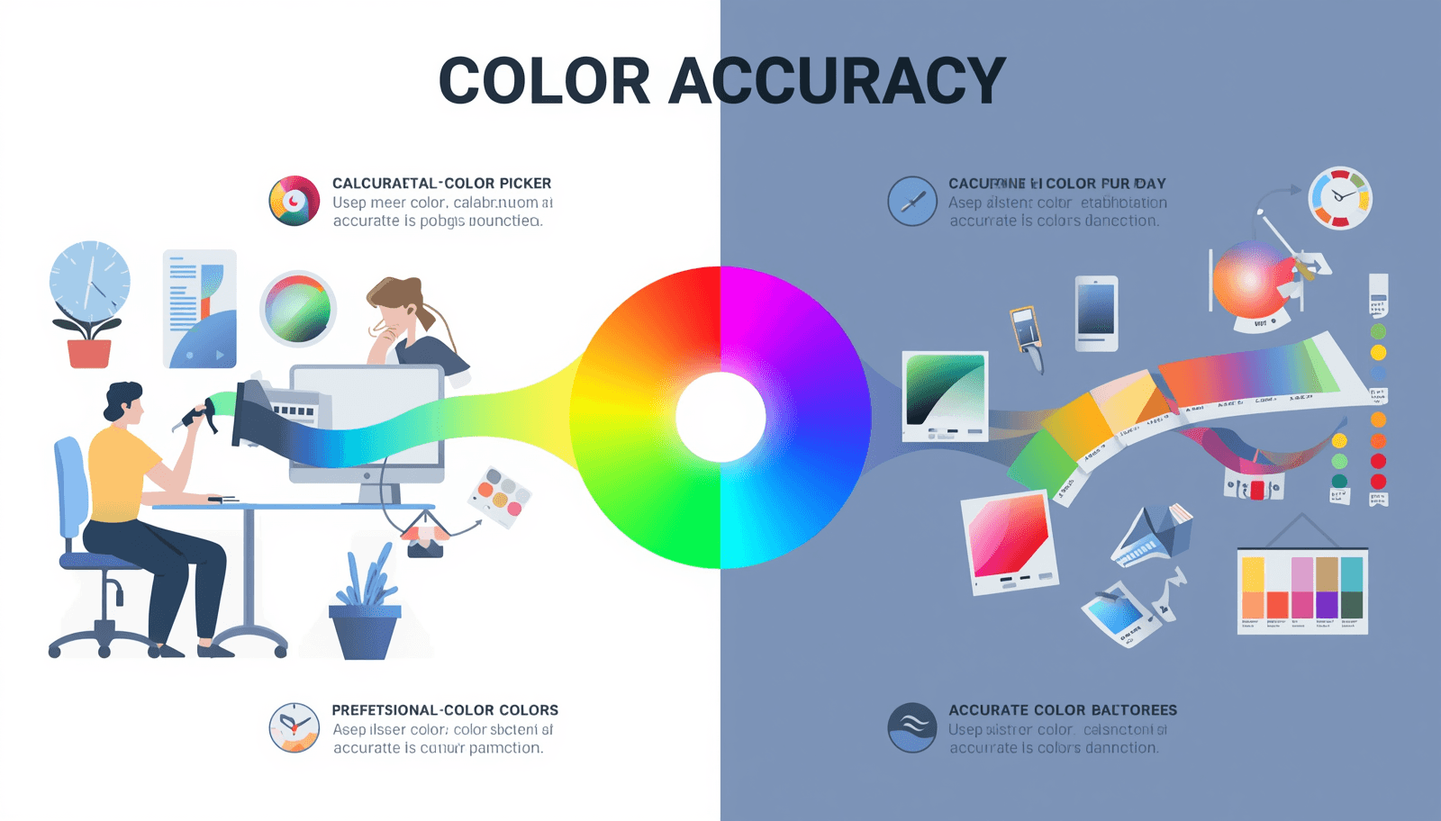
Colors are one of the strongest elements used in design. Regardless of whether you are working on branding, web design, developing an application interface, or creating a marketing campaign, colors will be an important part that defines the experience of your clients. But despite being crucial for design, colors pose one very important problem for many designers, be they amateurs or professionals.
Why Color Palettes Define Every Great Design
People are drawn to color. Before they see a title, hit a button, or interact with a product, they respond to color — instinctively and instantly. When building websites, developing logos, or creating graphics for social media, the color palettes you create influence perception and convey messages without uttering a single word.
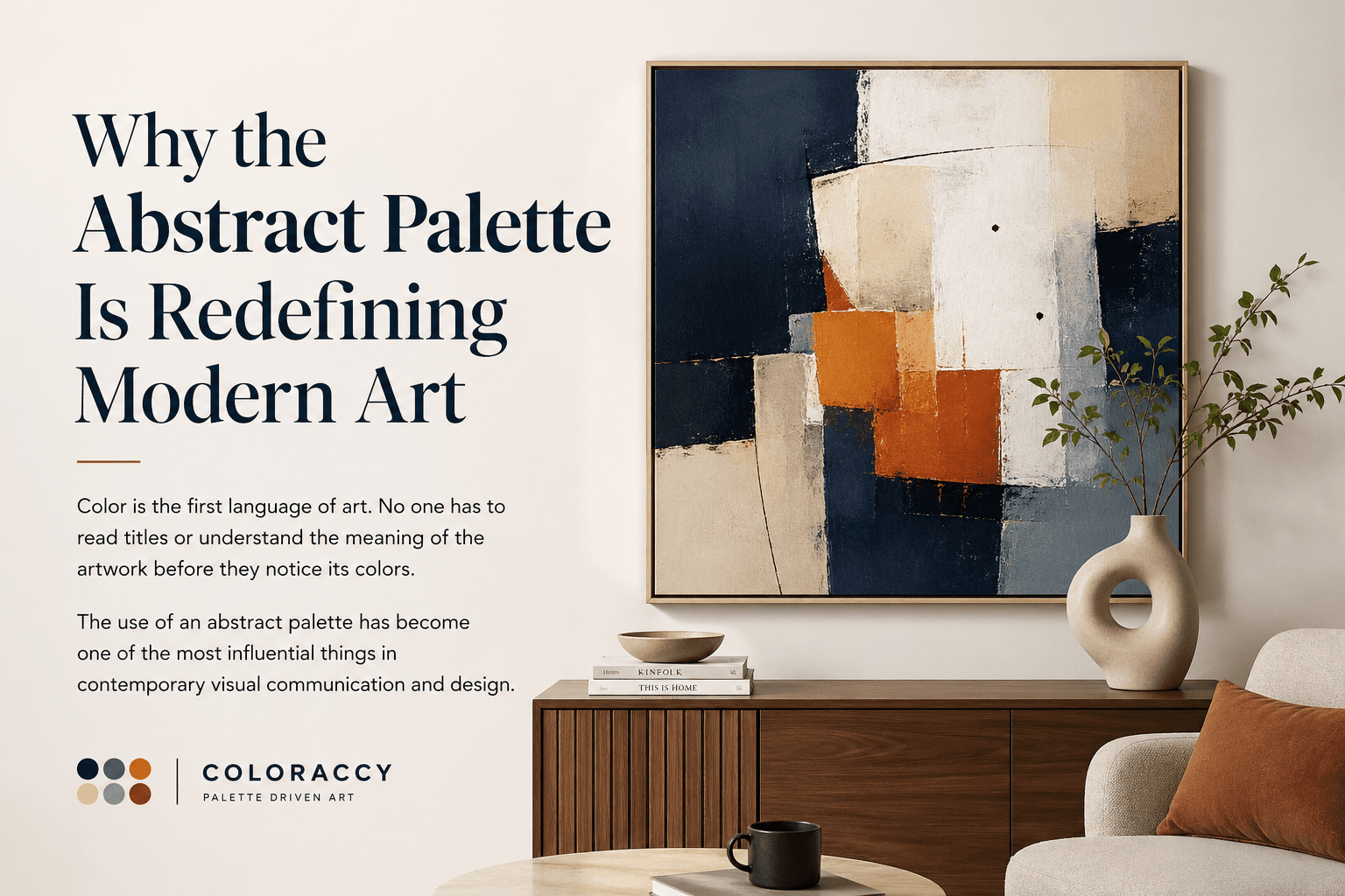
Abstract Palette Is Redefining Modern Art
Color is the first language of art. No one has to read titles or understand the meaning of the artwork before they notice its colors. The use of an abstract palette has become one of the most influential things in contemporary visual communication and design.
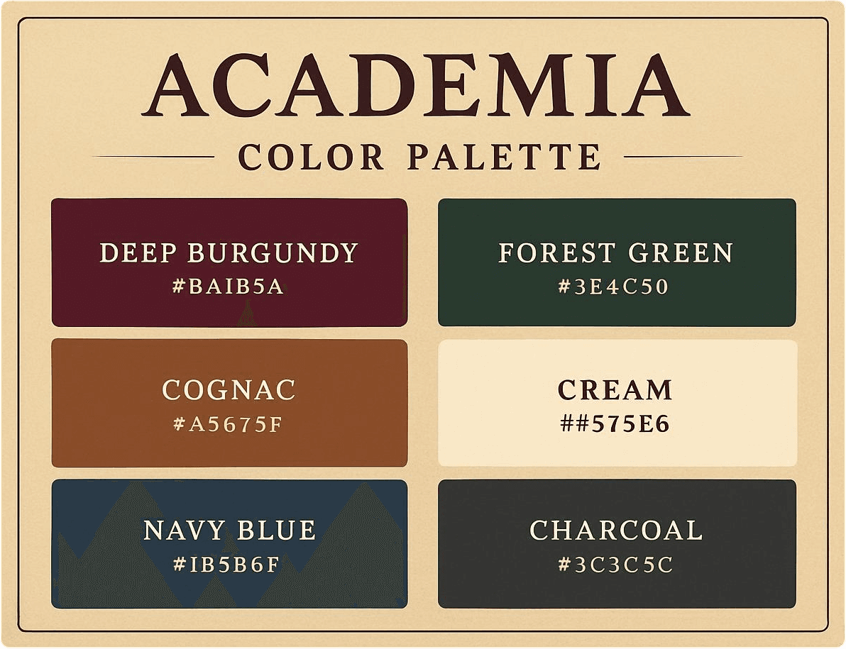
The Enduring Appeal of the Academia Palette
While some of them appear and disappear with the changing seasons, some aesthetic styles stick around. Academia palette is definitely one of those. In the world of graphic design and other forms of creativity, the academia palette is far more than just an aesthetic style that was born on the internet. Instead, it represents an extremely important palette that has already been able to make its impact on many different industries such as graphic design, interior design, fashion design, and branding.
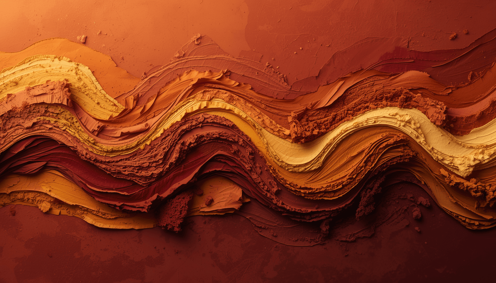
The African Palette Has the World Paying Attention
There is a moment in every designer's life when a color just stops them cold. Not because it is trendy. Not because an algorithm recommended it. But because it feels true — like the color already existed somewhere deep in memory, and they are only now recognizing it.

21 Pastel Color Palette Ideas to Elevate Your Design
There's a moment in every design project where you pull back from the screen, squint a little, and ask yourself: does this actually feel right? Not just look right — feel right. That gut-check moment is where color does its most important work, and it's exactly where pastels earn their place.
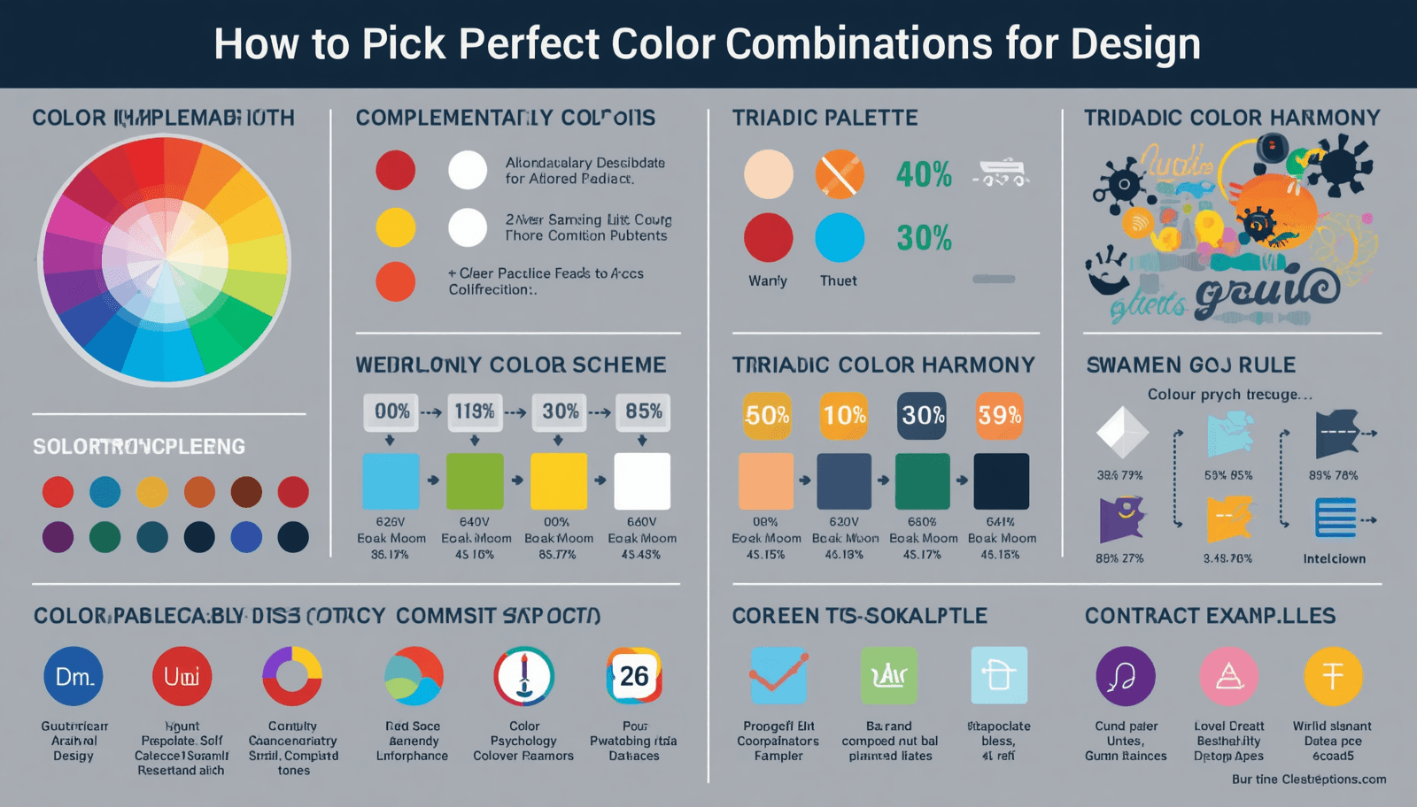
How to Pick Perfect Color Combinations for Any Design
How to Choose Perfect Color Combination worldwide — learn expert tips to build a stunning color palette for any design with Coloraccy.