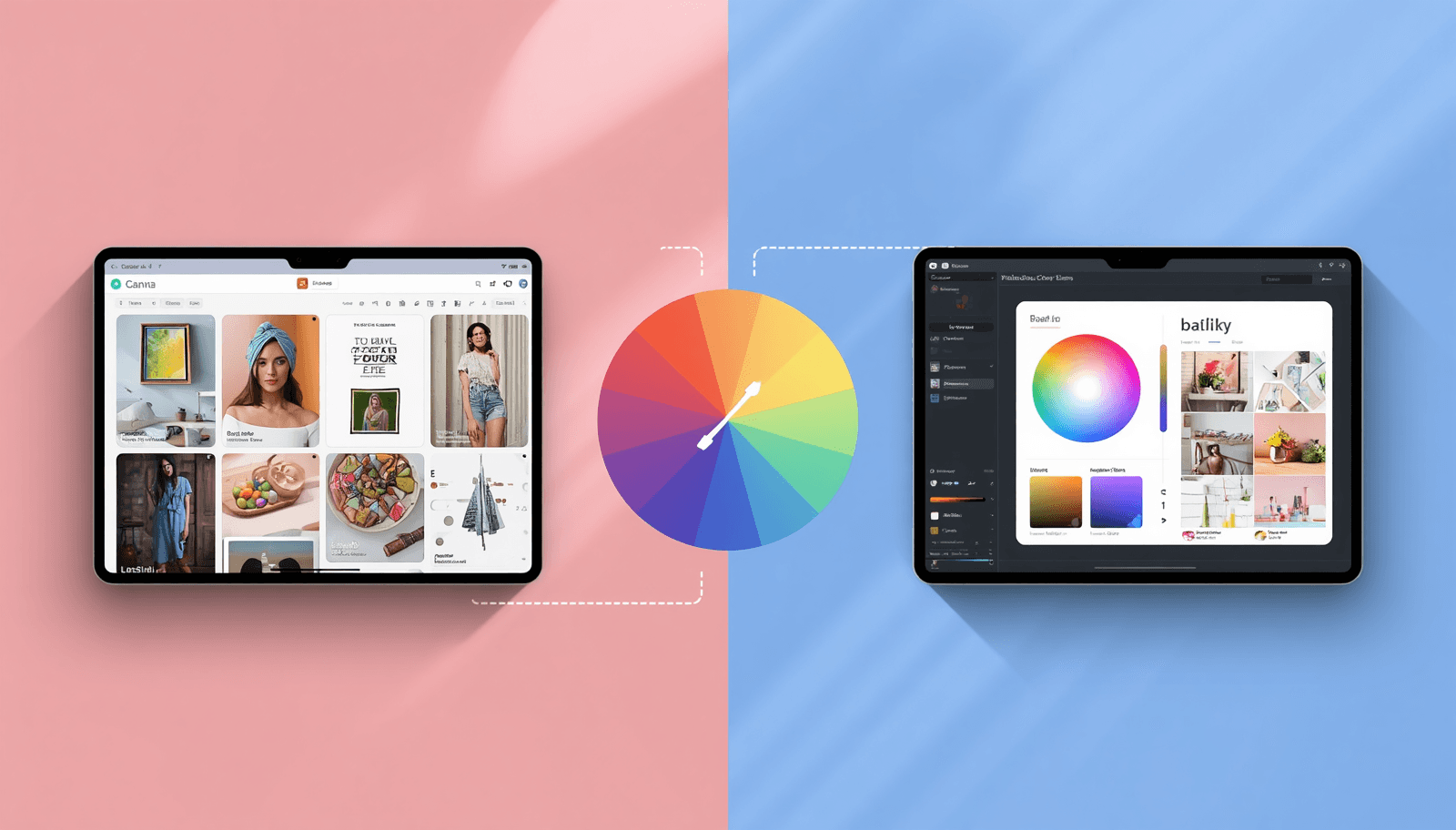
If you have ever opened Procreate on your iPad, spent twenty minutes building a palette you loved, and then had absolutely no idea how to use it in Canva, you are not alone. When it comes to Canva vs Procreate colors, which platform actually serves you better?
The honest answer is that neither is the clear winner for everyone. They were built for completely different types of creative work.
This breakdown is based on real hands-on experience with both tools across branding projects, client illustration work, and UI palette development. No fluff, no feature lists recycled from product pages.
Understanding What Each Tool Was Built to Do
This is the piece most comparison articles skip over, and it is the reason so many people end up frustrated with whichever tool they pick.
Canva was designed for people who need to produce a lot of visual content, fast, without a design background. Think social media managers, small business owners, and marketing coordinators.
Procreate was designed for artists. Full stop. It is an iPad-native illustration tool, and its color engine reflects that completely. The color disc, the harmony panel, the way colors interact with brush pressure and blending modes — these are not features layered on top of a design tool.
Neither description is a criticism.
Why Your Color Tool Choice Has Real Consequences
Here is something worth sitting with: the Institute for Color Research has found that people form a subconscious opinion about a product within 90 seconds of seeing it, and nearly 90% of that first impression is driven by color alone.
A palette built carelessly in Canva because "it looked fine" can quietly undermine a brand for years.
Color work deserves intentional tools. That is precisely why many professional designers and illustrators build their palettes in a dedicated environment like Coloraccy first — somewhere platform-neutral — before bringing them into Canva or Procreate for production use.
What Working Inside Canva's Color System Actually Feels Like
The Good Parts — and They Are Genuinely Good
Canva's color tools are underrated for what they do well. If you manage a brand — even a small one — the Brand Kit feature alone justifies the subscription.
It is not as nuanced as Coloraccy's image color extractor, but it works without leaving the app — which matters when you are deep in a project and do not want to break your focus.
WCAG readability requirements. For anyone developing shopify color palettes or e-commerce content, that check is quietly valuable.
Where It Starts to Feel Like a Cage
Spend a few hours actually trying to build a considered color system inside Canva and the limitations surface fast.
If you are developing an aesthetic palette for an editorial project, or trying to create a brand color system with genuine conceptual depth, Canva's color panel will start feeling cramped almost immediately.
What Working Inside Procreate's Color System Actually Feels Like
The Part Artists Talk About for a Reason
The Procreate color disc is one of those interface elements that sounds gimmicky until you actually use it. You can lock a color and watch its harmonic partners shift in real time as you adjust the hue.
For illustrators developing procreate color palette ideas for a series of character designs or environment concepts, that live feedback is genuinely hard to work without once you are used to it.
The Real Limitations You Will Run Into
Procreate is iPad-only, and that is not a small caveat — it is a fundamental constraint. If you work across a laptop, desktop, and tablet, your Procreate palettes live exclusively on one device. Exporting them requires manual steps, and the .swatches format is not natively readable by most other design apps without conversion.
There is also no brand management system, no shared color libraries, and no client-facing kit.
Side-by-Side: The Honest Breakdown
Feature | Canva | Procreate |
Platform | Web, iOS, Android | iPad only |
Color Modes | HEX, RGB, HSL | Disc, Classic, Harmony, Value |
Palette Building | Template-driven, surface-level | Hands-on, artist-focused |
Harmony Tools | Not available | Full panel with live preview |
Image Color Extraction | Yes | Yes |
Brand Kit / Shared Colors | Yes | No |
Gradient Maps | No | Yes |
Export Formats | PNG, PDF, SVG | .swatches, PNG |
Accessibility Checks | Basic contrast flagging | None |
Best For | Brand design, marketing | Illustration, digital art |
Learning Curve | Low | Medium |
Price | Free tier + Pro from ~$15/mo | One-time ~$12.99 |
The Gap Both Tools Leave — and How to Fill It
Here is what neither Canva nor Procreate will tell you directly: they are both closed ecosystems when it comes to color. What you build in one does not transfer cleanly to the other.
That gap is real, and it is where a dedicated resource like Coloraccy does its most useful work. Coloraccy operates outside any single app — it is built specifically around color discovery.
The color palette library spans genuinely diverse aesthetic directions. Building from an abstract palette for editorial work? Exploring an acrylic palette direction for traditional-inspired digital art? Working from an african palette for culturally grounded brand identity? The library covers that range in depth and keeps growing.
When you need a direction but do not know where to start, the palette showcase is the kind of curated resource that makes the blank-canvas paralysis go away fast.
Real Workflow Tips That Actually Make a Difference
If You Primarily Work in Canva
Set up your Brand Kit before you touch a single template — not after. Most people build five designs first, realize their colors are inconsistent, and then spend an hour fixing them. Forty minutes of upfront color work saves hours of revision.
When Canva's palette generator does not extract quite what you need from an image, run the photo through Coloraccy's image color extractor for finer control, then paste the hex codes directly into your Brand Kit. Two minutes, much better result.
If you are stuck on direction entirely, Coloraccy's random color generator is genuinely useful as a creative unstick — not because random colors make a palette. The post on elegant minimalist colors is also worth reading if your palette keeps feeling crowded.
If You Primarily Work in Procreate
When you photograph real-world references for color, also cross-check through Coloraccy's image color extractor. Photography captures color casts from lighting that your eye compensates for automatically but the app records literally — the extractor helps clarify which colors are genuinely there.
For series-based work, spend real time with pastel color combinations and monochrome color palettes as structural frameworks. A consistent, intentionally restricted palette across a series builds visual identity far faster than varied palettes ever will. And if you have not revisited color theory basics recently.
When Color Leaves the App: Branding, UI, and Real-World Context
Color decisions do not live inside Canva or Procreate permanently. They end up in websites, apps, product packaging, print materials, and everywhere your brand or creative work meets the world.
For digital interface work specifically, this matters enormously. Understanding adaptive color system UI palettes before finalizing any digital color system is not a nice-to-have — it is the difference between a palette that scales and one that needs to be rebuilt every time the context changes.
If you are building a color system from zero, the guide on how to work with color palettes provides a practical framework that applies across both tools and beyond them. Pair it with academia palette references for editorial projects, or explore pastel color palette generator techniques for softer brand directions.
Mistakes That Are More Common Than They Should Be
Picking colors you love instead of colors that work. Personal taste and functional palette design are not the same discipline. A color you find beautiful in isolation can destroy readability.
Never check how colors will print. Canva defaults to RGB. Procreate defaults to RGB. Both look great on screen. Neither automatically warns you that a rich teal will print as a muddy green-gray under a commercial CMYK profile.
Testing palettes as swatches instead of in context. A swatch grid is not a design. Always place your colors inside an actual layout — or at minimum on a realistic background — before committing. The palette showcase on Coloraccy shows palettes applied within real visual contexts, which is exactly the test that swatch grids cannot replicate.
Keeping palettes only inside the app. Updates break things. Devices get replaced. Files corrupt. If your palette only exists inside Procreate or Canva and something goes wrong, it is gone. Export hex codes to a separate document, a spreadsheet, or store them through Coloraccy's color palette library as a permanent, app-independent reference.
Overcomplicating the palette. The complementary color finder and harmony tools exist to help you find structure, not to justify using twelve colors.
The Bottom Line
Canva and Procreate are not really competing for the same job. Canva is a production environment that happens to have color tools.
The smarter move is to use each tool for what it genuinely does well — and to build your color thinking in a space that belongs to neither. Somewhere like Coloraccy, where you can explore, test, document, and share color decisions without being constrained by any single app's limitations or ecosystem.
Visit Coloraccy.com and start building palettes that actually work, across every tool, every project, and every screen.