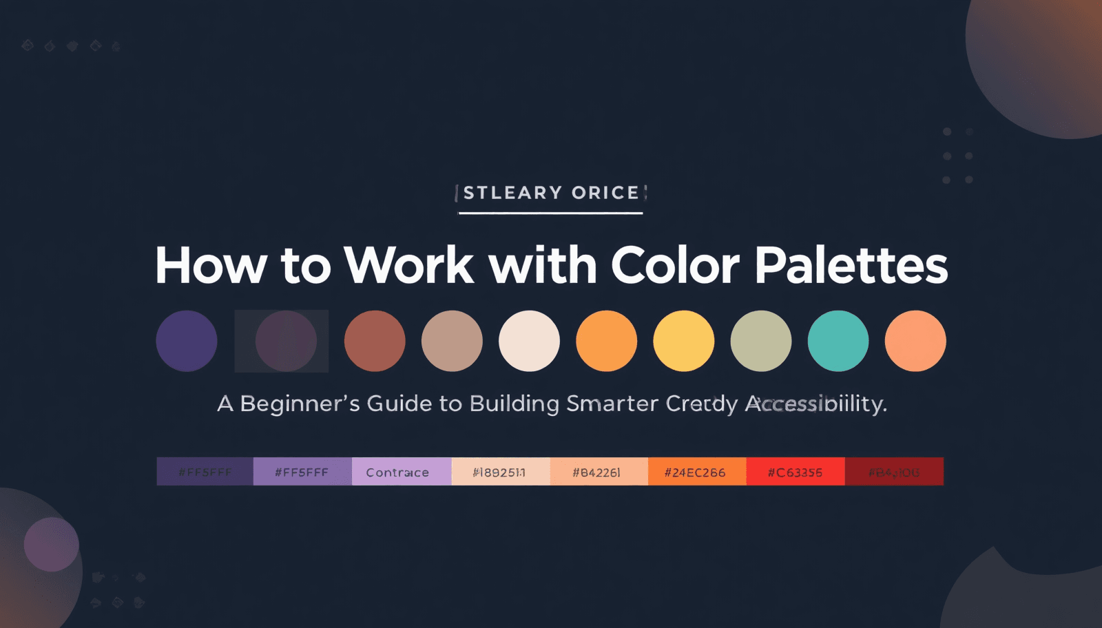
Learning how to work with color palettes is one of the fastest ways to make a website, brand, product interface, or interior concept look deliberate rather than accidental. Beginners often think good color comes from instinct alone, but strong visual systems are built from repeatable decisions: hue relationships, contrast, hierarchy, context, and consistency. Color theory frameworks from Figma and Adobe both emphasize that palettes work best when colors are chosen in relation to one another rather than as isolated favorites.
In practical design work across websites, apps, packaging, hospitality spaces, retail signage, and office environments, the same pattern appears again and again: the hard part is not finding attractive colors, but making them work together under real conditions. A palette has to survive bright screens, dim rooms, print production, text contrast rules, branding needs, and user expectations at the same time. That is why professional palette building always combines aesthetics with usability.
That is also why a focused tool stack matters. Coloraccy presents itself as an all-in-one color platform for designers and developers, with palette generation, WCAG validation, format conversion, brand kits, real-time previews, export options, and a picker-to-export workflow built for modern projects.
What Working With a Color Palette Really Means
A color palette is a curated set of colors, neutrals, shades, and tints chosen to create a consistent visual language across a brand, interface, campaign, or physical space. If you browse a color palette library or study a live palette gallery, you are not just looking at pretty swatches — you are looking at structured combinations designed to communicate mood, clarity, and cohesion.
A beginner-friendly way to think about this:
Color scheme — describes the relationship between hues on the color wheel (e.g., complementary, analogous, triadic, or monochromatic).
Palette — the actual set of colors you choose from that scheme.
Color system — goes one step further and assigns those colors to jobs like background, body text, border, button, accent, hover, or heading.
This distinction is central in modern product design, where Figma explains color theory as a framework for harmony and Material Design treats color roles as assignments tied to interface elements rather than random swatches.
Palette selection should always start with intent:
For artistic or experimental projects → abstract palette ideas can point you toward unexpected combinations.
For credibility and restraint → an academia-inspired palette suggests more classic and scholarly tones.
For energy and visual impact → a high-energy acrylic palette is a better reference point.
For most beginners, the best starting structure is one base color, one support color, one accent color, and two or three neutrals. That gives you enough range for hierarchy without creating noise.
Why Color Palettes Matter in Real Decisions
Color palettes shape recognition, readability, emotional tone, and decision-making. Color is not decoration layered onto a design at the end — it is part of how the design communicates from the beginning.
Accessibility
Accessibility is where this becomes non-negotiable. Under W3C WCAG 2.2:
Normal text generally needs a contrast ratio of 4.5:1 at Level AA.
Large text can use 3:1.
Non-text interface elements also need meaningful contrast, commonly 3:1 against adjacent colors.
Those standards matter globally:
The World Health Organization says at least 2.2 billion people worldwide have near or distance vision impairment.
The National Eye Institute notes that about 1 in 12 men have color vision deficiency.
A palette that looks stylish but fails on contrast or distinguishability is not just weak design — it excludes real users. Accessibility should be built into palette work early, not bolted on later.
Color Psychology
Color carries meaning, but meaning is contextual. Adobe highlights how color psychology can amplify a message, while Interaction Design Foundation notes that color perception is shaped by factors such as culture, visual ability, and personal preference. That is why:
A mood-first direction like an aesthetic palette collection, can feel ideal for lifestyle branding.
African palette references may suggest richer earth tones, bolder contrast, and culture-rooted warmth when used thoughtfully.
As projects grow, palettes also need structure. A role-based setup is more scalable than naming colors only by feeling — defining which tone is for surfaces, buttons, borders, captions, hover states, and headings keeps consistency across teams and channels.
A Beginner-Friendly Process That Actually Works
Follow a structured sequence rather than chasing inspiration at random. The basic workflow is: set a base → choose harmony → expand the tonal scale → verify contrast → export values → test in context.
Step 1: Start With the Source of Truth
If you know your hero color → use a precision color picker to lock the exact HEX, RGB, HSL, or CMYK value.
If your inspiration begins with photography or product images → use an image color extractor to turn visual references into structured, usable color values.
Step 2: Choose a Harmony
Adobe identifies these core harmony types:
Harmony Type | Description |
Complementary | High-contrast opposite hues |
Analogous | Adjacent hues on the wheel |
Triadic | Three evenly spaced hues |
Split-complementary | A base color plus two colors adjacent to its complement |
Monochromatic | Tints and shades of a single hue |
Use a complementary color finder when you need a high-contrast counterpart, or a random palette starter when you need fast variations to compare.
Step 3: Build the Full Tonal Range
Most real projects need lighter tints and darker shades for:
Hierarchy and hover states
Background fills and borders
Captions and section breaks
A shade and tint generator lets you turn one base color into an ordered scale, including complementary, neutral, muted, soft, and vibrant variations with WCAG-aware outputs.
Step 4: Document Every Code Format
Different workflows need different formats:
Web: HEX, RGB, HSL, CSS variables, SCSS variables, utility classes
Print production: CMYK awareness
A color format converter prevents the classic problem of slight inconsistencies from using the "same" color in different formats.
Step 5: Assign Roles Before Applying Colors
Decide what the palette needs to do:
Primary action / Secondary action
Warning / Success
Body text / Muted text
Divider / Surface / Overlay
When color gets tied to roles early, the system becomes easier to scale, audit, and hand off.
Step 6: Test in Real Context
Preview the palette on buttons, cards, forms, hero areas, signage mockups, presentation slides, and dark mode surfaces. Good palette work only counts when the colors remain legible and balanced after they leave the mood board.
How Palette Choices Change Across Industries
A good beginner palette is never universal. The right answer for a fintech dashboard, a café menu, a mobile app, a hotel lobby, and a premium shopping mall wayfinding system will not be the same.
Digital Products, Websites, and SaaS Interfaces
For digital products, clarity usually wins over novelty. Interfaces need:
Dependable neutrals
Unmistakable text contrast
Action colors that guide the eye without overwhelming the layout
Material Design's role-based approach treats colors as functional tokens, and W3C contrast rules keep those tokens readable across screens and states. In practice: fewer hues, stronger tonal discipline, and more attention to surface, border, and emphasis levels.
Branding, Print, and Cross-Channel Campaigns
Branding projects need emotional clarity but also technical consistency:
Digital work is usually built in RGB-oriented formats.
Print depends on CMYK.
If your team is moving between websites, signage, brochures, menus, pitch decks, and product packaging, keep a documented source of truth for final production values.
Qatar Commercial Sector Use Cases
In Qatar's commercial sector, palette choices often need to do more than look premium:
Hotel palette — needs to feel cool, calm, and high-end in bright daylight while reading clearly in evening lighting.
Office palette — needs professionalism, focus, and lower visual fatigue across dashboards and presentations.
Mall palette — needs stronger contrast for wayfinding, store differentiation, directional signage, kiosks, and promotion zones.
Sampling finishes, surfaces, or environment photos with an image-extraction tool gives designers a more realistic starting point than choosing swatches in isolation.
For concept direction, reference families can speed up exploration:
Experimental abstract schemes → bold identity and art-forward energy
Scholarly combinations → authority and trust
Bold acrylic-inspired hues → promotions, experiential zones, or youth-focused systems
Soft aesthetic sets → wellness, beauty, boutique retail, contemporary hospitality
Earth-rich tones → grounded, warm, material-led directions
Practical Tips and Common Mistakes
Practical Tips
Tip 1: Solve hierarchy with value, not more colors. Keep the number of main hues controlled, then use a tonal ladder to create depth, emphasis, and breathing room.
Tip 2: Name colors by role, not emotion. "Primary 500," "surface muted," "text strong," and "border subtle" scale much better than "sky blue," "coffee beige," or "warm gray two." A role-based semantic system is easier to hand off, easier to audit, and more reusable.
Tip 3: Check accuracy before approval. Verify exact values with a color picker, check contrast pairings, and preview color-vision simulations before finalizing.
Palette Approach Comparison
Palette Approach | Good Side | Bad Side | Best Use |
Random bright colors | Fast inspiration, high energy | Usually inconsistent, often weak on contrast | Brainstorming only |
Base color + harmony rule | Balanced, teachable, easy to refine | Can feel generic if not customized | Beginner branding and UI |
Brand kit with tonal scale | Scalable, consistent, handoff-friendly | Takes more setup time | Products, systems, multi-page brands |
Image-led palette extraction | Feels grounded and contextual | Can inherit muddy or low-contrast colors | Hospitality, retail, packaging, interiors |
Common Mistakes to Avoid
Mistake 1: Choosing colors one by one without testing them together. A swatch that looks perfect on its own may fail once body text, button states, off-white backgrounds, and dark surfaces enter the picture. Real palette work is relational, not isolated.
Mistake 2: Confusing contrast with difference. Two colors can look obviously different and still fail accessibility. W3C's thresholds account for low vision, color vision deficiency, glare, device variation, and aging eyes.
Mistake 3: Treating print and digital as identical. RGB, HSL, HEX, and CMYK serve different environments. If the palette appears on business cards, menus, packaging, signage, websites, and social graphics, your documentation has to reflect that reality.
Mistake 4: Overusing the accent color. Accent colors work because they are rare. If every button, badge, card, label, icon, and headline uses the same bright highlight, emphasis disappears. Give each color a job and respect that job over time.
Build Your Next Palette With Coloraccy
If you want a reliable answer to how to work with color palettes as a beginner, the shortest version is this:
Good palettes are not about collecting favorite colors. They are about creating a clear system that looks right, feels right, and performs well across screens, print, content, and physical spaces.
Ready to stop guessing and start building smarter color systems? Visit the Coloraccy homepage, test your base color, generate a working palette, validate contrast, and turn your next website, hotel concept, office brand, or mall campaign into a more consistent, more usable, and more memorable visual experience.