While some of them appear and disappear with the changing seasons, some aesthetic styles stick around. Academia palette is definitely one of those. In the world of graphic design and other forms of creativity, the academia palette is far more than just an aesthetic style that was born on the internet. Instead, it represents an extremely important palette that has already been able to make its impact on many different industries such as graphic design, interior design, fashion design, and branding.
Whether you are a graphic designer creating a brand logo or simply someone who likes to experiment with interior designs, the academia palette offers you a lot of different options since it does not depend on trends. Academia colors are timeless and always look great no matter which project they are implemented in.
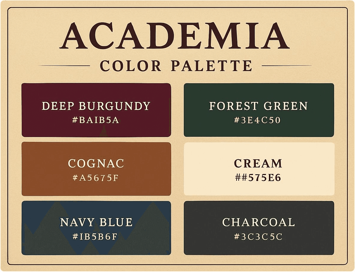
That is why the academia palette is an indispensable part of the curated Coloraccy palette collections.
In this comprehensive guide, you will find detailed information concerning the characteristics of the academia palette, its psychology, application in graphic designs, interior, and fashion design, and ways to obtain the academy palette resources for free.
What Is the Academia Color Palette?
Academia Colors is a selection of colors chosen from an environment where knowledge and wisdom were cultivated. Imagine brown paper, antique wooden tables, ink-stained hands, musty pages of old books, cracked leather, and sunlight filtering through high windows during the latter part of the day.
The palette typically includes colors from the following families:
Warm neutrals — ivory, cream, parchment, warm white, off-white
Browns and tans — caramel, walnut, chestnut, sepia, raw umber
Deep greens — forest green, hunter green, bottle green, olive
Burgundy and wine — deep red, maroon, oxblood, merlot
Navy and slate — dark navy, dusty blue, ink blue
Black and charcoal — rich black, soft charcoal, graphite
Gold and amber — antique gold, honey, amber, aged brass
The common denominator of all these diverse shades is that they share the same level of saturation; they are all, for the most part, subdued, weathered, and dull in appearance. There are no fluorescent tones, no pristine white, and no electric blue tones either. All elements of an academia color palette have been left to mature, to darken, and to become patina-colored.
The Cultural and Historical Roots of Academia Aesthetics
The reason for the popularity and success of the academia palette can be explained by briefly exploring its background. The aesthetics of the academia palette have roots in the visual culture of the European and American university settings. More specifically, the aesthetic is based on the appearance of those institutions of higher education which were established in the eighteenth or nineteenth century.
Some of them include Oxford and Cambridge Universities located in Great Britain and the Ivy League institutions located in the United States. All these educational establishments boast architectural design characterized by the use of dark wooden panels, leather books, Persian rugs in deep colors, portraits painted in oils and encased in gold frames, and stonework that gained a tint because of exposure to weather conditions over the years.
As the aesthetics of those institutions were aimed at conveying authority and stability, the colors used should also convey such messages. When the academia aesthetic became popular again in the early 2020s, it retained that serious image. For marketers and designers, it means that there is no need to explain the meaning of colors from that palette.
Why the Academia Color Palette Works Across Design Disciplines
What is most astonishing about the academia color palette is its adaptability in different designs. Academia colors are not exclusive to any one particular program; rather, they are adaptable in all situations.
Interior Design and Home Decor
The academic colour palette in interior design is one that brings out an essence of refinement, culture, and uniqueness in residential rooms. The combination of dark green walls, ivory trimming, and antique brass fittings. A study decorated using walnut brown colors, burgundy and worn-out leather. A bedroom in dusty navy and parchment color that provides a getaway from modern life.
Academic colors can be applied in various rooms due to their subtle and non-overpowering qualities. Academic colors enhance and compliment the beauty of natural materials such as wood, stone, wool, and linen. Incandescent light helps to intensify the amber and gold colors while bringing out the burgundy and greens vividly.
Graphic Design and Branding
If an enterprise is interested in conveying its message of professionalism, tradition, and high quality, the Academia color palette will be among the most efficient marketing tools at their disposal. The publishing industry, legal firms, academic organizations, manufacturers of luxury goods, booksellers, coffee makers, and artisans can all profit from the power associated with the color palette.
The combination of typography printed on parchment or warm cream colored pages, green or red accents, and golden details has been tested for centuries of print communications, from ancient manuscripts to contemporary luxury product packaging.
Fashion and Personal Style
Academia-style fashion involves classic items in the basic hues of the color palette: camel coats, forest green jackets, white button-down shirts, dark brown shoes, and burgundy accessories. In this case, the color palette acts as a fashion philosophy, whereby one is advised to pick quality clothing in classic colors that match well as opposed to following seasonal fashion trends.
Digital Design and Web Aesthetics
If your website, social media content, or digital platform is meant to target audiences who are sophisticated, educated, or culturally minded, then using the color palette of academia would give your site an instant visual edge compared to the many other sites on the internet that are designed with bright colors and stark contrast.
Free Academia Color Palette: What to Look For and Where to Find It
"Free academia color palette" refers to the actual requirement of users who wish to have access to quality-designed academia-themed color palettes that they can put to use instantly without paying any license fees.
These are some of the features you should consider when evaluating a free academia color palette.
Hex code accuracy — Ensure that the color values provided are precise and consistent. Slight variations in hex codes can produce noticeably different results on screen, especially with muted, complex tones like those in the academia range.
CMYK and RGB values — A truly useful palette resource provides color values across multiple formats, allowing the palette to be applied consistently across both digital and print applications.
Cohesion testing — The colors in an academia palette should work together as a unified system, not simply as a collection of individually appealing tones. Look for palettes that have been tested as complete compositions.
Contextual application examples — The best palette resources show you the colors in use — on mockup surfaces, in typography combinations, in spatial contexts — so you can evaluate their effectiveness before committing.
At Coloraccy, the palette collections, which were inspired from academia, are designed considering all these criteria. The palettes have full information about the colors used in them, the contexts of their use, and the designs that can be applied.
Visit Our Color Palette Guide Post
Practical Guide: Applying the Academia Palette to Your Project
Whether you are working on a brand identity, a personal design project, or a physical space, the following principles will help you apply the academia palette with confidence and intentionality.
Establish a Dominant Neutral Base
Start by using one of the warm neutrals from the color palette as the main background color, either parchment, ivory, or cream. The use of such a neutral background color creates some space for the more vibrant colors to be readable without overwhelming the entire design.
Choose One or Two Anchor Colors
Choose one deep color as the main anchor, which will make up the largest amount of the design and convey the dominant mood of the palette. It could be forest green, burgundy, navy, or dark walnut brown. An additional anchor could also be chosen for contrast, although two anchors is enough.
Use Gold and Amber as Accent Tones
Gold and amber are what make the academia color scheme "work." It does not take much of these colors to activate the whole picture and connect it to ideas of warmth and excellence – just an ornamental strip of gold, a metallic accent, or a hint of amber.
Maintain Consistent Saturation Levels
The most common mistake in applying academia-inspired colors is mixing the muted, aged tones of the palette with colors from outside its saturation range. A single bright or highly saturated color will immediately break the palette's tonal unity. Stay within the muted, complex color range throughout.
Test Across Lighting Conditions
A color scheme for an academic design will have very dynamic behavior in regards to light changes. For instance, one palette may seem very vivid when under incandescent lighting but less vivid under fluorescent light, which is cool. Always remember to conduct your lighting test before anything else.
Common Mistakes to Avoid With Academia Color Design
Over-darkening the palette — It is tempting to lean entirely into the deep, dramatic end of the academia spectrum, but a palette composed exclusively of dark tones becomes heavy and difficult to read. Balance is essential.
Ignoring texture — The academia aesthetic is inseparable from texture. Colors that look flat on a smooth digital surface come alive on textured paper, woven fabric, or worn wood. If your application allows for texture, use it.
Applying the palette without typographic alignment —The use of color and typography in academic aesthetics is related. The ability of the palette to communicate its message would greatly be compromised when using modern sans-serif typefaces, which lack the history that serif typefaces have.
Using too many colors simultaneously — The academia palette contains many beautiful tones, but restraint is a virtue here. Four to six colors used consistently is more effective than ten applied inconsistently.
Choosing digital-only color values for print applications — Colors that look rich and warm on screen can appear flat or muddy when printed. Always verify CMYK values before finalizing any print-destined academia palette application.
Conclusion: Build Something That Lasts With the Academia Palette
In a world where design is frequently driven by the urge to be innovative no matter what, the use of the academia color palette provides an interesting alternative view, suggesting that the most long-lasting pieces of work can be created only on the basis of color palettes with true history and psychology behind them.
Indeed, warm and neutral shades, dark green, rich burgundy, and antiquated gold found in the academia color palette have a lot more behind them than their contemporary look. These colors speak about many years of tradition of knowledge, science, and art, and by using them in your design, you automatically communicate your message to your audience.
If you need a free academia color palette for some particular creative project of yours or want to get familiar with this type of design in general, our website is here to help you with that.
Explore the Coloraccy academia palette collection today — and build something worthy of the aesthetic it represents.