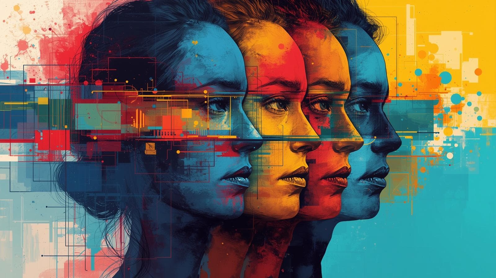
Colors are the very first things users see and the very last things that come to their mind. Before they even start reading any text on the web page or brand identity, colors have done a lot of things for them already: created emotions, generated trust, or on the contrary, provoked mistrust, and built overall perception.
In a world full of digital products competing for people's attention, which often lasts only several milliseconds, creating the right combinations of colors is not something to do for the sake of creativity — this will affect the conversion rate, brand loyalty, and user experience.
In this article, we will go through all the things that are connected with the use of colors and color palettes in design, starting from psychology basics and going through the best combinations to the Coloraccy Color Palette Generator.
What Are Creative Color Palette Combinations?
A color palette is a set of colors that have been consciously chosen to be used throughout an entire design system or UI interface. An innovative combination of a color palette is when a designer selects a set of colors that not only work well together but also convey certain feelings or intentions through their use.
Color palettes are typically built around several foundational structures:
Monochromatic palettes: variations in shade and tint of a single hue, ideal for clean and sophisticated aesthetics.
Analogous palettes: colors sitting adjacent on the color wheel, producing a naturally cohesive and calm visual experience.
Complementary palettes: opposite colors on the wheel that create high contrast and visual energy.
Triadic palettes: three evenly spaced colors that deliver vibrancy and creative balance.
Split-complementary palettes: a refined version of complementary, offering contrast without the visual tension.
Understanding these structures is the foundation of both great UI design and strong branding.
The Psychology of Color in UI Design and Branding
Color psychology is a very studied area in which particular colors are associated with certain emotions and behaviors. The University of Winnipeg discovered that as much as 90% of fast opinions about an item can be influenced only by its color. This shows the power of color in design, which is often overlooked.
Here is a practical overview of how core colors perform in design and branding contexts:
Blue: Trust, stability, professionalism. Dominant in fintech, healthcare, and SaaS.
Green: Growth, wellness, sustainability. Widely used in eco-brands and finance.
Red: Urgency, passion, energy. Effective for CTAs, food brands, and retail.
Yellow: Optimism, warmth, creativity. Works well for consumer and youth brands.
Purple: Luxury, wisdom, imagination. Common in beauty, education, and premium products.
Black and white: Timelessness, clarity, minimalism. A staple for high-end branding.
Orange: Enthusiasm, accessibility, affordability. Popular in tech startups and entertainment.
When building creative color palette combinations for a UI or brand, anchoring your palette choices in color psychology ensures the visual identity communicates the intended emotional message from the first impression.
Top Creative Color Palette Combinations for UI and Branding
1. Modern Minimalist: Off-White, Slate Gray, and Deep Navy
This palette is ideal for SaaS products, professional service providers, and fintech businesses. Off-white ensures clarity and readability, while slate gray brings functional value to secondary texts and border lines. Deep navy brings credibility and power to headers, call to actions, and navigation features.
Such a blend works incredibly well with the minimalist color palette generator strategy, which relies on fewer colors but achieves more functional outcomes.
2. Warm Earthy Tones: Terracotta, Sand, and Olive Green
Earth tones have become popular within brands from various industries such as lifestyle, wellness, and sustainability. Terracotta adds warmth and friendliness, sand adds neutrality, while olive green contributes to nature. The overall result represents honesty and brand consciousness — something that modern consumers are looking for.
3. Bold and Vibrant: Electric Blue, Neon Lime, and Charcoal
Startups, technology companies, and games should go with energetic colors. Electric blue and neon lime provide an instant contrasting effect, whereas charcoal ensures that the design doesn’t overwhelm the user. This is arguably the most effective combination of colors for dark mode UI design.
4. Pastel Elegance: Blush Pink, Lavender, and Soft Mint
Combinations in pastels rule in the fields of beauty, fashion, and wellness. The soothing nature of pastels helps lower the cognitive load and implies a warm reception. In the context of user interface design, users tend to dwell longer on designs incorporating pastels due to their soothing nature.
5. Timeless Luxury: Matte Black, Gold, and Ivory
These three colors serve as the bedrock upon which the luxury brand identity is founded. The color black exudes elegance and gravitas. The color gold infuses it with an aura of prestige and warmth. The color ivory acts as a soothing element to this vibrant color combination.
6. Seasonal Color Palettes: Aligning Design with Temporal Context
Seasonal color palettes are increasingly used by marketers, UX designers, and branding agencies to align visual identity with specific times of the year:
Spring: Pale yellow, mint green, and soft coral. Energetic, fresh, and transitional.
Summer: Coral, sky blue, and bright white. Open, warm, and inviting.
Autumn: Burnt orange, deep burgundy, and warm brown. Rich, textured, and grounded.
Winter: Deep teal, icy blue, and silver. Composed, elegant, and cool.
Brands that incorporate seasonal color palettes into their campaign design show notably higher engagement on seasonal promotions and landing pages.
How to Build Your Own Color Palette Using a Color Palette Generator
There's no faster or better way to find great color palette combinations than to use a color palette generator tool. Such tools take the guesswork out of color theory and allow users to discover thousands of color combinations at the speed of light.
Coloraccy exists for such purposes. Whether you need a simple SaaS dashboard color palette generator or something more creative and expressive, the Coloraccy platform offers:
Instant palette generation based on input colors or keywords
Harmony rules (complementary, analogous, triadic, and more)
Accessibility checks for contrast ratios (WCAG compliance)
Export options compatible with design tools like Figma, Adobe XD, and Sketch
Seasonal and trending palette libraries curated for current design trends
Explore Coloraccy's full Color Palette Generator and find combinations that match your creative vision in seconds.
Color Palettes for UI Design: Specific Use Cases
Dashboard and Data Visualization
Color control is essential when dealing with data-oriented interfaces. Ideally, you should use either white or light gray as your default background while incorporating only a few categorical colors for your graph and chart representations. Never exceed six colors per data representation since the human eye will have difficulty differentiating between values.
Mobile App UI Design
The mobile user interface should consider the small size of the display screen, lighting variations, and accessibility considerations in its color palette choices. High contrast is compulsory, with a minimum of 4.5:1 ratio as per the Web Content Accessibility Guidelines (WCAG) AA standards.
E-Commerce Branding
As far as e-commerce is concerned, color plays a direct role in influencing the buying behavior of customers. Numerous studies have found that CTA buttons with high color contrast tend to be more successful than CTA buttons that fade into the background of the website page.
Common Mistakes to Avoid When Choosing Color Palettes
Even experienced designers fall into predictable color traps. Here are the most common mistakes to avoid:
Using too many colors. A palette with more than five primary colors almost always creates visual noise. Restrict your palette to three to five colors, then build tints and shades from those.
Ignoring accessibility. Nearly 300 million people worldwide experience some form of color vision deficiency. Always validate contrast ratios before launching any UI or brand design. Tools like Coloraccy include built-in contrast checkers to make this effortless.
Chasing trends blindly. Trending seasonal palettes should inform, not dictate, your design choices. A color that dominates social media in a given season may look dated within 12 months. Build core brand palettes for longevity.
Skipping contextual testing. Colors behave differently across devices, monitors, and print media. Always test your chosen palette across multiple screen types before finalizing.
Neglecting the background relationship. Many designers choose beautiful foreground colors but pair them with a default white background without consideration. The background is an active part of the palette, not a neutral afterthought.
Conclusion: Color Is Strategy — Choose It With Intention
Choosing colors for their palette combinations isn’t just a stylistic issue; it’s a functionally and psychologically important element that will affect how each person interacts with your brand or product on a daily basis.
Whether it's the elegance of a navy and ivory combination for a luxury item or a vibrant and dynamic mix of electric blue and neon lime, color always speaks. The brands that really know what they’re doing treat their colors with the same seriousness and intentionality as their copy, typography, and user experience.
Fortunately for you, learning about color doesn't have to be a lone endeavor. With Coloraccy's Color Palette Generator, you can get access to expert-quality color analysis quickly, efficiently, and creatively – be it designing a SaaS product, creating a season-specific marketing campaign, or crafting your brand identity out of thin air.
Start building your perfect palette today and transform the way you think about color in design.