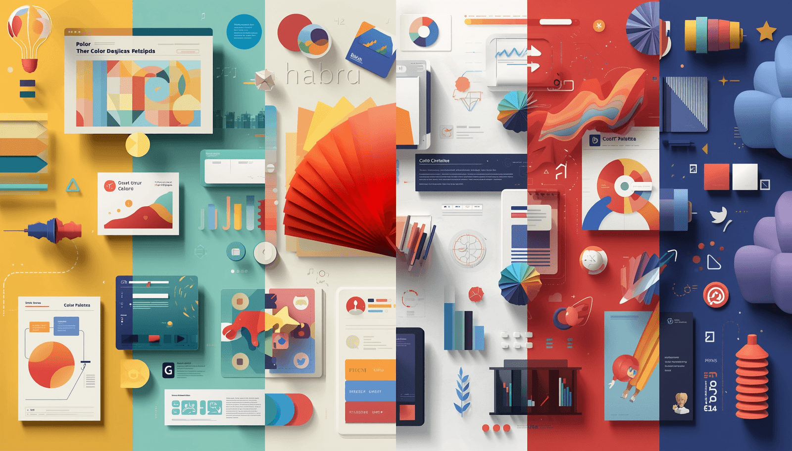
People are drawn to color. Before they see a title, hit a button, or interact with a product, they respond to color — instinctively and instantly. When building websites, developing logos, or creating graphics for social media, the color palettes you create influence perception and convey messages without uttering a single word.
From Coloraccy, this comprehensive guide to color palettes provides information on all aspects of color palettes — definition, process, appropriate color palettes for various themes, as well as color coding systems such as HEX, RGB, and HSL. You'll also discover more than 100 curated color palette ideas classified by mood and type of project you have in mind — available in any part of the world.
What Are Color Palettes and Why Do They Matter?
Color schemes involve selecting specific colors to be used together in harmony in a design. They act as the vocabulary in which any design can be executed. Designers, brand managers, and developers use color schemes to guarantee coherence, create an atmosphere, and lead the viewers' eyes through a design.
The perfect selection of colors is more than beautiful because it sends signals such as trustworthiness, excitement, peace, innovation, or dominance, depending on how the colors were put together. Various research indicates that color schemes increase brand recognition by up to 80 percent.
The Role of Color Palettes in Modern Design
Color palettes serve several critical functions:
Visual consistency — Keeps branding unified across print, digital, and environmental formats
Emotional resonance — Colors trigger psychological responses (blue for trust, red for urgency, green for nature)
User experience clarity — Guides attention and improves readability in UI/UX design
Cultural communication — Colors carry different meanings across cultures worldwide
Types of Color Palettes: A Deep Dive
Understanding the different palette types helps you choose the right visual approach for every project.
Abstract Palette
An abstract color palette is not bound by the conventions of colors found in nature. Its strength lies in its surprising use of color combinations with the aim to create an impressive effect rather than one which adheres to convention.
Characteristics of an abstract palette:
High contrast between colors
Non-representational color relationships
Often includes vivid neons, deep saturated hues, or stark monochromes
Evokes curiosity, disruption, or originality
Example abstract palette combinations:
#7B00D4 | #AAFF00 | #0D0D0D |
#FF4F5A | #0047AB | #FAF0E6 |
#E97451 | #009B8D | #708090 |
Abstract palettes work especially well for album covers, tech startups, and portfolio websites.
Academia Palette
The academics color palette takes cues from the ivy-covered campuses, leather-bound books, and the opulence of wisdom. This is one of the most widely recognized stylistic movements in web design and internet culture, made popular via sites such as Tumblr and Pinterest.
Characteristics of an academia palette:
Warm, muted, and earthy tones
Rich burgundies, deep forest greens, aged cream, tobacco brown
Conveys intellectualism, nostalgia, and refinement
Example academia palette combinations:
#6D213C | #F5F0DC | #2D5A27 | #5C4033 |
#002147 | #F1E6CE | #B5A642 | #36454F |
Academia palettes are ideal for editorial blogs, educational platforms, writing portfolios, and lifestyle brands rooted in classical aesthetics.
Acrylic Palette
The inspiration for the acrylic palette lies in the characteristics of acrylic paints, which are intense colors with opacity and texture. This is a palette of rich and vibrant colors that are reminiscent of colors applied on a painting canvas by an artist.
Characteristics of an acrylic palette:
Saturated, high-pigment colors
Strong mid-tones and rich contrasts
Mix of primary and secondary colors with occasional neutral grounding tones
Example acrylic palette combinations:
#E32636 | #003153 | #CB9D06 | #FAFAFA |
#123524 | #E01869 | #231F20 | #FAF9F6 |
Acrylic palettes are perfect for art-focused brands, creative agencies, painters' portfolios, and event branding.
Aesthetic Palette
Aesthetic palettes are a wide-ranging genre that includes visual aesthetics made popular through internet communities. They range from soft pastels in dreamscapes, melancholic aesthetics in dark academia, neon colors in vaporwave, to natural colors in cottagecore. The common theme between all aesthetic palettes is their deliberate creation of atmosphere through carefully selected colors.
Soft Pastel Aesthetic:
#FFD1DC | #E6E6FA | #F5FFFA | #FFDAB9 |
Dark Aesthetic:
#0C0C0C | #4B0082 | #B2BEB5 | #880808 |
Cottagecore Aesthetic:
#BCB88A | #C19A6B | #FFF44F | #FAF8F5 |
Vaporwave Aesthetic:
#FF6EC7 | #7DF9FF | #9B59B6 | #B57BEE |
Aesthetic palettes are dominant in social media content creation, influencer branding, and digital illustration.
Visit Our Blog Post for More Guide
Color Systems Explained: HEX, RGB, and HSL
Regardless of how aesthetically pleasing a palette may be, it must communicate its message effectively through all digital mediums. This is where color systems play an important role. Knowing your HEX, RGB, and HSL codes guarantees that your palette will look the same whether viewed on your phone, computer, or design software application.
HEX Color Codes
HEX color codes represent the most common color codes for use in website design and programming. The HEX color code consists of a six-digit character code that begins with the hashtag sign, which represents the RGB code.
Structure: #RRGGBB (e.g., #FF5733 = a vivid orange-red)
Why designers use HEX:
Compact, copy-paste ready format
Universally supported in CSS, HTML, and design tools
Easy to share and document in style guides
HEX examples:
#FF0000 Pure Red | #1CA9C9 Ocean Blue | #36454F Soft Charcoal |
RGB Color Model
RGB (Red, Green, Blue) uses numerical values between 0 and 255 to define color by light intensity. It is the native color model for screens, cameras, and digital displays.
Structure: rgb(R, G, B) — e.g., rgb(255, 87, 51)
Why designers use RGB:
More intuitive for developers working with dynamic color adjustments
Ideal for animations, gradients, and UI interactions
Supports transparency through RGBA format: rgba(255, 87, 51, 0.8)
HSL Color Model
HSL (Hue, Saturation, Lightness) is the most human-readable color system. Rather than mixing light values, HSL describes color in terms that match how designers actually think about it.
Structure: hsl(H, S%, L%) — e.g., hsl(14, 100%, 60%)
Hue (H): The color itself, expressed as a degree on the color wheel (0-360)
Saturation (S): How vivid or muted the color is (0% = grayscale, 100% = full color)
Lightness (L): How light or dark the color is (0% = black, 100% = white)
Why designers use HSL:
Easiest to adjust programmatically (increase lightness without changing hue)
Perfect for creating harmonious color variations and tints
Preferred in modern CSS frameworks and design systems
HEX vs RGB vs HSL: Which Should You Use?
Feature | HEX | RGB | HSL |
Readability | Low | Medium | High |
Web/CSS Support | Full | Full | Full |
Best For | Static values | Dynamic color | Design systems |
Transparency | HEX8 | RGBA | HSLA |
Human Intuition | Low | Low | High |
Recommendation: Use HEX for documentation and style guides. Use RGB or RGBA for JavaScript and canvas-based animations. Use HSL for building design systems, themes, and accessible color scales.
100+ Perfect Color Combinations by Category
Warm and Energetic Palettes
Sunset Fire: #FF4500 + #FF8C00 + #FFD700
Desert Rose: #C19A6B + #D2691E + #F4A460 + #FFF8DC
Coral Bliss: #FF6B6B + #FFA500 + #FFE4B5
Autumn Harvest: #8B0000 + #D2691E + #DAA520 + #F5DEB3
Tropic Punch: #FF1493 + #FF6347 + #FFD700 + #ADFF2F
Cool and Calming Palettes
Ocean Drift: #003153 + #1CA9C9 + #B0E0E6 + #F0FFFF
Arctic Breeze: #E0F7FA + #80DEEA + #26C6DA + #006064
Moonlit Waters: #191970 + #4169E1 + #87CEEB + #E0EEEE
Misty Mountain: #708090 + #B0C4DE + #DCDCDC + #F5F5F5
Nordic Fjord: #2F4F4F + #5F9EA0 + #AFEEEE + #E0FFFF
Nature-Inspired Palettes
Forest Canopy: #013220 + #228B22 + #90EE90 + #F5FFFA
Golden Meadow: #6B8E23 + #9ACD32 + #F0E68C + #FFFACD
Terracotta Earth: #E2725B + #C46A5A + #8B4513 + #D2B48C
Alpine Flora: #2E8B57 + #3CB371 + #98FB98 + #FFF0F5
Desert Dusk: #C19A6B + #F4A460 + #DEB887 + #FAEBD7
Monochrome and Neutral Palettes
Charcoal Studio: #1C1C1C + #3C3C3C + #787878 + #D3D3D3
Warm Grays: #F5F5F5 + #D4C5B2 + #A09080 + #5A4A42
Navy Blueprint: #001F3F + #003366 + #336699 + #99BBDD
Midnight Ink: #0A0A0A + #1A1A2E + #16213E + #0F3460
Alabaster Suite: #FAFAFA + #F5F5DC + #DCDCDC + #C0C0C0
Vibrant and Bold Palettes
Neon Festival: #FF00FF + #00FFFF + #FF4500 + #7FFF00
Electric Storm: #7B00D4 + #AAFF00 + #FF0090 + #00F0FF
Carnival Ride: #FF1744 + #FF6D00 + #FFD600 + #00E676
Retro Arcade: #FF3366 + #33CCFF + #FFCC00 + #FF6600
Pop Explosion: #FF0080 + #FF8000 + #00FF80 + #8000FF
Muted and Sophisticated Palettes
Studio Linen: #E8DCC8 + #C4A882 + #9C7A5A + #6B4C3B
Parisian Dust: #D4B5A0 + #B89A8A + #8A6A60 + #5C3D35
Sage Wisdom: #87A878 + #6B8E6A + #4A7A5A + #2E5E3E
Ash & Ivory: #F5F0EB + #D5CCB8 + #A09070 + #5A5045
Nordic Minimal: #EDEDED + #CFCFCF + #6E6E6E + #2A2A2A
Technology and Digital Palettes
Cyber Pulse: #00FF41 + #003B00 + #0D0D0D + #1A1A1A
Neural Network: #2D2D2D + #3A86FF + #8338EC + #FF006E
Data Stream: #0D1117 + #161B22 + #21262D + #58A6FF
Interface Blue: #F0F9FF + #BAE6FD + #38BDF8 + #0284C7
Silicon Valley: #F8FAFC + #E2E8F0 + #94A3B8 + #1E293B
Luxury and Premium Palettes
Obsidian Gold: #0D0D0D + #1A1A1A + #D4AF37 + #8B7536
Champagne Dreams: #F7E7CE + #E8C99A + #C9A96E + #8B7355
Royal Velvet: #4B0082 + #800080 + #DDA0DD + #F8F0FF
Platinum Suite: #E5E4E2 + #C8C8C8 + #A9A9A9 + #1C1C1C
Jade Dynasty: #00A36C + #3CB371 + #C5B358 + #1C1C1C
Pastel and Soft Palettes
Cotton Candy: #FFB3BA + #FFDFBA + #FFFFBA + #BAFFC9 + #BAE1FF
Sorbet Morning: #FEC8D8 + #FFDFD3 + #FFF1C1 + #E8F8D0
Petal Blush: #FFD1DC + #FFB3C6 + #FF85A1 + #FF5880
Horizon Haze: #D4E8E1 + #C5D8E8 + #D5C8E8 + #E8C8D5
Cloud Nine: #F0F8FF + #E6E6FA + #FFF0F5 + #F0FFF0
Fashion and Style Palettes
Runway Noir: #1A1A1A + #2D2D2D + #FFFFFF + #C41E3A
Couture Cream: #FAF7F0 + #EDE8DC + #C8B89A + #7A6652
Street Style: #FF4500 + #1C1C1C + #FFFFFF + #808080
Bohemian Bloom: #C19A6B + #D4956A + #B56E4F + #6B4C3B
Athleisure Edge: #00B4D8 + #0077B6 + #023E8A + #F8F9FA
Vintage and Retro Palettes
Mid-Century Modern: #D4713C + #E8C56A + #4A7C8C + #F5EBD5
Groovy 70s: #CC5500 + #DAA520 + #8B4513 + #F4A460
Neon Eighties: #FF1493 + #00FF7F + #FF4500 + #FFFF00
Film Noir: #1A1A1A + #4A4A4A + #8A8A8A + #C8C8C8
Polaroid Fade: #E8DCC8 + #C8B89A + #A09070 + #786450
Minimalist Design Palettes
Clean Slate: #FFFFFF + #F7F7F7 + #E0E0E0 + #2C2C2C
Swiss Grid: #FFFFFF + #000000 + #FF0000
Bauhaus Core: #003366 + #FFCC00 + #CC0000 + #FFFFFF
Scandinavian Soft: #F9F6F1 + #E8E0D5 + #C8BFB0 + #5C5248
Japanese Wabi: #F5F0EB + #C8B4A0 + #786450 + #3C2A1E
Wellness and Mindfulness Palettes
Zen Garden: #C8BEB2 + #A09080 + #786450 + #3C2E1E
Serenity Spa: #D5E8E4 + #A8D5CF + #6BBAAF + #2D8A82
Healing Botanicals: #4A7A3A + #6B8E5A + #98B87A + #E0EDD0
Morning Meditation: #F5F0E8 + #E0D5C0 + #BCA88A + #8A6A50
Cloud Therapy: #EEF5FB + #D6EAFB + #AED6F1 + #5DADE2
Wedding and Celebration Palettes
Garden Romance: #F8BBD9 + #F48FB1 + #F06292 + #AD1457
Rustic Elegance: #8B6914 + #C9A84C + #E8D5A3 + #F5EDD0
Midnight Gala: #1A1A2E + #16213E + #0F3460 + #E94560
Blush and Sage: #F2D1D1 + #E8B4B8 + #A9C5A0 + #6B8F71
Silver Anniversary: #C0C0C0 + #A8A8A8 + #808080 + #F8F8F8
Gradient-Ready Palettes
Sunrise Gradient: #FF512F → #F09819
Ocean Depth: #360033 → #0B8793
Purple Haze: #DA22FF → #9733EE
Golden Hour: #F7971E → #FFD200
Aurora: #1A2980 → #26D0CE
Rose Quartz: #FFCBA4 → #FF6B9D
Emerald Dreams: #11998E → #38EF7D
Midnight Galaxy: #0F0C29 → #302B63 → #24243E
Practical Use Cases for Color Palettes
Web Design
Color schemes for web designs should incorporate both aesthetic considerations and usability requirements. They have to comply with the contrast ratio as per WCAG accessibility guidelines. A combination of neutral colors with a primary bright accent and a secondary color is the best color scheme for a website.
Recommended approach: Choose one dominant color, one accent, and two neutrals. Use the 60-30-10 rule: 60% dominant, 30% supporting, 10% accent.
Branding and Logo Design
The color scheme of the brand should have flexibility in its application on print, digital media, merchandise, and signages. The color scheme of a great brand usually has two to four colors at most. Consider, for instance, the fact that the color red is synonymous with Coca-Cola..
Recommended approach: Test your palette in grayscale, on light and dark backgrounds, and at small sizes before finalizing.
UI and UX Design
In user interface design, color conveys function as much as aesthetics. Green typically signals success, red signals error, yellow signals warning. Consistency matters — users learn your system quickly if colors are applied with clear purpose.
Recommended approach: Define semantic colors (primary, secondary, success, error, warning, info, neutral) before choosing aesthetic colors.
Social Media Content
Social media content benefits from recognizable, on-brand palettes. Consistent color use across posts, Stories, and Reels creates a cohesive grid and strengthens audience recognition over time.
Recommended approach: Create a content palette of four to six colors used exclusively across your feed. Tools like Coloraccy make this simple by generating palette variations from a single starting color.
Tips for Choosing the Perfect Color Palette
1. Start with mood, not color. Define the emotion or atmosphere you want to create before selecting any specific hue.
2. Use the color wheel as your foundation. Complementary, analogous, and triadic color relationships each produce distinct harmonic effects.
3. Limit your palette. Most successful palettes use three to five colors. Expanding beyond five increases the risk of visual chaos.
4. Test in context. Colors look different on screens versus print, in light versus dark environments, and at different sizes.
5. Check accessibility. Verify that your text colors meet a 4.5:1 contrast ratio against backgrounds for readability and compliance.
6. Consider your audience. Color meanings vary across cultures. White represents mourning in some cultures but purity in others.
7. Gather inspiration systematically. Tools like Coloraccy offer curated palettes organized by mood, style, and industry.
Common Mistakes to Avoid When Building Color Palettes
Using too many colors. Palettes with six or more colors often lose cohesion. Simplify ruthlessly.
Ignoring contrast. Beautiful colors that lack sufficient contrast between foreground and background create accessibility barriers.
Copying instead of adapting. Drawing inspiration from successful palettes is smart. Copying them without adaptation weakens your unique identity.
Forgetting dark mode. A significant proportion of users browse in dark mode. Palettes that work only on white backgrounds leave users with a broken experience.
Skipping neutral colors. Every palette needs neutrals. Without off-white, warm gray, or muted beige, even beautiful colors can feel overwhelming.
Not documenting your palette. Designers who fail to record HEX, RGB, and HSL values create inconsistency as projects grow and teams expand.
Conclusion: Build Beautiful Color Palettes with Coloraccy
Color palettes are the unseen architects behind brilliant designs. From the natural, earthen colors of an academia palette, to the dynamic hues of an abstract palette, from the vibrant pigments of an acrylic palette, to the immersive environment of an aesthetic palette – each color you choose influences mood, recall, and credibility.
Knowing HEX, RGB, and HSL codes means you will be able to discuss and apply your palette precisely. With more than 100 hand-picked color palettes included, you will have the necessary foundation for any design project, from web design and brand design, to social media graphics and interiors.
The top designers and creatives around the world have one thing in common. They develop a color system, keep notes on their decisions, and constantly evolve their palettes.
Coloraccy was made to help you do all that and much more.