If you have spent any time designing websites, mobile apps, or brand identities, you already know how much time disappears into color decisions. Should this button be #3B82F6 or a shade darker? Does your background-text contrast actually pass WCAG AA? Does your palette feel cohesive or just accidental? These are not small questions — they are the difference between a product that feels polished and one that looks like it was assembled in a hurry.
The good news: you do not need five different tools open in five different tabs anymore.
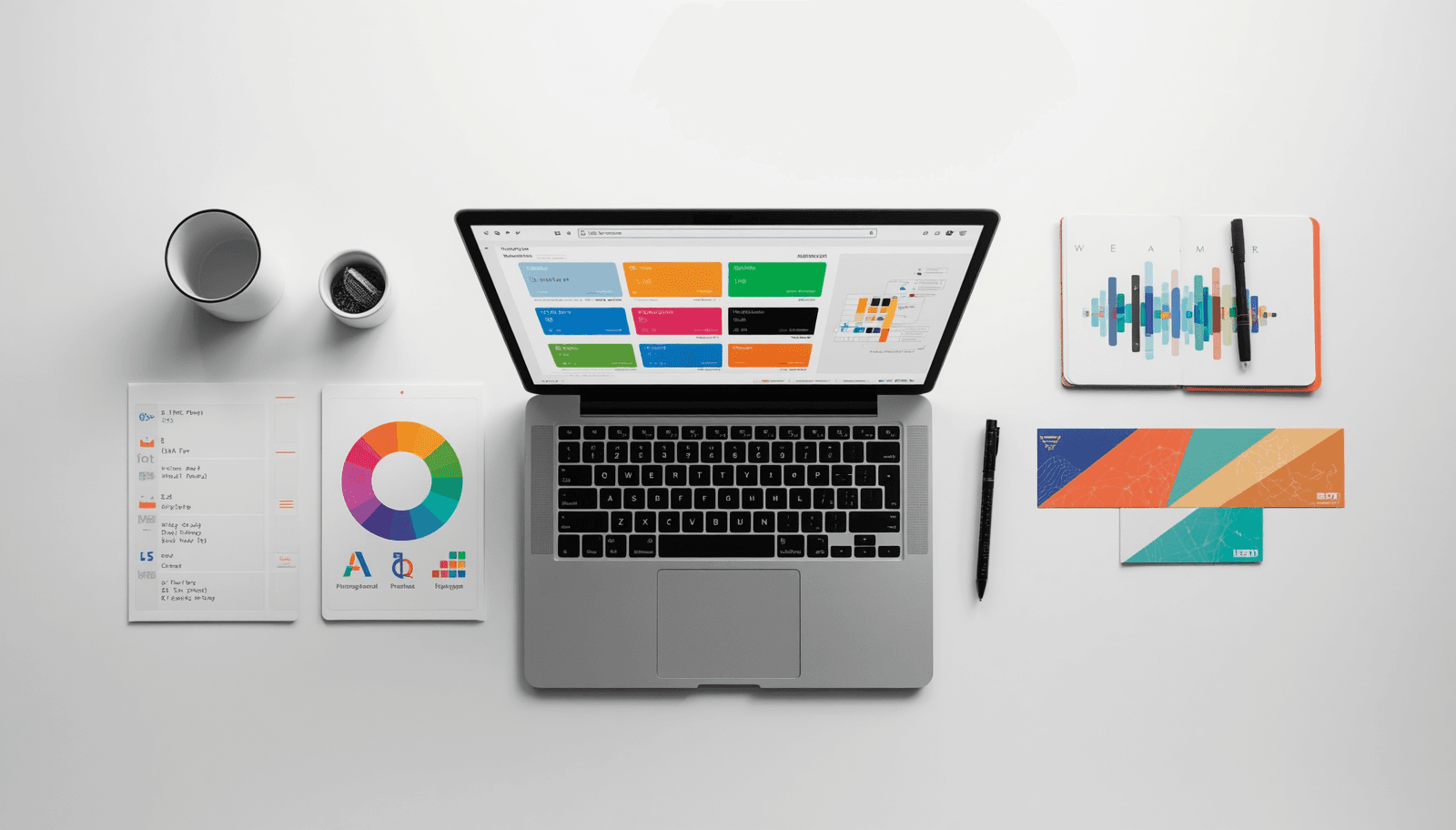
Coloraccy brings everything a designer needs for color work into a single, fast, browser-based toolkit. Whether you are generating palettes from scratch, extracting colors from an uploaded image, validating contrast ratios, or building a complete brand color system, Coloraccy handles it without asking you to create an account, pay a subscription, or download anything.
This post breaks down exactly what the platform offers, who it is for, and why it has become one of the more practical color tools available for designers in 2026.
What Is Coloraccy?
Coloraccy is a free, web-based color design platform built specifically for UI designers, web developers, brand designers, and anyone who works with digital color on a professional level. The core idea is simple: instead of jumping between a color picker here, a contrast checker there, and a palette generator somewhere else, Coloraccy puts the entire color workflow in one place.
The tool set covers:
Palette generation — create harmonious color combinations instantly, with support for complementary, analogous, triadic, and trending 2026 schemes
Color picker — live eyedropper preview with instant output in HEX, RGB, and HSL
Tints and shades generator — build a 12-step scale of lighter and darker variations from any base color
Format converter — instant HEX ↔ RGB ↔ HSL ↔ CMYK ↔ CSS conversion
Contrast checker — WCAG 2.2 AA/AAA validation with live 4.5:1+ ratio calculations
Image color extractor — upload any photo and pull out its dominant color palette
Gradient generator — create linear, radial, and conic CSS gradients with live preview
Brand color system builder — build semantic primary, secondary, and accent roles for complete design systems
Each tool is designed for real production use, not just exploration. The output includes ready-to-copy CSS variables, SCSS, JSON, and Tailwind config formats — which means the gap between design and development handoff shrinks considerably.
Why Color Decisions Matter More Than Most Designers Admit
Before getting into the specific tools, it is worth addressing why a dedicated color platform is worth your attention in the first place.
Color in design is not decorative. It is functional. Research in cognitive psychology consistently shows that color affects how users perceive urgency, trustworthiness, warmth, and hierarchy. A CTA button in the wrong shade can reduce conversion. A low-contrast text color is not just ugly — it actively excludes users with visual impairments, which is an accessibility and legal issue in many regions.
Yet most designers still handle color in a fragmented way: guessing in Figma, validating in a separate browser tab, converting formats manually, and building tint scales by hand. This is slow and error-prone.
Having a single, well-designed tool that covers the full color workflow changes the quality of decisions, not just the speed of making them. That is the premise behind Coloraccy.
A Closer Look at the Key Tools
Color Palette Generator
The palette generator is the centerpiece of the platform. Enter any base color — or let the tool generate one randomly — and you instantly receive a harmonious palette with HEX and RGB codes ready to copy.
What sets this apart from basic palette tools is the breadth of harmony types supported. You can generate:
Complementary — the classic high-contrast pairing using 180° opposites on the color wheel
Analogous — neighboring hues for a natural, cohesive look
Triadic and tetradic — multi-hue combinations that maintain visual balance
Trending 2026 combinations — curated palettes based on current design movements
Each generated palette comes with codes in every web format and can be exported for direct use in development. There is no friction between inspiration and implementation.
WCAG Contrast Checker
This is one of the most practically important tools on the platform, and it is easy to overlook until you have had a client or audit flag contrast issues in a finished product.
The WCAG (Web Content Accessibility Guidelines) defines specific contrast ratio requirements for text and UI elements. WCAG 2.2 requires a minimum ratio of 4.5:1 for normal text (AA standard) and 7:1 for AAA compliance.
Coloraccy's contrast checker validates in real time. You input your foreground and background colors, and immediately see whether you pass AA, AAA, or neither — along with the exact ratio. It also works across light and dark mode combinations, which is increasingly important as dark mode becomes the default preference for a large portion of users.
For any designer building products that need to be accessible — which, practically speaking, means every designer — this tool removes guesswork from a process that should not involve guesswork.
Tints and Shades Generator
Design systems need color scales, not single colors. A good primary color needs eight to twelve steps — from near-white tints for backgrounds to near-black shades for text — to function properly across a UI.
Building these scales by hand in Figma is tedious and inconsistent. Coloraccy generates a full 12-step tint and shade scale from any base color automatically. The output is visually balanced and immediately usable in tokens, SCSS variables, or Tailwind configurations.
This feature alone saves significant time for anyone building or maintaining a design system.
Image Color Extractor
The image extractor is particularly useful for brand work. Upload any photo — a product image, a mood board, a client's existing marketing material — and the tool identifies the dominant colors and generates a palette from them.
This is useful in several scenarios: reverse-engineering a competitor's color strategy, building a design direction from a client's photography, or finding unexpected combinations from reference imagery.
CSS Gradient Generator
CSS gradients are used constantly in modern web design, and writing gradient syntax by hand is genuinely annoying. The generator supports linear, radial, and conic gradients with a live preview. Adjust colors, direction, and stops, then copy the CSS output directly.
Who Should Be Using Coloraccy?
The platform is broadly useful, but it is particularly well-suited for:
Freelance web designers and UI designers who need a fast, capable toolkit without paying for multiple subscriptions. Coloraccy is free and requires no account to use the core tools.
Front-end developers who need accurate color format conversion and ready-to-use CSS output. The ability to copy Tailwind configs or CSS variables directly removes manual translation work.
Brand designers working on visual identity systems who need to build coherent, scalable color architectures — not just pick a few nice colors.
Accessibility-focused teams who need to validate contrast ratios before shipping. WCAG compliance is increasingly required, not optional.
How Coloraccy Compares to Other Color Tools
What Coloraccy adds is integration. Rather than being great at one thing, it covers the full workflow: generate, validate, extract, convert, and export — all in one place, all free, all without requiring a login.
For designers who find themselves maintaining four or five browser tabs just to handle color decisions during a project, this consolidation has real practical value.
Practical Tips for Getting the Most Out of Coloraccy
Start with a constraint, not a blank canvas. The most effective palettes usually start from a fixed point — a brand color, a hero image, or a specific mood. Use the image extractor or enter a known HEX code as your anchor, then generate variations around it.
Validate contrast early, not at the end. Accessibility issues discovered late in a project are expensive to fix. Build contrast checking into your early design decisions, not a pre-launch audit.
Use tint scales for your design tokens. If you are building a design system, generate a full 12-step scale for each of your core brand colors and use those values as your token foundation. This makes it much easier to maintain visual consistency as a product grows.
Export in the format your stack uses. If you are working with Tailwind, grab the Tailwind config output. If you are writing vanilla CSS, use the CSS variables format. Coloraccy generates for both — use the output that fits your workflow.
Final Thoughts
Color work in design is simultaneously one of the most creative and one of the most technical aspects of the job. Getting it right requires both intuition and precision — an eye for what feels right combined with objective validation that your choices are accessible, consistent, and production-ready.
Coloraccy is built for that reality. It is not a mood board tool or a color inspiration gallery. It is a working toolkit for designers who need to make accurate, defensible color decisions quickly.
If you have been managing your color workflow across multiple tools, it is worth spending fifteen minutes on Coloraccy to see how much of that can be consolidated. For most designers, the answer will be: most of it.
Related reading: WCAG 2.2 Accessibility Guidelines — the official documentation for web accessibility contrast requirements.