There is a moment in every designer's life when a color just stops them cold. Not because it is trendy. Not because an algorithm recommended it. But because it feels true — like the color already existed somewhere deep in memory, and they are only now recognizing it.
That is what the African palette does to people.
This is not a seasonal trend that will look dated by next spring. The African color palette is a visual language developed over thousands of years across the most culturally diverse continent on earth. It carries the weight of ceremony, the warmth of handmade craft, and the unmistakable confidence of a tradition that never needed outside validation to know its own beauty.
Think about the sun-baked terracottas of Marrakech at golden hour. The electric indigos hammered into Tuareg silver jewelry. The deep ochres of the Serengeti at dusk. The vivid turquoise tilework lining a Moroccan riad. These are not "inspired by" nature — they are nature, translated into pigment and dye and clay by human hands over generations.
Whether you are a graphic designer searching for a brand identity that actually means something, an interior stylist tired of the same greige everything, a fashion designer craving colors with genuine soul, or simply someone who wants their creative work to feel a little less like everyone else's, the African color palette is waiting for you.
At Coloraccy, we have spent years building one of the world's most thorough libraries of culturally grounded color collections. Our African palette selections draw directly from regional textile traditions, architectural heritage, and natural landscapes — and they are among the most-loved collections we have ever published. This guide walks you through what these colors are, where they come from, and exactly how to use them well.
What Actually Makes Up an African Palette?
This is where a lot of people get it wrong — and honestly, it is an easy mistake to make.
"African palette" is not a single set of five colors on a swatch card. Africa is the world's second-largest continent. It has 54 countries, over 3,000 ethnic groups, and ecosystems ranging from the Sahara Desert to equatorial rainforests to the temperate vineyards of the Cape. The visual traditions that have emerged from this extraordinary diversity are just as varied.
That said, there are color families that appear again and again across this tapestry — anchors that feel distinctly African regardless of region.
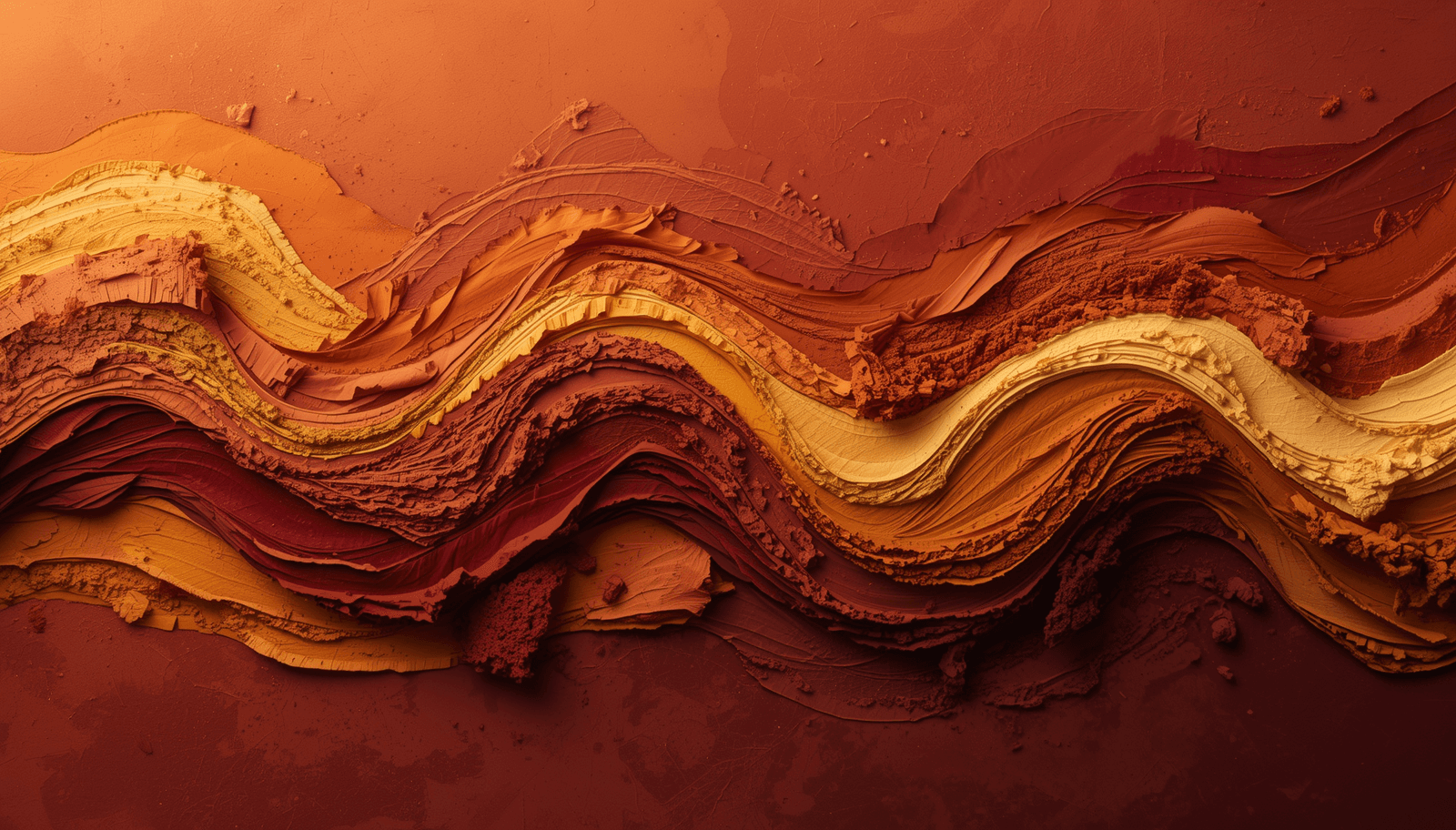
Earth Tones and Warm Neutrals
These are the colors most people instinctively associate with Africa, and for good reason. They are pulled directly from the physical world:
Terracotta and burnt sienna — the color of hand-thrown clay pots, of sun-dried mud bricks, of the famous red roads of West Africa
Deep ochre and golden yellow — the Saharan dunes at midday, the dry savannah grasses of the Serengeti
Raw umber and warm chocolate brown — the bark of an acacia tree, rich topsoil after rain
Sandstone and warm beige — the architecture of ancient Mali, the Sahelian landscape
What makes these tones different from generic "neutral" palettes is their warmth. There is nothing cool or clinical about them. They feel worn and loved and alive in a way that standard beige simply never does.
Bold, Saturated Accent Colors
This is where the palette becomes genuinely thrilling.
Layered over those earthy foundations are colors of remarkable intensity — colors that were traditionally used in ceremonial dress, woven into festival textiles, and hammered into precious metalwork:
Cobalt and electric blue — the glazed tilework of North Africa, Tuareg silver inlaid with lapis
Flame red and deep crimson — ceremonial cloth from Ethiopia, northern Nigerian embroidery
Emerald and deep forest green — Maasai beadwork, tropical canopy viewed from below
Vivid saffron and marigold orange — West African wax-print fabrics, kente cloth border stripes
These are not shy colors. They do not whisper. They are designed to be seen from a distance, to mark significance, to hold meaning. That same quality is what makes them so powerful in contemporary design when used with intention.
Deep, Dramatic Darks
The palette does not end at the warm and the bright. Rich darks provide contrast and depth:
Charcoal and dark espresso — carved ebony, blackened iron, dark teak
Deep aubergine and plum — the batik dyeing traditions of East and Central Africa
Midnight navy — the shadow side of Moroccan zellige tile, night sky over the Sahara
All three of these layers — earthy neutrals, saturated accents, and dramatic darks — work together to create palettes that have range, tension, and incredible visual richness.
You can explore the full spectrum through Coloraccy's African-inspired palette library, where every collection comes with professional hex, RGB, and CMYK values ready for immediate use.
Why Right Now? The Global Surge in African Palette Interest
The timing of this trend is not random, and calling it just a "trend" undersells what is actually happening.
People Are Exhausted by Sameness
Scroll through enough design portfolios, brand identities, and interior mood boards and you start to see the same colors everywhere. The same cool sage greens. The same blush pinks. The same warm greys. Designers and consumers alike have started actively looking for aesthetics that feel different — that carry some weight of real history and place rather than being generated by a committee.
The African palette answers that hunger directly. These colors come from somewhere real. They have a story. And people can feel that, even when they cannot always articulate it.
Afrofuturism Changed the Visual Conversation
Over the last several years, Afrofuturism — the cultural movement that fuses African heritage with visions of technological and speculative futures — has moved from niche artistic circles into the global mainstream. Major films, music releases, fashion houses, and design studios have all engaged with its visual vocabulary, bringing bold, layered African-inspired color combinations to audiences of millions. The effect has been lasting: people have seen these colors in exciting, contemporary contexts and they want more of them.
Biophilic Design Is Pointing Everyone in the Same Direction
One of the biggest shifts in interior and product design over the past decade has been toward biophilic aesthetics — designs that reconnect people to the natural world through organic materials, warm tones, and living textures. Terracotta walls. Rattan furniture. Handmade ceramics. Natural linen.
The African palette is, at its core, a palette derived from nature. It slots into biophilic design beautifully, offering warmth and earthiness without feeling derivative or staged.
Coloraccy's color palette tools make it easy to build, test, and export African-inspired combinations for any project — whether you are working in digital, print, interiors, or fashion.
How to Actually Use the African Palette in Your Work
Knowing which colors belong to the palette is one thing. Using them well is another. Here is how the palette behaves across different creative disciplines.
Interior Design and Architecture
The African palette is one of the most rewarding color systems to work with in interiors because it has natural hierarchy built in. The earthy neutrals want to be walls and floors. The saturated accents want to be textiles and ceramics. The darks want to be furniture and fixtures.
A few practical starting points:
Paint walls in terracotta or deep ochre to immediately shift the warmth of a room in a way that standard white or grey simply cannot achieve
Bring in cobalt blue or emerald green through cushions, throws, and rugs — the contrast against warm walls is striking without being jarring
Ground everything with dark espresso or charcoal furniture so the palette has weight as well as warmth
Layer in natural materials — woven rattan, carved wood, handmade ceramics — because the palette was built alongside these materials and they belong together
The result is an interior that feels genuinely curated rather than assembled from a standard mood board.
Graphic Design and Branding
For brand identity work, color is arguably the single most powerful tool available — and the African palette offers qualities that many modern brands desperately need: warmth, authenticity, cultural depth, and a sense of meaning that goes beyond the product itself.
Some combinations worth exploring:
Terracotta paired with warm cream works beautifully for wellness, skincare, or food brands that want to feel natural and trustworthy without leaning into clinical minimalism
Electric blue alongside deep ochre signals innovation and energy while remaining warm — a compelling direction for tech or creative agencies
Deep aubergine with saffron gold is a genuinely luxurious combination, rich without being cold in the way that standard luxury palettes (navy and gold, black and gold) often feel
Coloraccy's brand palette collections include a range of African-inspired combinations already optimized for digital screens and print applications.
Fashion and Textile Design
Fashion has been drawing from African textile traditions for decades — but often superficially. Designers who take the time to understand the specific traditions they are referencing produce work of a completely different quality.
The palette is central to some of the world's most sophisticated textile traditions:
Kente weaving in Ghana, where the precise combination of colors carries specific cultural and social meaning
Adire indigo resist-dyeing in Nigeria, where deep blues and near-blacks are used with extraordinary skill
Shweshwe printing in South Africa, where geometric patterns in indigo and white create graphic intensity
Ethiopian tilraz embroidery, where gold and crimson thread work together on deep grounds
Contemporary designers are using these traditions as starting points for seasonal collections that need warmth, storytelling, and a genuine point of view.
Digital and UI/UX Design
Digital design has been dominated for years by cool, clean, clinical color schemes — whites, light greys, cool blues. There is a reason for this (readability, professionalism, neutrality across cultures) but there is also a cost: a great deal of digital design feels cold and forgettable.
African-inspired tones offer a path toward warmer, more human digital experiences:
Earthy backgrounds with saturated accent colors create interfaces that feel approachable and confident simultaneously
The natural contrast ratios within the African palette — light sand against deep espresso, for example — work well for accessibility compliance while remaining visually interesting
For brands targeting global audiences, the palette signals cultural awareness and inclusivity in a way that standard Western-neutral palettes simply do not
How Color Changes Across Africa's Regions
One of the greatest pleasures of working with the African palette is discovering how dramatically the colors shift when you move from one region to another. This is not a monolithic aesthetic. It is a family of aesthetics with deep internal variety.
North Africa
The visual culture of Morocco, Tunisia, Algeria, and Egypt is shaped by centuries of Islamic geometric art, Berber weaving traditions, and proximity to the Mediterranean. The palette here is:
Deep indigo and cobalt blue (the famous blue streets of Chefchaouen; the glazed tilework of Fez)
Pure brilliant white alongside sandy cream and warm terracotta
Mosaic turquoise and cerulean in hand-cut zellige tile
Rose clay and dusty coral in the older parts of Marrakech
These colors are precise, geometric, and strikingly beautiful. Designers who have traveled to Morocco rarely come back unchanged.
West Africa
If North Africa tends toward precision and pattern, West Africa tends toward intensity and boldness. The textile traditions here — kente cloth, ankara wax-print fabrics, adire indigo dyeing — are among the most visually powerful in the world:
Bright gold, deep forest green, and flame red in kente weaving
Every conceivable combination of saturated color in wax-print fabrics
Graphic black-and-white contrast with vivid accent colors in many ceremonial dress traditions
East Africa
The Maasai people of Kenya and Tanzania have one of the most instantly recognizable color traditions on the continent — intense reds and crimsons combined with vivid cobalt blue, bright yellow, and deep green in elaborate beadwork patterns. The landscapes here — the Great Rift Valley, the savannah, the volcanic highlands — contribute their own palette of warm ochres, dusty sages, and deep burgundies.
Southern Africa
Ndebele mural painting from South Africa is genuinely unlike anything else in the world. The geometric precision, the unexpected color combinations, the sheer graphic confidence of these painted walls have influenced architects, typographers, and textile designers internationally:
Pure white grounds with bold geometric forms in red, yellow, black, and green
Bright turquoise and cerulean appearing as vivid accents against warm neutrals
Explore all four regional traditions directly through Coloraccy's regional African palette pages.
Mistakes That Undercut the Palette — And How to Avoid Them
Treating Africa as One Aesthetic
This is the most common and the most damaging mistake. Africa is not a country. It is not a single culture. Applying one earthy-toned color scheme to everything and calling it "African-inspired" is both creatively limiting and culturally lazy. The depth is in the specificity — take the time to research which tradition you are drawing from and why.
Saturating Everything Without a Neutral Anchor
The bold, saturated colors of the African palette are genuinely exciting. It is tempting to pile them all in. Resist that instinct. These colors were always used in dialogue with earthy, grounded neutrals. When you strip out the neutrals and use only the brights, you lose the tension that makes the palette work. Follow the 60-30-10 rule: sixty percent neutrals, thirty percent mid-tones, ten percent saturated accents.
Bypassing Cultural Context
If you are drawing inspiration from a specific ceremonial tradition, a particular weaving pattern, or a culturally significant color combination — do your homework. Understand what it means. Credit your sources. Better still, buy materials directly from African artisans and reference contemporary African designers doing extraordinary work in these traditions today.
Using Imprecise Color References
African palette colors were originally developed in organic pigments, mineral dyes, and natural clays. Their spectral properties are genuinely distinctive, and poorly calibrated digital representations often fail to capture their warmth. Coloraccy's professional palette tools provide lab-calibrated values across hex, RGB, and CMYK so that what you design on screen is what you actually get in print, paint, or fabric.
Five Things That Will Immediately Improve How You Use These Colors
Start with a single anchor and build out. Choose one color — your terracotta, your ochre, your deep espresso — and let everything else respond to it. Palettes that try to start from multiple equal anchors tend to feel scattered.
The 60-30-10 rule genuinely works. Sixty percent of your space or design should be the dominant neutral, thirty percent the secondary mid-tone, and ten percent the bold accent. This proportion is not arbitrary — it mirrors how these colors appear in their original cultural contexts.
Texture is part of the palette. You cannot fully separate these colors from the materials they come from. Rough-woven rattan, smoothed clay, hammered copper, hand-stitched fabric — these textures are what give the colors their life. Wherever possible, pair the palette with materials that carry genuine physical character.
Test physical swatches before committing. Screen rendering of warm, saturated tones varies considerably between devices and calibration standards. If you are working on an interior project, a print job, or a fashion piece, get physical swatches printed and tested in the actual lighting environment.
Use reference photography from the actual sources. Working from photographs of Moroccan riads, Ghanaian kente weavers, Maasai beadwork, or Ndebele murals will give you far more accurate and nuanced palette references than any digital mood board. Coloraccy's palette generator can extract precise color values directly from uploaded photographs.
Final Thoughts: These Colors Deserve to Be in Your Work
If you take one thing away from this guide, let it be this: the African palette is not an aesthetic choice you make to seem interesting. It is a color system with genuine depth, genuine history, and genuine emotional power — and when you use it well, people feel it.
The warmth in these colors comes from real soil and real sunlight. The boldness in the saturated accents comes from real traditions of ceremony and celebration. The sophistication of the combinations comes from real artisans refining their craft over generations. That realness is what separates these palettes from the algorithmically generated, trend-chasing color schemes that flood design feeds every season.
Whether you are building a brand, decorating a space, designing a collection, or simply looking for fresh creative direction, the African color palette offers something worth staying with. Not just for a season. For the long haul.
At Coloraccy, our African palette collections are built to serve serious creative work — with professionally calibrated color codes, regional breakdowns, and tools that make the palette genuinely usable rather than just inspirational.
Explore the full African palette collection at Coloraccy and find the exact colors that belong in your next project.