Ask any working web designer what their browser tab situation looks like mid-project, and you will hear a familiar answer: too many. A palette generator here. A contrast checker there. A format converter in another tab. A gradient tool somewhere else.
Color work in web design is genuinely multi-step. The problem is not that the tools are bad — it is that they are scattered. You pick a color in one place, validate it in another, convert it in a third, and somehow end up with a clipboard full of HEX codes you can no longer track.
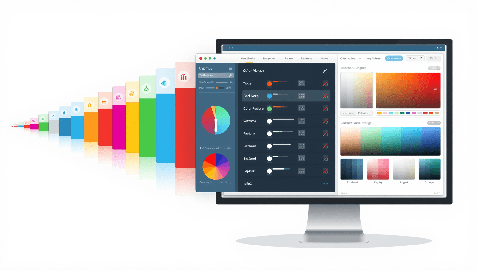
This post covers the 10 color tools that actually matter for professional design work in 2026, what each one does, and why Coloraccy has quietly become the most sensible place to access all of them without switching between a dozen browser tabs.
1. Color Palette Generator
What it does: Takes a base color (or generates one randomly) and produces a full harmonious palette — complementary, analogous, triadic, or trending combinations.
Why you need it: No one builds a UI with a single color. Every project needs a palette that holds together visually — primary, secondary, accent, neutral — and generating one from color theory principles saves hours of trial and error.
What to look for: HEX and RGB output, multiple harmony types, one-click copy, and trending palette suggestions based on current design directions.
Coloraccy's palette generator supports all of the above, including curated 2026 trending combinations, which is genuinely useful when a client asks for something that feels current.
2. WCAG Contrast Checker
What it does: Measures the contrast ratio between two colors and tells you whether they meet WCAG 2.2 AA (4.5:1) or AAA (7:1) standards for text and UI elements.
Why you need it: Accessibility is not optional anymore. Low contrast text fails audits, excludes users with visual impairments, and in some jurisdictions creates legal exposure. More practically, it just makes interfaces harder to read.
What to look for: Real-time ratio calculation, explicit AA/AAA pass/fail labels, and dark mode support — since many products now ship both light and dark themes.
This is one of the most underused tools in most designers' workflows. Building contrast validation into early decisions rather than a pre-launch audit saves significant rework. The WCAG official guidelines define the standards; Coloraccy validates against them live.
3. Tints and Shades Generator
What it does: Takes a single base color and generates a full scale — typically 10 to 12 steps — of progressively lighter tints and darker shades.
Why you need it: Design systems do not run on single colors. You need a full scale for every brand color: near-white for background fills, mid-tones for borders and secondary elements, deep shades for text and emphasis. Building these by hand is time-consuming and visually inconsistent.
What to look for: Even visual distribution across the scale, output as CSS variables or design tokens, and compatibility with frameworks like Tailwind.
A 12-step scale from Coloraccy is immediately exportable as Tailwind config or SCSS variables — which means the gap between your design file and the codebase stays narrow.
4. Color Format Converter
What it does: Converts any color value between HEX, RGB, HSL, CMYK, and CSS format instantly.
Why you need it: Different tools, platforms, and clients use different color formats. Figma uses HEX. CSS uses HSL or RGB. Print workflows use CMYK. Manually converting between formats is error-prone and slow.
What to look for: Support for all major formats, instant conversion on input, and clean copy output.
This sounds like a small convenience. It is not. Color format errors — a transposed digit, a rounding mistake — cause subtle inconsistencies that take time to diagnose. A reliable converter eliminates the problem entirely.
5. Image Color Extractor
What it does: Uploads a photo or image and extracts its dominant color palette — usually five to eight colors that represent the image's visual identity.
Why you need it: Brand work often starts from existing assets — a client's photography, a product image, a mood board. Extracting the palette from those reference images and building a design direction from them is far more grounded than starting from a blank canvas.
What to look for: Accurate dominant color detection, output in all standard formats, and enough color variety to build a functional palette from the result.
The image extractor on Coloraccy is also useful for reverse-engineering competitor color strategies or aligning a new digital presence with established physical brand materials.
6. CSS Gradient Generator
What it does: Builds linear, radial, and conic CSS gradients through a visual interface and outputs ready-to-use CSS code.
Why you need it: Gradients are used constantly in modern web design — hero backgrounds, button states, overlays, decorative elements. Writing gradient CSS by hand is syntactically tedious and hard to visualize without a preview.
What to look for: Live preview, support for all three gradient types, adjustable color stops, direction control, and clean CSS output.
The ability to copy gradient CSS directly into your stylesheet — without translating a visual decision into code manually — is a simple workflow improvement that adds up over time.
7. Complementary Color Finder
What it does: Identifies the 180° opposite of any color on the color wheel — its true complementary color.
Why you need it: Complementary pairs create strong visual contrast and are the foundation of many classic design compositions. CTA buttons often use the complementary of the dominant brand color to maximize visual pop without looking arbitrary.
What to look for: Interactive color wheel visualization, instant output in HEX and RGB, and clear visual comparison of the original and complementary colors.
Understanding where complementary colors sit in relation to your brand palette helps you make deliberate contrast decisions rather than guessing.
8. Color Picker with Live Preview
What it does: A precise eyedropper and color selection tool that generates HEX, RGB, and HSL values with a live preview of the selected color.
Why you need it: Sometimes you need to sample a color from a reference image or a design asset and get exact values. Sometimes you just need to explore a hue family with precision. A good color picker is a fundamental tool that every design workflow touches daily.
What to look for: Accurate eyedropper sampling, live preview of selected values, and instant output across all web formats.
9. Brand Color System Builder
What it does: Helps you build a structured, semantic color system — primary, secondary, accent, neutral — with proper naming conventions suitable for design tokens and developer handoff.
Why you need it: A collection of nice colors is not a color system. A real color system has semantic roles, scales, and naming structures that make it usable across a product without inconsistency. For any project beyond a single landing page, this level of structure is necessary.
What to look for: Token-ready output, semantic role assignment (primary, surface, on-surface, etc.), and export formats compatible with your design and development tools.
Coloraccy's brand system builder outputs in CSS variables, SCSS, JSON, and Tailwind config formats — covering the most common design-to-development handoff scenarios.
10. Random Color Generator
What it does: Generates random HEX and RGB colors, either completely random or within a constrained hue range.
Why you need it: This sounds like the least serious tool on the list, and in one sense it is. But random generation is genuinely useful for breaking creative blocks, exploring unexpected combinations, and discovering starting points you would never have reached through deliberate selection.
What to look for: Truly varied output (not just shades of the same mid-range blue), the ability to lock colors you want to keep while regenerating others, and clean format output.
Some of the most interesting design directions start from an accidental color that a random generator surfaced on the fifth click.
Why Use One Platform Instead of Ten Tools?
Each of the tools above is available somewhere online — often as a dedicated app or website built around that single function. So why does consolidation matter?
A few reasons:
Consistency. When you validate a color in the same tool where you generated it, you are working with the same color values throughout. Copying between tools introduces transcription errors.
Speed. The seconds spent switching tabs and re-entering values compound across a project. A workflow that keeps you in one place is a faster workflow.
Context. When palette generation, contrast checking, and tint scale generation are in the same interface, you make better decisions. Seeing a palette and immediately validating its contrast ratios in the same view changes how you think about color selection.
Coolors is excellent for fast palette generation. Adobe Color has strong harmony tools. But neither offers the full workflow — from palette creation through contrast validation through developer-ready export — that a complete color platform provides.
That is the gap Coloraccy fills. It is not trying to be the most visually elaborate color tool on the internet. It is trying to be the most complete and practical one for designers who work in production environments, not just inspiration sessions.
Getting Started
All ten tools described above are available for free at Coloraccy. No account required for core functionality. The interface is fast, browser-based, and works on both desktop and mobile.
If your current color workflow involves more than two tabs, it is worth spending ten minutes seeing how much of it can be consolidated in one place.