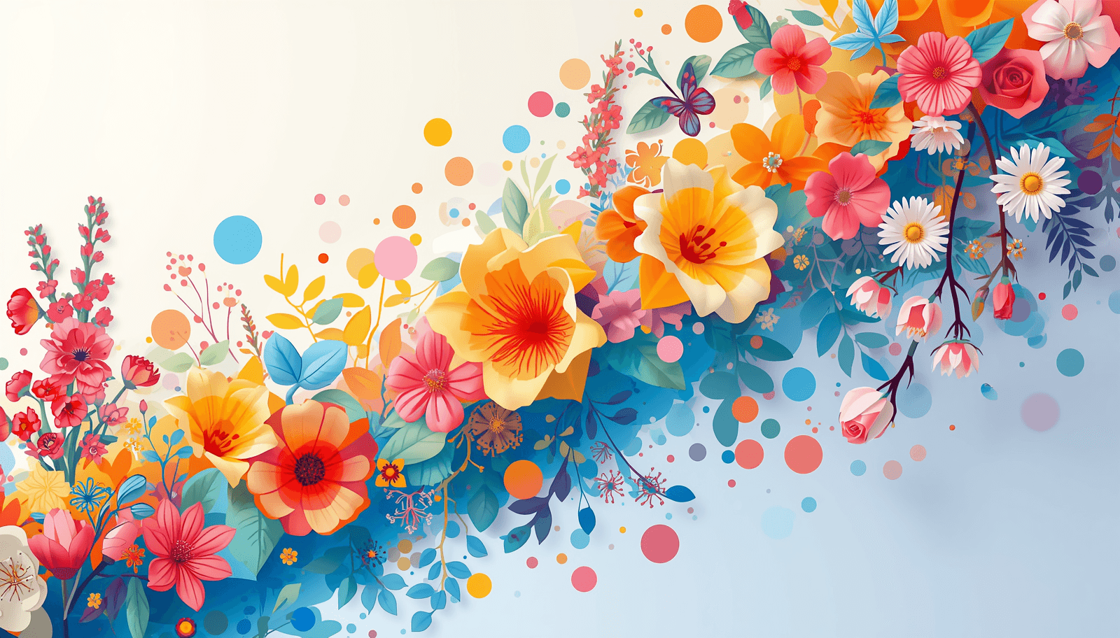
Spring is always a fresh start. Everything begins blooming; daylight returns; the design industry as a whole takes a deep breath after the heaviness of the winter season. However, spring of 2026 is more than just another change in seasons – it signifies an important pivot in the approach to using color in graphic design, branding, interior design, fashion, and digital UI/UX design.
Discussions on the upcoming Spring Color Palettes of 2026 are already in progress in design studios and creative agencies worldwide. What we see is a unique contrast between extreme saturated brights on one hand and softened, bleached-out mineral washes on the other hand. The designers who succeed this season know how to balance and even combine them at times.
In this guide, you will learn everything you need to know about color trends in 2026. It will be full of trend context, palettes, and application tips, but what sets us apart is that it includes our free online color picker tool by Coloraccy to make it easy for you to go from inspiration to action without extra effort.
What Defines a Spring Color Palette?
Before discussing the trends that will emerge in 2026, it would be useful to define the idea properly, particularly when using AI-assisted search engines or for designers who are forming their basic lexicon.
The definition of spring colors can therefore be understood as follows: these are hues that have been selected based on the imagery associated with the spring season, which includes colors like green from budding leaves, pink from blossoming trees, yellow from sunshine, and blue from clear skies. Common attributes in spring palettes include:
High luminosity: colors tend to be lighter and more reflective than winter or autumn tones
Low to moderate saturation: spring hues are often "pastel-adjacent," though 2026 is introducing more vivid exceptions
Natural inspiration: florals, foliage, soil, water, and sky all anchor the spring palette tradition
Emotional warmth: spring colors are psychologically associated with hope, renewal, energy, and optimism
Understanding these principles allows designers to evaluate any palette — whether trending or self-built — against the standard of seasonal coherence.
The Dominant Spring Color Palette Trends Shaping 2026
1. Botanical Softness: Greens Reclaim the Spotlight
Green is definitely the definitive color of spring 2026. However, this is not the dark green color that characterized winter designs. In this case, the predominant green colors are light, more yellowish, and nearly translucent.
Key shades:
Pistachio — a warm, creamy yellow-green that pairs with everything
Fern mist — a pale, slightly grey-green with strong interior and branding applications
Celery — clean, slightly saturated, and extremely versatile in digital UI
The use of these plant-based greens is especially effective in branding for wellness, food, and lifestyle brands. They can be used brilliantly in websites and apps as backgrounds that are contemporary yet warm.
Palette pairing: Pistachio + warm ivory + terracotta + dusty blush
2. Bleached Brights: Washed-Out Versions of Bold Colors
Among the most fascinating trends within color direction in the Spring 2026 season, one can point to the advent of bleached brights, referring to vibrant colors that have been muted and washed out to create the effect of wear or being exposed to sunlight.
The development of this trend has roots in the culture's general nostalgic appreciation of the analog aesthetic, which involves film photography, fabrics of old vintage clothing, and faded print material. It presents an excellent opportunity for designers to make use of colors such as red and orange without creating aggressive compositions.
Key shades:
Washed coral — between peach and orange, soft and photogenic
Powder cerulean — a pale, hazy blue with enormous versatility
Dusk lavender — a muted purple that reads as both feminine and sophisticated
Palette pairing: Washed coral + powder cerulean + warm sand + soft white
3. Earthy Spring: Terra Meets Bloom
Not all designers are turning towards soft and pastel shades. The space left behind by spring's florals in the trend forecast of 2026 is largely dominated by combinations of palettes that establish spring flowers' energy using warm, earthly tones as a base. The color scheme combines the natural charm of terracotta, ochre, and clay with floral shades such as blush, peachy, and gold hues.
The palette is highly suitable for use by fashion designers, artisan product labels, weddings, and editorial illustrations.
Key shades:
Raw clay — a warm, peachy brown with significant texture in print
Dusty ochre — a softer, greyed-down version of mustard yellow
Petal blush — a pink so light it almost reads as white in certain lighting
Palette pairing: Raw clay + dusty ochre + petal blush + sage
4. Digital Optimism: Clean Brights for Screens
Spring 2026 color combinations do not always have to be soft. There is another trend that goes hand-in-hand – more prevalent in product designs for digital platforms, social media marketing campaigns, and youth-targeted promotions – using highly contrasting and deliberate bright colors.
It is not the wild maximalism that was popular a couple of years back. The Spring 2026 optimistic digital trend is deliberate and purposeful: two or three bright hues paired with plenty of negative space and sharp black lettering. Imagine Swiss design sensibilities applied to the vibrant color palette of spring.
Key shades:
Electric lime — a highly visible yellow-green with strong accent potential
Warm poppy — a clean red-orange that avoids both the aggression of pure red and the playfulness of classic orange
Bright sky — a clear, unmuddied blue that reads confidently on screens
Palette pairing: Electric lime + bright sky + clean white + charcoal type
How to Apply Spring 2026 Color Palettes Across Design Disciplines
Learning about the trends is just the first step. The next important step is learning how to convert those palette ideas into practical designs. Here is how the Top Color Palettes of Spring 2026 apply in various industries.
Graphic Design and Branding
For brand identity design, it is recommended to use the spring palette where only one shade takes on the primary branding task while others complement it through photography layers, background washes, icons, and typography highlights.
Botanical green is especially effective for brands that seek to rebrand themselves under the themes of sustainability, wellness, or natural materials. The earthy spring palette is ideal for artisan and heritage branding. Digital optimism palettes are perfect for tech, fintech, and DTC brands that target younger audiences.
Web and UI/UX Design
The color schemes for Spring 2026 provide a much-needed respite from the years spent in the darkness of digital interfaces. These colors are being used to create:
Primary button and CTA colors (warm poppy, electric lime)
Background gradients (pistachio to ivory, powder cerulean to white)
Illustration and icon systems (full earthy spring palette)
Hover states and micro-interactions (bleached brights as accent layers)
Accessibility remains a critical consideration. Always test spring palette combinations against WCAG 2.1 contrast requirements, particularly when using light pastels for body text or UI labels.
Social Media and Content Design
When it comes to designing new visual elements and creating unique series of content, spring 2026 color schemes are a great chance for the content creator. The best way of doing that is by keeping the palette consistent throughout the series and utilizing just two or three colors.
As far as the bleached brights and botanical greens go, these hues fit perfectly into Instagram and Pinterest environments and perform better than harsh contrasting colors.
Fashion and Textile Design
Fashion designers and fabric and textiles artists would find the earthiness and botanics directions more relevant for them. Colors on the computer screen do not react the same as fabric colors; the luminescent colors of spring could be translated in dyes as complex and rich in texture.
Practical Tips for Building Your Own Spring 2026 Color Palette
Even with trend knowledge firmly in hand, building a palette from scratch requires method. These principles will serve any designer regardless of experience level.
Start with a dominant neutral. Color schemes are anchored by their bases, which generally include warm ivory, sand, or grey tones. In Spring 2026, neutral tones will tend to be warmer, consisting of whites tinged with peach or yellow hues rather than cold grey whites.
Choose one hero color. Before adding any complexity to your palette, determine which single color needs to be more dominant than others and make it visually prominent. This is the color your audience will look at again and again.
Use the 60-30-10 rule. Allocate 60% of the visual space to your neutral hue, 30% to the supporting color, and 10% to the accent hue. The classic rule will help you create a visual hierarchy effortlessly, working equally well for spring color schemes as for any other type.
Test in context before committing. While a color scheme may appear balanced on a sample card, it may either dominate the design or simply not be visible at all when applied within the design setting. Never fail to test your color scheme within the actual design environment first.
Explore and build palettes on Coloraccy. The Coloraccy Spring Color Palette tool allows you to browse curated 2026-ready palettes, customize individual shades, and export complete color systems for immediate use in your design workflow. You can also explore the full seasonal color palette library to compare spring directions against summer, autumn, and winter collections.
Common Mistakes Designers Make With Spring Color Palettes
Even experienced designers fall into predictable traps when working with spring colors. Awareness of these patterns prevents costly revisions.
Over-relying on pastels. Spring need not be only delicate in nature. The use of pastel colors alone will yield color schemes lacking in contrast, which are likely to fall short when put into practice. All spring color schemes need to have one grounded color present.
Ignoring warm-cool balance. Spring palettes often err too warm or too cool without achieving the season's characteristic freshness. Truly compelling spring combinations typically mix warm and cool tones deliberately — a warm peach with a cool mint, or a warm golden yellow with a cool powder blue.
Copying trends without considering context. A fashion trend palette may be completely inappropriate for a financial technology application or an educational product aimed at children. Consider the appropriateness of a trend within the context of the project or brand before applying it seasonally.
Neglecting color accessibility. Color schemes featuring light colors in spring tend to be particularly vulnerable to contrast problems. Text with poor contrast against pastel backgrounds is among the most frequent accessibility issues found in design. Always test color schemes early in your design process.
Using too many colors. The beauty of many colors in spring often tempts a designer to choose palettes that have six, seven, or even eight colors in them. This usually leads to visual clutter. Limiting one’s color palette to three to five colors will definitely ensure professionalism.
Spring 2026 Color Palettes by Use Case
To make this guide as practical as possible, here are five ready-to-use palette directions with specific use-case recommendations:
Wellness Brand Identity: Fern mist + warm ivory + soft clay + pistachio accent
Tech Product Landing Page: Bright sky + clean white + charcoal + electric lime
CTA Wedding Stationery Suite: Petal blush + sage + dusty gold + cream Social
Media Content Series: Washed coral + powder cerulean + warm sand Editorial
Illustration: Raw clay + dusty ochre + botanical green + deep ink
Conclusion: Build Your 2026 Spring Palette with Intention
Spring 2026 is an interesting season of design colors, with its diversity and range that make it one of the most exciting seasons ever in terms of the choice of colors.
And the key point that all professional designers should remember here is as follows: the best Spring Color Palette is not just the list of hot shades. Instead, it is always an effective color system designed with the help of proven color theory principles like harmony, contrast, hierarchy, and context.
This is what Coloraccy can give designers from around the world right now. The palette generator, season collections, and color systems ready for export will make this process simple and quick.
No matter whether you are working on the brand redesigning, a new app, a seasonal advertising campaign or even trying to enhance your skills in choosing the right colors, you are to find some interesting shades in Spring 2026 palettes.
Explore the full Spring 2026 Color Palette collection at Coloraccy— free to use, built for designers, and ready for your next project.