Every designer has made a color mistake they could not unsee. You finish a layout, step back, and realize that something about the color combination is actively working against you — the text is hard to read, the palette feels aggressive, or two colors are fighting each other so loudly that nothing else in the design registers.
Bad color combinations are not always obvious in the selection stage. Some look fine as swatches and only reveal their problems at scale, in context, or against each other. Others are so commonly misused that they have become shorthand for certain kinds of design failures.
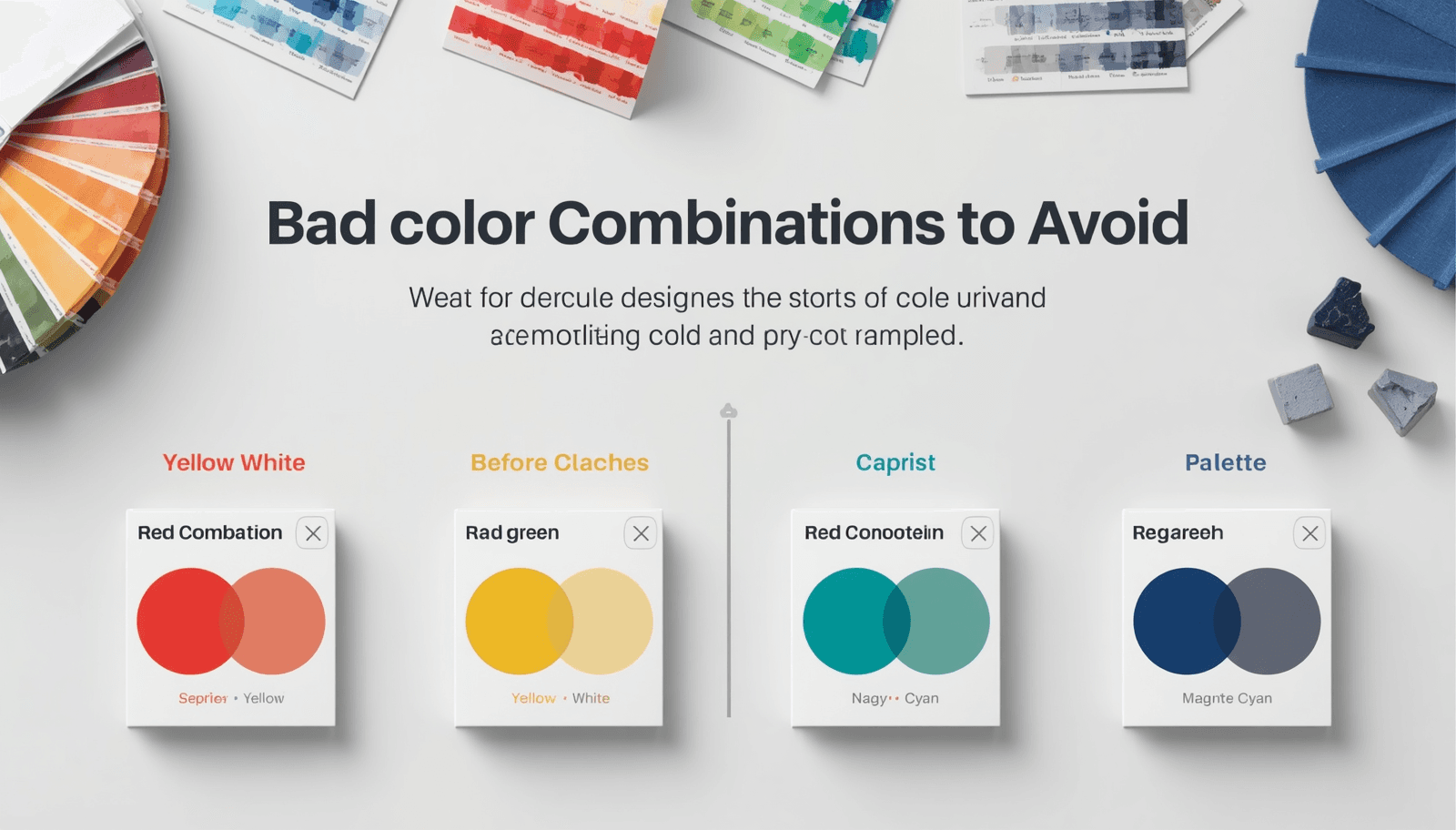
This list covers twenty of the most problematic color clash examples — not to shame anyone who has used them, but to explain precisely why they fail and what the underlying problem is.
Why Color Combinations Fail
Before the list, a brief framework. Color combinations fail for one of a small number of reasons, and most entries below will trace back to one of these:
Simultaneous contrast. When two colors are placed adjacent to each other, each affects how the other is perceived. Colors of similar saturation but opposing hues create a visual vibration at their edges that is physically uncomfortable to look at.
Insufficient value contrast. Two colors at similar lightness values — regardless of their hues — create combinations where text becomes unreadable and hierarchy collapses.
Temperature conflict. Warm and cool colors can coexist beautifully, but certain pairings — particularly highly saturated warm and cool colors at similar values — create a visual tension that reads as unintentional.
Semantic conflict. Some color combinations carry cultural or contextual associations so strong that they override any aesthetic intention — combinations that trigger warning associations, nationalistic readings, or brand confusion in unintended contexts.
1. Pure Red on Pure Blue
The problem: These two fully saturated primaries at similar lightness values create severe simultaneous contrast. The edges between red and blue areas appear to vibrate — a phenomenon called chromostereopsis, where the brain attempts to process the two wavelengths at different depths. Extended exposure is genuinely uncomfortable.
Use instead: Desaturate one or both colors, or introduce significant value contrast. A deep navy with a muted coral sits in similar hue territory without the visual aggression.
2. Neon Green on White
The problem: Neon green — particularly the yellow-greens like #00FF00 — has a luminosity that makes it look like it is glowing on a white background. This is not a contrast failure; it is a contrast excess. The combination is visually jarring and actively difficult to focus on.
Use instead: A deeper, more muted green on white. Or neon green on a dark background, where its luminosity becomes an asset rather than a problem.
3. Yellow Text on White
The problem: This is one of the most common bad color combos in web design. Yellow and white sit very close in perceived lightness — even saturated yellows fail the WCAG contrast requirements against white backgrounds badly, often producing ratios below 2:1. The text effectively disappears.
Use instead: Yellow works beautifully as a background color with dark text on top. Never as text on a light background. The color format converter on Coloraccy makes it easy to check contrast ratios quickly before committing to a text color.
4. Red Text on Green Background (or Vice Versa)
The problem: Beyond the Christmas decoration association that makes this combination contextually loaded, red-green is the most common form of color vision deficiency. Approximately 8% of men have some degree of red-green color blindness, making this pairing functionally inaccessible for a significant portion of users.
Use instead: If you need both red and green in a palette, ensure they differ significantly in lightness value, and never use them as text-on-background pairs.
5. Brown on Gray
The problem: Brown and gray are both low-saturation neutrals, which means they sit uncomfortably close in both value and saturation without actually harmonizing.
Use instead: Choose a direction. Warm neutrals (brown-adjacent tones — taupe, camel, warm beige) paired together feel cohesive. Cool neutrals (gray family) paired together feel cohesive. Mixing them without a clear purpose creates visual ambiguity.
6. Hot Pink on Orange
The problem: Two highly saturated warm colors at similar values create a combination that reads as visually overwhelming — and worse, slightly aggressive. There is no breathing room, no neutral space, and the colors compete rather than cooperate.
Use instead: If both hues are essential, desaturate one significantly and use it as a background rather than an equal-weight pairing with the other.
7. Light Gray Text on White
The problem: This is perhaps the most widespread accessibility failure in modern web design. Light gray text on white backgrounds looks elegant in design mockups on calibrated, high-resolution monitors. On consumer devices, in sunlight, or for users with any degree of vision impairment, it becomes genuinely difficult to read. Common at-fault combinations like #AAAAAA on #FFFFFF produce contrast ratios around 2.3:1 — dramatically below the WCAG AA minimum of 4.5:1.
Use instead: Body text should be dark enough to achieve at least 4.5:1 against its background. The threshold value on a pure white background is approximately #767676 for AA compliance — anything lighter than this fails.
8. Cyan on White
The problem: Cyan — particularly in its fully saturated form — has a luminosity problem similar to neon green. On white, it appears washed out and lacks visual weight. It also reads as a default browser link color in many contexts, creating unintended interactive associations.
Use instead: Deep teal or dark cyan on white, where the increased darkness provides genuine contrast. Or cyan on a very dark background where its brightness becomes legible.
9. Purple on Dark Blue
The problem: Purple and dark blue sit close enough in hue that their combination creates muddiness rather than contrast. On the wrong monitor calibration, the two colors can appear almost identical.
Use instead: Pair purple with warm neutrals, creams, or near-whites for maximum legibility. If blue is needed in the same palette, ensure significant value differentiation — a pale blue with a deep purple, rather than two mid-dark variants of similar hues.
10. Olive Green on Brown
The problem: Similar to brown on gray, olive green and brown are both desaturated warm tones at similar lightness values. The combination feels muddy and dated — like camouflage without intention. Neither color clarifies the other, and the combination lacks any focal point.
Use instead: Olive green paired with cream or warm white, where the contrast gives the olive room to be interesting. Or brown anchored by a much lighter or darker partner.
11. Bright Red on Black
The problem: This is not always a failure — used selectively, red on black is dramatic and effective. The problem arises at scale, particularly for body text. Extended reading in red text on a black background produces significant eye fatigue due to the extreme contrast and the high energy of the red wavelength.
Use instead: For headline impact, brief and sparing. For anything longer than a few words, consider a different color for the text or reduce the saturation of the red.
12. Fluorescent Yellow-Green on Light Yellow
The problem: Two highly similar, high-luminosity colors at nearly identical lightness values. The text disappears, the eye cannot distinguish the contrast edge, and the overall effect is a visual blur. This is one of the most extreme readability failures possible.
Use instead: Dark text on yellow, or fluorescent green on a dark background. Never two highly luminous colors against each other.
13. Teal and Purple (Equally Saturated)
The problem: Teal and purple can work beautifully together — they appear in many well-regarded palettes. The failure occurs when both are at full or near-full saturation. At equal saturation, they compete for dominance and create the simultaneous contrast vibration effect. The combination looks unbalanced and slightly garish.
Use instead: Mute one significantly. Deep, desaturated teal with a vivid purple, or muted sage-teal with a rich plum — the value and saturation contrast between the two is what makes the pairing work. The complementary color finder on Coloraccy helps identify balanced saturation relationships between non-analogous hues.
14. Dark Red on Dark Green
The problem: Both colors are dark, both are deeply saturated, and for users with red-green color blindness, they may be effectively indistinguishable. Beyond accessibility, the combination simply lacks contrast — two heavy, saturated colors sit at similar values and neither brings lightness or structure to a layout.
Use instead: If this pairing is necessary — say, for data visualization where both colors need to appear — ensure significant value differentiation, and always supplement with labels, patterns, or other non-color distinguishers.
15. Baby Blue on Pale Pink (Equal Value)
The problem: Two pastel colors at nearly identical lightness values create a combination with almost no contrast. Both colors are soft, both are light, and placed together, they create a palette that, while not unpleasant, is functionally unusable for anything requiring hierarchy or legibility. It is the color equivalent of whispering everything at the same volume.
Use instead: Pair one pastel with a much deeper tone from the same palette to anchor the combination. A pale blush pink paired with a deep berry creates a structure that two equal-value pastels cannot.
16. Neon Orange on Red
The problem: Two warm, high-saturation colors at similar values create extreme visual noise. This combination is used intentionally in certain sports and entertainment branding contexts for maximum impact — but even there, it is applied briefly and at a large scale where legibility is not required.
Use instead: Bring one tone down significantly in saturation, or introduce a neutral between them as a separating space.
17. White Text on Yellow
The problem: Like yellow text on white, this is a contrast failure — just in the opposite direction. Yellow is highly luminous, and white text on a yellow background produces a very low contrast ratio. Yellow backgrounds demand dark text, not light text.
Use instead: Dark brown, deep navy, or near-black text on yellow. The contrast is dramatic and striking, and it is one of the more effective high-visibility combinations when used correctly.
18. Magenta on Cyan
The problem: Magenta and cyan are complementary in the RGB color model — theoretically a harmonious pairing. In practice, at full saturation, they produce the same chromostereopsis vibration effect as red on blue, and the combination reads as visually chaotic. Both colors have a synthetic, screen-like quality that makes the combination feel digital in an unintentional and dated way.
19. Multiple Fully Saturated Colors Together
The problem: This is not a specific two-color pairing but a systemic failure — using three, four, or five fully saturated colors in the same composition. Each individual color may be perfectly fine. Together, they compete for attention simultaneously, and the result is a palette that exhausts the viewer rather than engaging them.
Use instead: Allow only one color to be at full saturation. Everything else should be desaturated, darkened, or lightened to support that single dominant hue rather than compete with it. Building well-structured palettes starts with browsing how professionals balance saturation — the color palette library on Coloraccy demonstrates this balance across hundreds of curated combinations.
20. Dark Navy on Black
The problem: Navy and black are both dark, and at screen resolution they often become indistinguishable — particularly on non-calibrated monitors and mobile devices. Any design element that needs to stand out from a black background will fail if the color used is dark navy. This is the inverse of the light gray on white problem, and it is equally common in dark mode design gone wrong.
Use instead: For dark interfaces, ensure your structural colors are at least two or three clear steps lighter than your darkest background value. What looks clearly distinguishable on your design monitor may merge completely on a consumer phone screen.
Patterns to Watch For in Your Own Work
Reading through twenty specific failures, a few patterns emerge that are worth keeping as mental checkpoints:
Equal value, different hue — the most common source of readability failures. Any time two colors of similar lightness sit adjacent to each other, check whether sufficient contrast exists.
Equal saturation, complementary hues — the source of most simultaneous contrast vibration. When combining complementary colors, vary their saturation significantly.
Cultural and semantic loading — some color combinations carry meanings that override aesthetic intention. Red-green as a pairing, red text as a general choice, and high-saturation warning palettes in non-warning contexts all create unintended communication.
Building Combinations That Work
Knowing what to avoid is half the work. The other half is building combinations that do work — and the most reliable path to that is starting with well-structured, professionally curated palettes rather than constructing everything from first principles.
Coloraccy's palette showcase and academic palette collection offer curated starting points where the saturation relationships, value contrast, and tonal balance have already been considered. From those starting points, the brand color kit helps you document and present finalized combinations in a format that is easy to share with clients and teams.
Conclusion
Every combination on this list has a specific, articulable reason for failing — and that specificity is what makes it useful. Understanding why red on blue vibrates, why yellow text disappears on white, and why equal-saturation complementaries create chaos gives you a diagnostic framework, not just a list of things to avoid.
Coloraccy provides the tools to select, test, and refine color combinations at every stage of the process.