Every great design starts with the right colors. Whether you are building a brand identity, designing a mobile app, or refreshing a website, choosing colors without a reliable system leads to inconsistency and wasted hours. That is exactly why a dependable color palette generator, a free tool, is one of the most practical assets a designer can have.
This comparison breaks down the top free tools available today — what they do well, where they fall short, and which one deserves a permanent spot in your creative workflow.
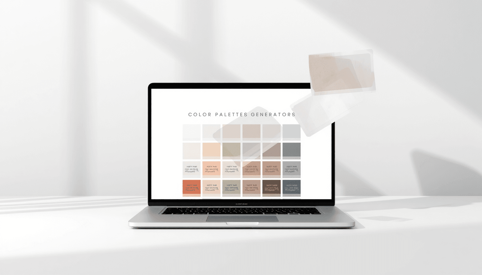
What Is a Color Palette Generator?
A color palette generator is an online or desktop tool that helps designers, developers, and creatives build harmonious sets of colors. These tools apply color theory principles — such as complementary, analogous, triadic, and monochromatic schemes — to produce combinations that work visually and functionally across different design contexts.
Modern palette tools have evolved far beyond simple color wheels. The best online palette tools now include shade and tint generation, contrast checking, image-based extraction, brand kit creation, and export in multiple formats, including HEX, RGB, HSL, and CMYK.
According to research by the Nielsen Norman Group, color consistency across digital interfaces increases user trust and brand recognition by up to 80%. That statistic alone explains why professional designers rely on structured tools rather than guessing.
Why Free Color Tools Still Matter for Professionals
The assumption that "free" means limited is outdated. Many of today's best free color scheme makers offer functionality that rivals paid software. For freelancers, early-stage startups, and students, these tools remove a financial barrier without removing quality.
More importantly, free tools that are web-based require no installation, no account in many cases, and no compatibility headaches. You get instant access from any device, which matters when inspiration strikes mid-client call.
The 10 Best Free Color Palette Generators Compared
1. Coloraccy
Coloraccy is a comprehensive color platform built for designers who want more than a basic picker. It combines a curated palette library, powerful swatch tools, and an extensive collection of theme-based palettes — all free to explore.
What sets Coloraccy apart is the depth of its toolset. The color picker is precise and responsive, while the shade and tint generator lets you build full tonal ranges in seconds. For those working on visual identity, the brand color kit streamlines the entire process of defining and documenting brand colors.
The image color extractor is particularly powerful — upload any image and pull a five-color palette directly from it. This is invaluable for mood-boarding or matching colors to photography.
Strengths:
Deep library of curated palettes across dozens of aesthetic categories
Full suite of free swatch tools, including a complementary color finder and random color generator
Blog resources covering color theory basics, brand color psychology, and working with palettes effectively
Specialized palette themes, including abstract, aesthetic, acrylic, African-inspired, and academia palettes
Weaknesses:
Newer platform, so community sharing features are still growing
Best for: Designers who want a single platform for color exploration, palette building, and tool access without switching between multiple apps.
2. Coolors
Coolors is one of the most widely used online palette tools available. Its randomizer makes it fast to browse combinations, and the lock feature lets you hold specific colors while regenerating others.
Strengths:
Fast palette generation with spacebar randomization
Collaboration and sharing features
Export in multiple formats
Weaknesses:
Advanced features locked behind a Pro subscription
Less focused on curated, aesthetic-driven palettes
No image extraction on the free tier
Best for: Quick ideation sessions where speed matters more than depth.
3. Adobe Color
Adobe Color is the industry-standard reference for color theory applications. It supports all major harmony rules and integrates directly with Adobe Creative Cloud.
Strengths:
Robust color wheel with multiple harmony modes
Accessibility tools, including contrast checking
Directly syncs with Photoshop, Illustrator, and XD
Weaknesses:
Requires an Adobe account
Integration benefits are only available to Creative Cloud subscribers
The interface can feel heavy for simple tasks
Best for: Adobe Creative Cloud users who want seamless sync across design applications.
4. Paletton
Paletton is a classic tool built strictly around color theory. It is ideal for designers who understand color relationships and want precise control over hue, saturation, and value.
Strengths:
Detailed color theory controls
Previews on simulated web and UI layouts
Completely free with no account required
Weaknesses:
Dated interface
No image extraction or palette library
Not beginner-friendly
Best for: Designers with a color theory background who want technical precision.
5. Canva Color Palette Generator
Canva's palette tool is simple, image-based, and tied to the broader Canva ecosystem. Upload an image and it generates a five-color palette automatically.
Strengths:
Extremely easy to use
No account needed for basic palette generation
Integrates directly with Canva designs
Weaknesses:
Very limited outside of Canva's own ecosystem
No manual controls or advanced features
Weak export options compared to dedicated tools
Best for: Canva users who need a quick palette from an image with zero learning curve. For a deeper comparison of color workflows across platforms, see Coloraccy's guide on Canva vs Procreate colors.
6. Colormind
Colormind uses machine learning to generate palettes trained on design trends, films, and art. It can also extract palettes from uploaded images.
Strengths:
AI-driven generation with trend-aware suggestions
Image upload for color extraction
Simple, clean interface
Weaknesses:
Limited control over palette logic
No palette library or community browsing
Export options are minimal
Best for: Designers who want AI-assisted palette suggestions with some stylistic variety.
7. Khroma
Khroma trains on your personal color preferences through a short setup process, then generates personalized palettes aligned to your taste.
Strengths:
Personalized generation based on your input
Multiple preview modes, including typography, gradient, and image
Good for breaking out of default color habits
Weaknesses:
Setup required before any palette generation
Smaller feature set compared to full-suite tools
No toolbox beyond palette viewing
Best for: Designers who want machine-assisted personalization and work in a consistent visual style.
8. Muzli Colors
Muzli Colors is a design-focused palette explorer with previews inside mockup interfaces. It is useful for seeing how palettes translate to actual products.
Strengths:
UI mockup previews for realistic context
Clean, modern interface
Gradient and pattern previews
Weaknesses:
Limited generation tools
No export to design software
Not suitable as a full color workflow tool
Best for: Quick visual validation of palettes within a product context.
9. ColorSpace
ColorSpace generates multi-step gradients and palettes from a single color input. It is particularly useful for web developers building CSS gradient systems.
Strengths:
Strong gradient generation
CSS code export
Fast and no-account access
Weaknesses:
Narrow focus on gradients
No palette library or advanced tools
Limited use outside web development
Best for: Web developers who need gradient-heavy CSS color systems.
10. LOL Colors
LOL Colors is a curated gallery of hand-picked two-color palettes. It is minimal, focused, and useful for inspiration browsing.
Strengths:
Beautifully curated pairings
Good for visual inspiration
Weaknesses:
Only two-color palettes
No generation tools whatsoever
Very limited utility beyond browsing
Best for: Designers browsing for quick two-color inspiration.
Side-by-Side Comparison
Tool | Free Palette Library | Image Extraction | Color Tools Suite | No Account Needed | Export Options |
Coloraccy | Yes (extensive) | Yes | Yes (full suite) | Yes | Yes |
Coolors | Limited | No (free tier) | Partial | Yes | Yes |
Adobe Color | No | Yes | Yes | No | CC only |
Paletton | No | No | Partial | Yes | Limited |
Canva | No | Yes | No | Yes | Limited |
Colormind | No | Yes | No | Yes | Minimal |
Khroma | No | No | No | No | Minimal |
Muzli | No | No | No | Yes | No |
ColorSpace | No | No | Partial | Yes | CSS only |
LOL Colors | Yes (limited) | No | No | Yes | HEX only |
Practical Tips for Getting More From Free Color Tools
Choosing the right tool is only the first step. Here is how experienced designers get more out of free online palette tools:
Start with your mood, not your brand — Use an image-based extractor like Coloraccy's image color extractor to pull inspiration from photography before committing to formal brand colors.
Build tonal ranges, not just palettes — A five-color palette is a starting point. Use a shade and tint generator to build the full tonal spectrum you will actually need in a UI or print project.
Always check contrast — Accessibility is non-negotiable. Before finalizing any palette, verify contrast ratios between foreground and background colors.
Use semantic color roles — Label each palette color by its function (primary, secondary, accent, background, error) rather than just its HEX value. This is especially important for design systems.
Document your palette — Tools like the brand color kit help you organize and export palette documentation that clients and developers can actually use.
For designers working on digital platforms, Coloraccy's guide on adaptive color systems for UI palettes offers a thorough walkthrough of building scalable, accessible color systems.
Common Mistakes Designers Make With Color Tools
Even experienced designers fall into predictable traps when using palette tools. Avoid these:
Overcomplicating the palette — More colors do not mean better design. Most effective visual identities use three to five core colors. Stick to that range and use the color format converter to keep all your format variants consistent.
Ignoring context — A palette that looks great on screen may not print well. Always check your colors in the context where they will actually appear. The palette showcase on Coloraccy shows palettes applied to real-world scenarios.
Relying only on intuition — Color psychology is a real discipline. Understanding why certain colors perform better for specific industries or audiences is not guesswork — it is strategy. Coloraccy's brand color psychology guide is a practical primer on this.
Not documenting palette decisions — Without documentation, your carefully chosen colors will drift across projects and team members. Always record HEX, RGB, CMYK, and any named usage guidelines.
Neglecting specific use cases — A color palette for a Shopify store has different demands than one for a physical brochure. Coloraccy's guide on Shopify color palettes and resources on Procreate color palette ideas address these context-specific needs directly.
Related Color Topics Worth Exploring
Once you have a palette workflow, these adjacent skills will significantly improve your output:
Monochromatic design — Working within a single hue creates sophisticated, cohesive visuals. See Coloraccy's deep dive into monochrome color palettes for minimalist UI.
Pastel combinations — Soft tones are trending in UI and branding alike. Explore pastel color combinations and the dedicated pastel color palette generator guide.
Elegant minimalism — If you design premium or luxury experiences, understanding elegant minimalist colors will give your work a polished edge.
Conclusion
Finding the right free color palette generator comes down to what your workflow actually demands. Quick generation? Coolors delivers. Adobe integration? Adobe Color is the obvious choice. But for designers who want a full-spectrum color platform — curated palettes, powerful swatch tools, image extraction, tonal generation, and educational resources all in one place — Coloraccy stands above the competition.
The platform is free, comprehensive, and built with the practicing designer in mind. Whether you are building a brand from scratch, exploring aesthetic palettes, or refining a pastel color scheme, Coloraccy gives you the tools to work with confidence and consistency.
Start building better color systems today — visit Coloraccy and explore the full palette library, or go straight to the complementary color finder to begin your next project with the right foundation.