Minimalism in design has never been about doing less. It has always been about doing exactly enough — choosing colors that earn their place, removing everything that dilutes the message. In 2026, that philosophy is sharper than ever.
Clean interfaces, generous white space, and tightly controlled minimalist color palettes are defining the work that stands out — in branding, UI, editorial, and digital product design alike. The palettes that feel most current are not the loudest ones.
This is a curated list of the best minimalist color palettes for 2026, each with hex codes and a clear sense of where and how to apply them. Whether you are designing a website, building a brand identity, or styling a portfolio, one of these palettes will fit.
What Makes a Color Palette Truly Minimalist?
Before the list, it is worth being precise about what minimalist actually means in a color context — because it is a word that gets stretched.
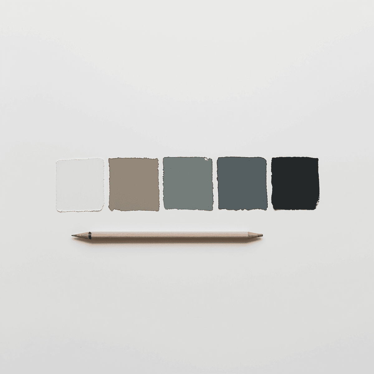
A minimalist color palette is not simply a palette with light colors or muted tones. It is a palette with a small number of intentional colors where each one carries a specific visual role. Typically, a minimalist palette has:
One or two neutrals (whites, off-whites, light grays, warm creams)
One mid-tone that provides visual structure (soft charcoal, warm taupe, slate)
One accent that draws attention precisely because it appears sparingly
That three-tier structure — neutral, structure, accent — is the backbone of almost every effective simple color scheme. Everything else is variation within that framework.
1. Warm Paper
Palette: Warm white, pale sand, soft taupe, cool charcoal, ink black
Hex codes: #FAF7F2 / #E8DDD0 / #C4B4A4 / #5A5A5A / #1C1C1C
This palette reads like a well-designed printed book. The warm white and pale sand carry a slight yellow undertone that stops the palette from feeling clinical. The cool charcoal and ink black handle all the typographic weight. Nothing here is purely cold, which makes it unusually comfortable for long-form reading environments.
In 2026, this palette is appearing across editorial sites, digital publishing platforms, and portfolio sites for architects and photographers who want the work to lead rather than the interface.
2. Blue Steel
Palette: Near-white, light silver, mid steel blue, deep navy, charcoal
Hex codes: #F4F6F8 / #D0D8E4 / #5B7FA6 / #1E3A5F / #2A2E35
Steel blue palettes are having a significant moment in 2026 UI design. The cool, measured quality of this palette communicates reliability and precision, which explains why it is particularly strong in fintech, SaaS, and productivity tool design.
If you want to see how this kind of structured palette behaves across a full design system, exploring an adaptive color system approach is worth the time — the principles of role-based color assignment apply directly to palettes like this one.
3. Warm Neutral Stack
Palette: Cream, warm linen, sand, camel, deep espresso
Hex codes: #FDF8F0 / #EEE5D8 / #D4C4B0 / #A08060 / #2C1F14
Monochromatic warmth done right. Every color in this palette sits within the same yellow-orange-brown family, and the range from cream to espresso gives it enough contrast to function across complex layouts. It feels luxurious without trying — which is exactly the quality that sustainable fashion brands, high-end hospitality, and wellness platforms are actively seeking in 2026.
4. Ghost Gray
Palette: Pure white, ghost white, light gray, mid gray, near-black
Hex codes: #FFFFFF / #F2F2F2 / #CCCCCC / #888888 / #1A1A1A
As pure as minimalism gets. Ghost gray is a fully achromatic palette — zero hue, pure tonal variation — and it works because the steps between each value are deliberate. There is no muddiness in the middle range, and the near-black is warm enough to avoid the harshness of pure #000000.
This palette is the backbone of typographic design. It suits editorial layouts, developer documentation sites, and portfolio work where the content is so strong it simply needs a clean surface to sit on. It is also one of the most effective minimal web colors for dark mode design — inverting the palette gives you a dark interface that maintains the same tonal relationships.
5. Sage and Stone
Palette: Off-white, light stone, muted sage, warm gray, deep slate
Hex codes: #F6F4F0 / #DDD8D0 / #9AAE98 / #8A8680 / #3A3C3E
The sage brings just enough life to what would otherwise be a purely neutral palette. It is a muted, slightly desaturated green — more dried herb than fresh leaf — which means it reads as natural and calm rather than vibrant or energetic.
This is also a palette worth exploring for its relationship to the broader elegant minimalist color direction that continues to define premium digital aesthetics this year.
6. Chalk and Carbon
Palette: Chalk white, warm cream, light taupe, medium charcoal, deep carbon
Hex codes: #F8F6F2 / #EDE8DE / #C0B4A4 / #4A4644 / #221E1C
Chalk and carbon are the palette for designers who find pure black and pure white slightly too harsh, but still want a strong contrast. The warm undertones running through every value — from the chalk white to the deep carbon — create a visual warmth that full-achromatic palettes lack.
This palette handles long-form reading environments particularly well.
7. Terracotta Minimal
Palette: Warm white, pale blush, dusty terracotta, warm brown, deep espresso
Hex codes: #FBF7F4 / #EDD8CC / #C07858 / #8A5240 / #2C1810
Most minimalist palettes avoid color almost entirely — this one shows that a single well-chosen hue can carry a minimalist palette without breaking its restraint. The dusty terracotta is earthy and warm, not bold or aggressive, which means it functions as structure rather than decoration.
Terracotta minimal is especially strong for brands in the food, ceramics, homewares, and lifestyle space — anywhere the warmth of natural materials is part of the brand story.
8. Arctic Blue
Palette: Ice white, pale blue-gray, soft sky, cool slate, deep indigo
Hex codes: #F4F7FA / #D4DDE8 / #9AB4CC / #5A7080 / #1E2C3A
Clean, cool, and precise. Arctic blue reads as the palette of clear-headed thinking — no warmth, no distraction. It is ideally suited to productivity tools, B2B SaaS interfaces, healthcare platforms, and any digital product where trustworthiness and focus are the primary emotional register.
For designers building a full-scale color system around a palette like this, the color palette library on Coloraccy offers structured references for cool-toned minimal systems worth studying.
9. Oyster
Palette: Oyster white, blush gray, warm silver, rose taupe, deep mauve
Hex codes: #F7F3F0 / #E0D8D4 / #C4B8B4 / #9A8884 / #3C2C2C
Oyster is quietly one of the most sophisticated palettes on this list. It occupies the space between warm neutral and cool mauve — neither fully committed to warmth nor to coolness — which gives it a distinctive, slightly unexpected quality.
This palette works for luxury beauty brands, fashion editorials, high-end hospitality, and premium personal branding. The deep mauve is subtle enough to maintain minimalist restraint while providing genuine character.
10. Bone and Ink
Palette: Bone white, soft ecru, warm parchment, dark graphite, pure ink
Hex codes: #F9F7F2 / #EDE7DA / #D8CEBC / #3A3530 / #18140E
Bone and ink is a typographer's palette. Everything here serves the relationship between text and surface. The bone white and ecru backgrounds have the warmth of paper without the visual noise of texture, and the dark graphite and pure ink provide enough contrast for comfortable reading at any size.
This palette has found a natural home in personal blogs, literary journals, architect portfolios, and any digital context that wants to feel print-influenced.
11. Desert Haze
Palette: Pale sand, warm fog, dusty rose, muted clay, deep umber
Hex codes: #F5EEE4 / #DDD4C4 / #C4A098 / #9A7464 / #3A2820
Desert haze carries the stillness of early morning light in an arid landscape — pale, warm, and almost colorless, with just enough rose and clay to give the palette emotional weight.
This palette is strong for travel brands, artisanal product design, wedding and event aesthetics, and slow-living lifestyle content. The muted clay bridges the pale sand and deep umber without creating a jarring jump, giving the palette a fluid, gradient-like quality across its range.
12. Monochrome Green
Palette: Pale mint, soft sage, muted olive, deep moss, near-black green
Hex codes: #EDF4EE / #B8CEB8 / #7A9878 / #3A5C3A / #182418
Green is experiencing a significant recalibration in 2026 design culture. The vivid, artificial greens of tech branding are giving way to more natural, desaturated tones — and a fully monochromatic green palette done at this saturation level feels contemporary and grounded rather than retro.
Monochrome green is finding favor in sustainability-focused brands, agricultural technology, outdoor and wellness products, and any brand narrative built around nature, growth, or environmental responsibility. The full range from pale mint to near-black green gives you surprisingly complete contrast coverage for a single-hue palette.
How to Choose the Right Palette for Your Project
With twelve strong options on this list, the practical question is which one fits your specific project. A few criteria to guide that decision:
Industry and audience expectations. Blue steel and arctic blue carry inherent associations with precision and technology. Terracotta minimal and warm paper carries warmth and craft.
Contrast requirements. If your design involves significant body text or complex UI states, verify that your chosen palette provides sufficient contrast between its text and background colors
Light and dark mode needs. If your product requires both, choose a palette whose tonal structure inverts cleanly — where the lightest and darkest values can swap roles without losing readability.
Brand differentiation. Within your specific market, what palette choices are common? Sometimes the most strategic move is to choose the palette that your competitors have not — a cool, achromatic palette in a warm, terracotta-heavy category.
For a deeper look at how palette choices affect brand perception and consumer behavior, the brand color psychology guide on Coloraccy is a practical reference worth reading alongside this list.
Conclusion
Design in 2026 doesn’t seek to get the viewer’s attention by creating volumes through colors; rather, it gets the attention of the viewer by being precise with the use of colors. Design done with a minimalist palette speaks volumes about what kind of designer used it.
Coloraccy gives you the tools to take any of these palettes further — generate full shade scales, find complementary additions, extract palettes from inspirational images, and browse thousands of curated references in the color palette library. Build your 2026 palette at coloraccy.com.