Color is one of the most powerful tools a designer has — and one of the most misunderstood. Whether you are building a brand identity, designing a website, or choosing paint for a room, understanding color theory basics can transform your work from ordinary to extraordinary. The difference between a design that feels cohesive and one that clashes often comes down to a single principle: knowing how colors relate to one another.
This guide breaks down everything beginners need to know about color theory, from the fundamentals of the color wheel to building harmonious color palettes. If you have ever stared at a blank canvas wondering which colors to use, you are in the right place.
What Is Color Theory?
Color theory is a body of practical guidance and principles used to create harmonious color combinations. It explains how humans perceive color, how colors interact with each other, and how they can be combined to produce specific visual and emotional effects.
At its core, color theory draws from both science and art. It spans physics (how light produces color), psychology (how color affects mood and behavior), and design (how color guides attention and communicates meaning). Designers, artists, marketers, and architects all rely on color theory to make deliberate, effective choices.
According to research published by the Institute for Color Research, people make a subconscious judgment about a product within 90 seconds of first viewing it — and between 62% and 90% of that assessment is based on color alone. That statistic alone underscores why every designer should invest time in understanding design color theory.
The Color Wheel: Where Everything Begins
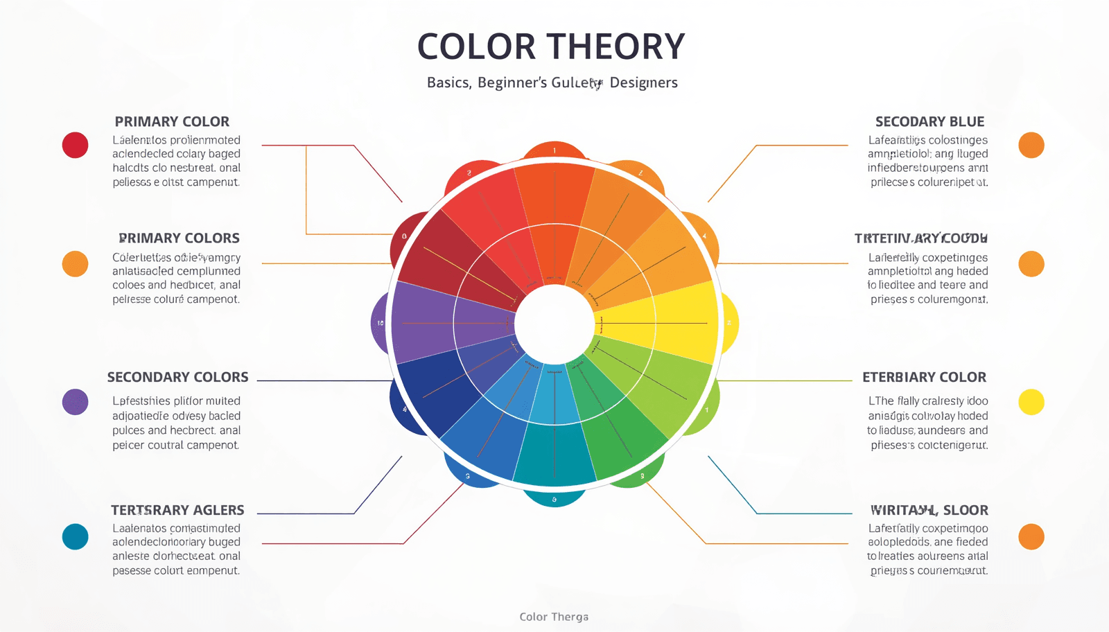
The color wheel is the foundational tool of color theory. First developed by Sir Isaac Newton in 1666 when he mapped the color spectrum onto a circle, it remains the starting point for virtually every color decision in design.
Primary, Secondary, and Tertiary Colors
Understanding the color wheel fundamentals starts with three tiers of color:
Primary Colors Red, yellow, and blue are the three primary colors. They cannot be created by mixing other colors and serve as the building blocks for all other hues.
Secondary Colors When you mix two primary colors, you get a secondary color:
Red + Yellow = Orange
Yellow + Blue = Green
Blue + Red = Violet
Tertiary Colors Mixing a primary with an adjacent secondary produces a tertiary color — for example, red-orange, yellow-green, or blue-violet. These twelve colors together form the complete traditional color wheel.
Digital designers working in screen-based environments use the RGB (Red, Green, Blue) color model instead of the traditional RYB model. Tools like the Coloraccy color picker let you work across both systems, making it easy to explore hues in any format.
Color Properties You Must Understand
Before diving into color schemes, you need to understand three fundamental properties that define every color.
Hue, Saturation, and Value
Hue refers to the pure color itself — red, green, blue, and so on. It is the attribute that gives a color its name.
Saturation describes the intensity or purity of a color. A highly saturated color is vivid and bold. A desaturated color appears washed out or grayish. You can explore saturation changes using the shade and tint generator on Coloraccy.
Value (also called brightness or lightness) refers to how light or dark a color is. Adding white to a hue creates a tint. Adding black creates a shade. Adding gray creates a tone.
Mastering these three dimensions gives you precise control over every color decision you make. If a design feels off, adjusting saturation or value — without changing the hue — can often fix the problem.
Color Harmony: Building Palettes That Work
Color harmony refers to the arrangement of colors in a way that is visually pleasing. Harmonious combinations feel balanced and intentional. Discordant ones create tension — which can be used deliberately but must be handled with care.
Here are the most important color harmony models every beginner should know.
Complementary Colors
Complementary colors sit directly opposite each other on the color wheel — for example, blue and orange, or red and green. When placed side by side, they create strong contrast and visual energy. This pairing is common in sports branding and high-impact advertising.
Use the complementary color finder at Coloraccy to instantly identify the complement of any color in your palette.
Analogous Colors
Analogous color schemes use three to five colors that sit adjacent on the color wheel — for example, yellow, yellow-green, and green. These palettes feel natural and serene. They are widely used in nature-inspired designs and wellness brands.
Triadic Colors
A triadic scheme uses three colors evenly spaced around the color wheel, such as red, yellow, and blue. This approach offers strong visual contrast while maintaining balance. It requires careful management of saturation to avoid a garish effect.
Split-Complementary Colors
A variation of the complementary scheme, split-complementary, uses one base color and the two colors adjacent to its complement. This produces contrast with less tension than a direct complement — a useful middle ground for beginners.
Tetradic (Rectangle) Colors
Tetradic schemes use four colors arranged in two complementary pairs. They offer rich variety but require deliberate control over which color dominates. Generally, one color should lead while the others support.
For ready-made examples of these harmonies in action, explore the Coloraccy color palette library, which organizes palettes by mood, style, and industry.
Warm Colors vs. Cool Colors
Color temperature is one of the most intuitive aspects of color theory and one of the most practically useful.
Warm colors — reds, oranges, and yellows — evoke energy, urgency, warmth, and excitement. They tend to advance visually, appearing closer to the viewer. Fast food brands, clearance sales, and call-to-action buttons often lean on warm colors.
Cool colors — blues, greens, and purples — suggest calm, trust, depth, and professionalism. They tend to recede visually. Technology companies, healthcare providers, and financial institutions frequently use cool palettes.
Neutral colors — black, white, gray, and beige — do not sit on the temperature spectrum and instead serve as grounding agents in any palette. Elegant minimalist color schemes often use neutral foundations with restrained warm or cool accents to achieve sophistication.
Color Psychology in Design
Color psychology explores how color influences human perception, emotion, and behavior. While cultural context plays a role — and associations are not universal — some patterns appear consistently across studies.
Color | Common Associations | Typical Use Cases |
Red | Energy, urgency, passion | Sales, food, and emergency |
Orange | Warmth, creativity, friendliness | Startups, lifestyle brands |
Yellow | Optimism, attention, caution | Children's products, warnings |
Green | Nature, health, growth | Eco brands, finance, wellness |
Blue | Trust, calm, authority | Tech, finance, healthcare |
Purple | Luxury, creativity, mystery | Beauty, premium brands |
Black | Power, elegance, sophistication | Fashion, luxury, tech |
White | Purity, simplicity, cleanliness | Minimalist design, healthcare |
For designers building brand identities, understanding this layer of color theory is as important as knowing the color wheel fundamentals. The Coloraccy brand color kit is a practical tool for testing how brand colors communicate across contexts.
Types of Color Palettes
A color palette is a curated set of colors used consistently across a design project. Building a strong palette is one of the highest-leverage skills in applied color theory.
Monochromatic Palettes
A monochromatic palette uses different values and saturations of a single hue. It creates cohesion and sophistication. Learn more about applying this approach in UI design with the monochrome color palettes guide on Coloraccy.
Analogous Palettes
These palettes use colors adjacent on the wheel and feel harmonious and natural. They are especially effective for editorial and lifestyle design.
Complementary Palettes
High contrast and visually bold, these palettes work well for marketing materials and interfaces that need to direct attention.
Neutral Palettes
Neutral palettes rely on whites, creams, grays, and browns with one or two accent colors. They are staples of interior design, luxury branding, and editorial layout.
For digital platforms, the aesthetic color palette collection on Coloraccy offers curated options across all these categories, ready to use in any project.
If you work with digital artwork tools, the Procreate color palette ideas blog post provides inspiration tailored to tablet-based illustration workflows.
Color in Digital Design: Hex, RGB, and HSL
Digital design introduces additional complexity because colors are defined numerically rather than by pigment mixing.
Hex codes are six-digit codes that specify colors in the RGB color model — for example, #FF5733 for a vivid orange-red. They are the universal standard for web design.
RGB values define color by specifying the intensity of red, green, and blue channels on a scale of 0–255. They are the native format for screen rendering.
HSL (Hue, Saturation, Lightness) offers a more intuitive way to specify colors programmatically, especially when you need predictable variations.
Converting between these formats is a regular part of digital design workflows. The color format converter on Coloraccy handles all these conversions instantly, saving time and preventing costly errors.
Applying Color Theory to Real Design Projects
Understanding theory is only useful when it translates into practice. Here is how color theory basics apply to common design scenarios.
Web and UI Design
In interface design, color serves functional roles. It establishes hierarchy, guides navigation, and communicates status. Primary actions use high-saturation, high-contrast colors. Secondary elements step back with lower contrast. Error states rely on red; success states use green.
For e-commerce specifically, Shopify color palettes that use warm accent colors on neutral backgrounds consistently outperform flat or over-colorized alternatives in conversion testing.
Brand Identity
A brand's color palette must work across print, digital, environmental, and packaging contexts. The palette should be tested in both light and dark environments, at small and large scales, and in grayscale.
Start palette exploration with the Coloraccy palette showcase, which groups curated palettes by industry and style.
Interior and Environmental Design
Color theory applies directly to physical spaces. Warm colors advance and energize; cool colors recede and calm. Hotels, offices, and retail spaces use color deliberately to manage customer flow, dwell time, and emotional state.
For commercial environments — hotels, corporate offices, and retail spaces — understanding how color temperature and value interact with lighting is critical. Designers in these sectors increasingly use tools like Coloraccy's color palette tools to prototype spatial color schemes before implementation.
Illustration and Fine Art
For artists working in traditional or digital media, color theory underpins every decision about light, shadow, and mood. Acrylic palette inspirations on Coloraccy provide excellent starting points for painters exploring new color relationships.
Extracting Colors from Images
One of the most practical skills in applied color theory is the ability to extract a harmonious palette from an existing image. This technique is used in brand identity work, interior design, fashion, and web design.
If you find an image with a color mood you want to replicate, the image color extractor on Coloraccy pulls the dominant colors and presents them as a usable palette. This bridges the gap between inspiration and application.
For moments when you need a completely fresh starting point, the random color generator on Coloraccy produces unexpected combinations that can break creative blocks.
Color Across Cultures
Color meaning is not universal. While blue communicates trust in North American and European corporate culture, it is associated with mourning in some parts of the Middle East. Red signals luck and prosperity in China but danger or urgency in Western contexts.
For designers working on global projects — websites, packaging, or campaigns targeting international audiences — cultural color research is an essential part of the design process. The African color palette collection on Coloraccy and the academia palette series offer useful cultural reference points.
Practical Tips for Beginners
These principles help beginners move from understanding theory to making confident color decisions.
Start with a neutral base. Build your palette outward from a white, off-white, or light gray foundation. This reduces the risk of visual overwhelm.
Limit your palette. Beginners often use too many colors. Three to five colors are enough for most projects. Fewer colors used well create more impact than many colors used carelessly.
Use the 60-30-10 rule. In interior design and graphic design alike, a reliable formula assigns 60% of the space to a dominant color, 30% to a secondary color, and 10% to an accent. This creates natural balance.
Test contrast ratios for accessibility. WCAG accessibility guidelines require a minimum contrast ratio of 4.5:1 for body text. Always verify that your color combinations are legible for users with visual impairments.
Pull from nature. Natural environments are inherently color-harmonious. Landscapes, flora, and seasonal palettes offer endless inspiration that already follows the rules of color theory.
Use tools to work faster. The pastel color palette generator on Coloraccy is ideal for soft, approachable aesthetics, while the full suite of swatches tools helps you build and refine palettes systematically.
Learn from existing palettes. Studying color decisions in well-regarded brands, films, and artworks trains your eye. The Coloraccy blog on working with color palettes offers structured guidance on this process.
Common Mistakes to Avoid
Even designers with a solid grasp of theory make these errors. Recognizing them early accelerates your growth.
Using too many saturated colors at once. High-saturation colors are visually demanding. Using several simultaneously creates visual noise. Reserve saturated hues for focal points and use lower-saturation variants elsewhere.
Ignoring value contrast. Two colors can be harmonious in hue but invisible against each other if their values are too similar. Always check designs in grayscale to verify contrast.
Applying color theory without context. Theory provides a framework, not a formula. A complementary color scheme that works beautifully for a tech startup may feel jarring for a spa brand. Always filter theory through the lens of context and audience.
Neglecting accessibility. Approximately 8% of men and 0.5% of women have some form of color vision deficiency. Designs that rely solely on color to convey meaning will fail for a significant portion of your audience.
Skipping the testing phase. Colors render differently across devices, paper types, and lighting conditions. Always test your palette in the environment where it will actually be used.
Overlooking negative space. White space and neutral areas are part of your palette. Leaving breathing room allows your colors to function as intended.
Conclusion
Color theory is not just an academic subject — it is a practical skill that shapes every visual decision you make as a designer. From understanding the color wheel fundamentals to building palettes that resonate emotionally, the principles covered in this guide give you a structured foundation to work from.
The best designers do not rely on intuition alone. They combine an understanding of design color theory with real tools, systematic testing, and continuous observation. Whether you are building a brand, designing a website, or decorating a space, the principles here apply directly.
Coloraccy brings all the tools you need into one accessible platform — from the color palette explorer and complementary color finder to the shade and tint generator and brand color kit. It is built for designers who want to move from theory to execution without friction.
Start building your palette today. Explore the full suite of color tools at Coloraccy and bring your design vision to life.