Color is the mute language of design. Even before a reader sees any text or presses any buttons, color has already formed their emotions. For designers, marketers, UI programmers, and digital artists around the world, choosing the perfect colors is not only a matter of creativity but also of strategy. And for soft, classic, and adaptable hues, nothing beats the effect of pastel colors.
That is where a Pastel Color Palette Generator becomes an indispensable tool. This guide covers everything you need to know: what these tools are, how to use them effectively, common mistakes to avoid and how Coloraccy makes the entire process smarter and faster.
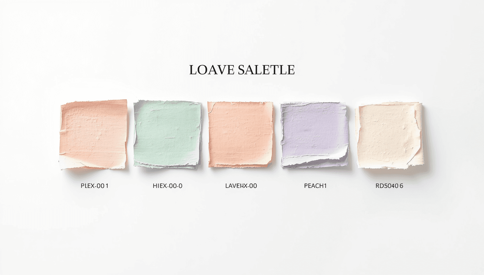
What Is a Pastel Color Palette Generator?
A pastel color palette generator is a digital tool that generates curated color combinations using pastel tones, which come with their HEX, RGB, and often HSL codes so they can be used directly in various designs.
Pastels are characterized by their high levels of lightness and low saturation. The visual softness of such tones carries a sense of calmness, creativity, and friendliness, which are extremely desirable features in design.
Platforms like Coloraccy's color palette tools go further by offering instant HEX code export, making the workflow seamless for developers and designers alike.
Why Pastel Color Palettes Matter in Modern Design
Design trends do not emerge randomly. The world-wide emergence of pastel color schemes over the past decade can be attributed to the changing responses of audiences to the visual communication process.
As indicated by studies conducted by the Color Marketing Group, soft color schemes continue to be favored over bright schemes where emotional appeal and credibility are required – specifically in the fields of health care, beauty products, and hospitality services.
Here is why choosing the right pastel palette matters:
Brand perception: Pastel tones communicate softness, luxury, and approachability simultaneously.
Readability and accessibility: Low-contrast pastel backgrounds paired with dark text meet WCAG accessibility standards more naturally than saturated alternatives.
Cross-platform versatility: Pastels translate well across digital screens, print media, and physical environments.
Emotional resonance: Soft colors reduce cognitive load and create a sense of comfort — a proven advantage for conversion-focused landing pages and wellness applications.
How Coloraccy's Pastel Color Palette Generator Works
Coloraccy is built around one core philosophy: color discovery should be effortless and precise. The platform's pastel palette generator combines algorithmic color theory with an intuitive interface that serves beginners and professionals equally well.
Core Features
Instant HEX Code Generation Every palette generated on Coloraccy comes with immediately copyable HEX codes. No conversions, no extra steps — just click and use.
Multiple Palette Modes Users can generate palettes based on:
A specific base color input
A mood or keyword (e.g., "calm," "spring," "minimal")
Randomized discovery for inspiration
Export and Integration Options Coloraccy supports one-click copy of HEX values, palette export for design tools, and formats compatible with CSS, Figma, and Sketch workflows.
Curated Pastel Collections Beyond the generator, Coloraccy's curated palette library offers hand-picked pastel combinations organized by theme — saving significant time during the ideation phase.
Step-by-Step: Generating Your First Pastel Palette
Visit Coloraccy and navigate to the palette generator.
Choose a starting color or enter a specific HEX value if you have a brand anchor color.
Select "Pastel" as your palette style or adjust the lightness and saturation sliders manually.
Review the generated color swatches and their corresponding HEX codes.
Click any swatch to copy the HEX code directly to your clipboard.
Export the full palette or save it to your Coloraccy account for future reference.
The entire process takes under two minutes — dramatically faster than manually building color combinations in a design application.
Pastel Color Palettes Across Industries and Use Cases
The versatility of pastel color palettes extends far beyond graphic design portfolios. Here is how different sectors apply them in practice.
Hospitality and Commercial Interiors
Pastel colors are being used in the interior designs of hotels and boutiques around the world. This trend extends to online branding as well. Pastel green tones, rosy shades, and ivory hues provide the luxury that does not have to shout about itself. For commercial interior consultants sourcing visual references, tools like Coloraccy's color exploration features offer a fast way to build cohesive mood boards with precise color specifications.
UI and App Design
Wellness, productivity, and lifestyle apps always function better when pastel colors are used for their user interfaces. The pastel background helps prevent eye fatigue, especially if the user uses the application for long periods of time.
Social Media and Content Creation
Instagram, Pinterest, and TikTok content with cohesive pastel aesthetics consistently achieves higher engagement rates in style, beauty, food, and travel niches.
Print and Packaging
Whether it’s for packaging or for event-related stationery, pastels are known to have a great look when printed on both coated and uncoated papers. Designers who specialize in print designs use software that can provide HEX and CMYK equivalents, which is something that Coloraccy’s color palette tool can offer.
Pastel vs. Muted vs. Light Colors: Understanding the Difference
Many designers use these terms interchangeably, but they represent distinct color properties.
Property | Pastel | Muted | Light |
Saturation | Low to medium | Very low | Variable |
Lightness | High | Medium | High |
Warmth | Variable | Tends toward cool or neutral | Variable |
Typical Use | Feminine, soft, airy designs | Sophisticated, earthy aesthetics | Background fills, open layouts |
Design Feel | Playful elegance | Refined minimalism | Clean and open |
Understanding these distinctions helps designers make intentional choices rather than defaulting to "soft colors" as a generic category.
Practical Tips for Working with Pastel Color Palettes
Working with pastels requires a slightly different mindset than working with saturated palettes. Here are actionable insights from professional design practice.
Anchor with neutrals. Pastel palettes benefit from one or two neutral anchors — soft white, warm cream, or light greige — that prevent the overall scheme from feeling too flat or visually monotonous.
Use contrast strategically. Pastel colors, being light colors, imply that any text and other user interface elements that may be placed against them need to be dark. Ensure there is at least a 4.5:1 contrast ratio between the body text and background. The WebAIM Contrast Checker is a reliable external tool for verification.
Limit your palette to three to five colors. Pastel palettes work best when kept restrained. More than five colors in a single scheme tends to produce visual noise rather than harmony.
For an ever-refreshing source of curated palettes, bookmark Coloraccy's trending palettes section to stay aligned with current design directions worldwide.
Common Mistakes to Avoid When Using a Pastel Palette
Even experienced designers fall into predictable traps when working with pastel schemes. Awareness of these mistakes saves significant revision time.
Mistake 1: Using pastel colors for all text.Pastel colors should not be used for the text at all because pastel colors have very little contrast compared to the background color, leading to problems with legibility. Pastel colors are best left to backgrounds, highlights, and decorations.
Mistake 2: Treating all pastels as interchangeable. A pastel shade of peach and a pastel shade of blue have very different psychological connotations. Combining warm and cool colors in pastel tones results in color schemes that look uncoordinated rather than coordinated.
Mistake 3: Ignoring print vs. digital differences. The pastel color that may look vibrant on-screen may end up looking faded when printed. In case you have to produce something using both forms, make sure that you obtain print proofs before producing the finished product.
Mistake 4: Over-relying on a single palette.The use of a pastel color palette generator is just a step in the process. The color palette that was generated can be used as a base, but should still be adjusted depending on your current situation.
Conclusion: Build Better Designs
Choosing colors is arguably one of the most critical stages in any design process, and a carefully selected pastel color scheme will have more flexibility and evocative qualities than virtually any other type of color range.
In this article, we covered the functionality of a pastel color palette generator, the reasons why pastel colors are so popular in many design fields, how to quickly create accurate palettes using Coloraccy's platform, and common pitfalls to avoid when working with colors.
Coloraccy gives you that foundation — free, fast, and built around the principles that professional designers rely on every day.
Start exploring pastel color palettes now at Coloraccy and bring your next design project to life with color that communicates exactly what you intend.