Color will be the very first thing that greets the eyes of a website visitor even before they start reading anything. It sets the mood for them, instills confidence, and conveys brand value in split seconds. However, despite all of its significance, selecting a color palette is often overlooked by designers.
Perhaps, there are some moments when you have found yourself staring at a blank canvas without any idea what to do next. This guide breaks down exactly how to choose a color palette that works for your website, your users, and your brand — backed by proven principles, modern tools, and real-world design experience.
Whether you are building an e-commerce platform, a SaaS dashboard, or a corporate landing page, this 2026 guide will give you a clear, actionable framework to make confident color decisions.
What Is a Website Color Palette?
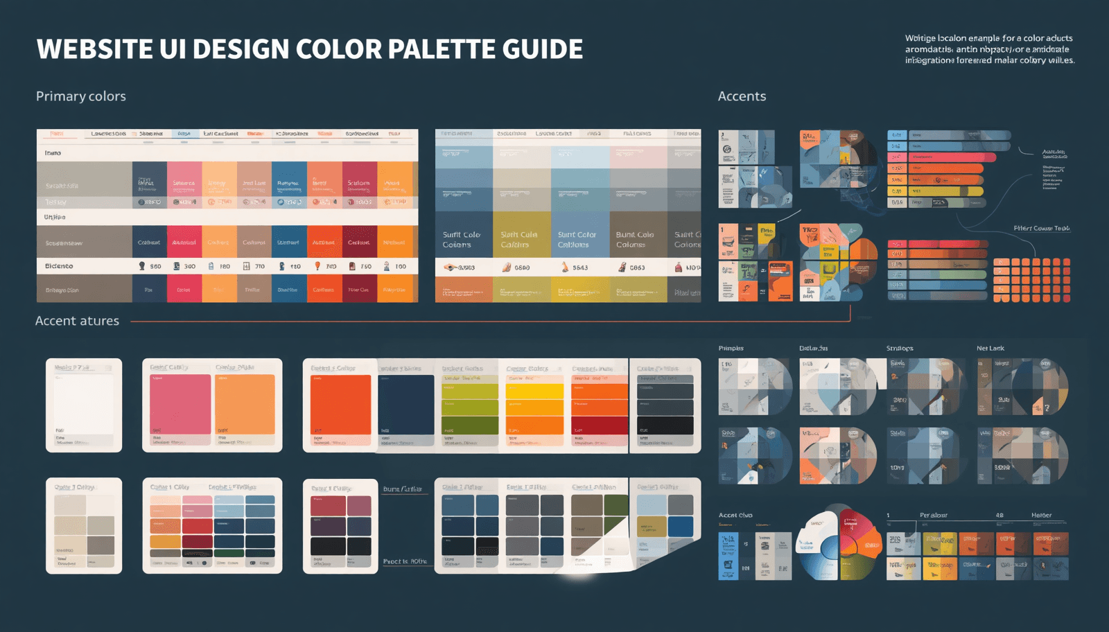
A website color palette is a curated set of colors — typically three to six — used consistently across all UI elements of a website. It consists of backgrounds, fonts, buttons, icons, borders, and interactive states.
Color schemes do not rely on arbitrary choices. Instead, they are carefully constructed based on principles of color theory, branding, and psychology. The right color scheme provides harmony and intuitive navigation within a user interface.
In UI design, color palettes are typically organized into three roles:
Primary color — the dominant brand color used for key actions and highlights
Secondary color — a supporting tone that complements the primary
Neutral colors — backgrounds, text, and dividers that provide visual rest
Understanding this structure is the foundation of every smart color decision.
Why Your Color Palette Matters More Than You Think
Studies carried out at the Institute for Color Research reveal that individuals subconsciously decide whether they like a product or not within ninety seconds from seeing it for the first time. Moreover, ninety percent of this judgment is made solely based on the product's color.
Beyond aesthetics, color palettes directly impact:
Conversion rates — A well-chosen CTA button color can lift click-through rates by double digits
Accessibility compliance — Poor contrast ratios exclude users with visual impairments and fail WCAG standards
Brand recognition — Consistent color use across platforms increases brand recognition by up to 80%
User trust — Certain color combinations are culturally associated with professionalism, safety, or creativity
For UI designers and business owners alike, the stakes are real. A mismatched or poorly constructed color palette can undermine even the most beautifully designed layouts.
How to Choose a Color Palette: A Step-by-Step Process
Step 1 — Define Your Brand Identity and Design Goals
Asking before using a color tool: What emotional response do I want my website to generate? A fintech application must be trustworthy and accurate; an educational application for children should be fun and welcoming; and luxury fashion brands must exude elegance.
Map your brand adjectives first. Then use color psychology as a translation layer:
Blue — Trust, reliability, calm (common in finance and tech)
Green — Growth, health, sustainability (popular in wellness and eco brands)
Red — Urgency, passion, energy (used in sales, food, and entertainment)
Yellow — Optimism, clarity, warmth (effective for creative and lifestyle brands)
Black/White — Sophistication, minimalism, elegance (luxury and editorial contexts)
This step gives your color choices strategic purpose rather than personal preference.
Step 2 — Choose Your Base (Primary) Color
Your primary color anchors the entire palette. It will appear on your most prominent UI elements — hero backgrounds, primary buttons, navigation accents, and brand logos.
Select a primary color that aligns with your brand identity from Step 1. Then use tools like Coloraccy to explore hue variations, saturation levels, and tonal ranges that give you flexibility across light and dark contexts.
A strong primary color should:
Work at multiple lightness levels (for hover, active, and disabled states)
Maintain accessibility at standard font sizes
Feel distinct from your direct competitors
Step 3 — Build a Complementary or Analogous Palette
Once your primary is locked in, you need supporting colors. The two most common approaches in UI design are:
Complementary palettes — Colors from opposite sides of the color wheel. High contrast, energetic, and attention-grabbing. Best for CTAs and interactive highlights.
Analogous palettes — Colors that sit adjacent on the color wheel. Naturally harmonious and calming. Best for content-heavy websites and dashboards.
You can also explore triadic, split-complementary, or monochromatic schemes depending on the visual complexity your design requires. Tools available through Coloraccy's palette generator simplify this process by auto-generating harmonious combinations from any seed color.
Step 4 — Define Your Neutral Scale
Neutrals are the unsung heroes of UI design. Grays, off-whites, and deep charcoal make up the majority of a website's visual surface — backgrounds, cards, dividers, and body text.
A strong neutral scale typically includes:
Near white or light gray background colors for main backgrounds
Mid gray background colors for secondary backgrounds
Dark gray or near black background color for body text
Optional warm/cool tones that subtly complement your main background color
Avoid pure black (#000000) for body text — it creates harsh contrast that tires the eye. A dark gray like #1A1A2E or a warm charcoal reads as professional and comfortable.
Step 5 — Test for Accessibility and Contrast
Accessibility is non-negotiable in 2026 UI design. WCAG 2.1 AA standards require a minimum contrast ratio of 4.5:1 for normal text and 3:1 for large text.
Run every text-on-background combination through a contrast checker. Pay special attention to:
Body text on your primary color backgrounds
Button labels on your CTA colors
Placeholder text in form fields
Tools like the WebAIM Contrast Checker and Coloraccy's built-in accessibility validator can automate much of this testing.
Step 6 — Create a Color System with Design Tokens
Modern UI design uses design tokens — named variables assigned to each color role. This makes your palette scalable, consistent, and easy to hand off to developers.
Structure your tokens like this:
--color-primary: #2563EB
--color-primary-hover: #1D4ED8
--color-secondary: #10B981
--color-bg-default: #F9FAFB
--color-text-primary: #111827
This system eliminates hardcoded hex values scattered across your codebase and ensures design consistency as your product evolves.
Types of Color Palettes in UI Design
Understanding the different types of color palettes helps you choose the right structure for your project:
Palette Type | Best For | Mood |
Monochromatic | Minimal, elegant designs | Cohesive, sophisticated |
Complementary | High-energy marketing sites | Bold, dynamic |
Analogous | Dashboards, editorial sites | Calm, natural |
Triadic | Creative agencies, portfolios | Vibrant, balanced |
Split-Complementary | E-commerce, SaaS | Lively, controlled |
Each approach carries distinct visual energy. Matching palette type to design intent is as important as the colors themselves.
Real-World Insights: How Top Brands Use Color
Analyzing existing brands will show that there is a predictable relationship between color palette choice and business results.
Slack's branding palette features purple colors, which symbolize innovation and creativity, thus differentiating it from the conventional blue-dominated enterprise applications. Notion's color palette features black and white colors with some gray hues, which emphasize the product's productivity aspect. The coral red color called Rausch became so intrinsic to the Airbnb brand that it serves as its quick recognition mark.
These are not accidents. Each palette was deliberately designed to serve both aesthetic and strategic goals. You can explore real palette inspiration from Coloraccy to study how colors perform across different industries and UI contexts.
Common Color Palette Mistakes to Avoid
Even experienced designers fall into these traps. Knowing them in advance saves hours of iteration:
Using too many colors — A palette with more than five or six active colors creates visual chaos. Limit your functional palette and use neutrals generously.
Ignoring dark mode requirements — In 2026, dark mode is a baseline expectation. Your color palette must function in both light and dark contexts without losing contrast or harmony.
Choosing colors by personal preference alone — Your favorite color is irrelevant if it conflicts with your audience's cultural associations or your brand's emotional goals.
Neglecting interactive states — Every color needs hover, focus, active, and disabled variants. Forgetting these leads to flat, inaccessible interfaces.
Skipping real-device testing — Colors render differently across monitors, phones, and ambient lighting conditions. Always test on multiple devices before finalizing.
Practical Tools for Building Color Palettes in 2026
The right toolset accelerates the entire process. Here are the most effective options currently available:
Coloraccy — An AI-powered color palette platform offering palette generation, accessibility testing, and export-ready design tokens
Adobe Color — Industry-standard tool with color wheel, trend exploration, and Creative Cloud integration
Coolors — Fast palette generator with locking and shuffling capabilities
Material Design Color System — Google's structured approach to color roles in UI systems
Figma Tokens Plugin — Connects your color system directly to your design files
For teams building at scale, Coloraccy's export features allow direct integration with Figma, Tailwind CSS, and CSS custom properties — reducing the gap between design and development.
Conclusion
Selecting a color scheme for web UI design is an art form. It can be used to build credibility, guide user focus, make the web page more accessible, and strengthen branding – all without the user even realizing it.
It begins by clarifying your brand identity, then applying color theory, and ending up at a well-tested, tokenized solution tailored to your product.
If you are ready to build a color palette that performs as well as it looks, Coloraccy gives you the tools, intelligence, and inspiration to do it right — from first selection to final export.
Start building your website's perfect color palette with Coloraccy today.