Color is the very first feeling we experience before seeing anything else consciously. No matter if you're creating a branding strategy, updating your website, or designing an interior space, the color palettes you select set the tone instantly. In the year 2026, designers all over the world are leaving the tried-and-true behind in favor of something more daring and emotionally impactful.
In this article, I'll share the best 7 color palettes for 2026, describing their appearance and usage principles. If you've been looking for guidance on color palettes that truly make conversions happen, you've come to the right place.
What Are Color Palettes and Why Do They Matter More Than Ever?
A color palette is a curated set of colors selected to work harmoniously across a design system. This usually involves one main color, one or two other colors used sparingly, an accent color, and some neutral colors as well.
According to findings made public through the Institute for Color Research, consumers form subconscious opinions regarding products after only 90 seconds of first impressions – and more than 90 percent of those opinions are formed based solely upon color perception.
By 2026, the use of color palettes will have transcended aesthetic concerns to become a strategic matter. With all the use of artificial intelligence in design across virtually all industries, handpicked and emotionally intelligent color palettes will make their mark.
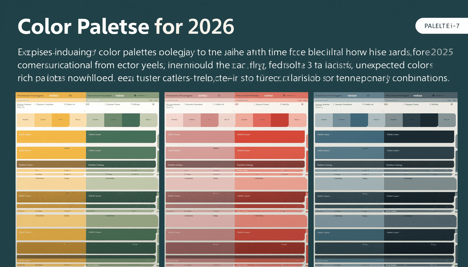
The Best 7 Color Palettes for 2026
1. Warm Terra: Earthy Warmth Meets Modern Sophistication
Terra tones have been building momentum for several years, and in 2026 they hit their stride. This palette combines burnt sienna, dusty clay, sandstone beige, and warm off-white.
Base: Burnt sienna (#C2613F)
Secondary: Clay rose (#D9927A)
Accent: Deep cacao (#5C2D1E)
Neutral: Linen white (#F5EDE3)
Explore a full breakdown of earthy color palettes for branding on Coloraccy, where thousands of curated combinations are available for immediate use.
2. Digital Frost: Cool Blues and Glacial Greens for Tech Brands
As artificial intelligence and fintech brands proliferate, Digital Frost emerges as the palette of credibility and precision. This combination uses pale arctic blue, glacier mint, soft graphite, and clean white.
Base: Arctic blue (#B8D8E8)
Secondary: Glacier mint (#A8D5C2)
Accent: Slate graphite (#4A5568)
Neutral: Cloud white (#F7FAFC)
Digital Frost is particularly effective for SaaS platforms, healthcare interfaces, banking apps, and corporate office environments. It signals intelligence without coldness and clarity without sterility. For digital projects, explore cool-tone palette collections organized by mood and industry at Coloraccy.
3. Golden Modernism: Luxury Meets Restraint
2026 is the year gold stops being maximalist and starts being refined. Golden Modernism pairs deep champagne, soft amber, warm charcoal, and ivory — stripping excess and keeping precision.
Base: Champagne gold (#D4A853)
Secondary: Warm amber (#C08B3A)
Accent: Charcoal noir (#2C2C2C)
Neutral: Ivory silk (#FAF6ED)
The color scheme is appropriate for upscale retail, high-end packaging, interior design of luxurious hotels, and corporate branding.
4. Soft Botanicals: Nature-Inspired Calm for Wellness and Lifestyle
Biophilic design continues its strong influence into 2026, and Soft Botanicals captures that movement in palette form. Think sage green, dusty lavender, pale moss, and cream.
Base: Sage green (#9CAF88)
Secondary: Dusty lavender (#B9A8C7)
Accent: Deep forest (#3D5A3E)
Neutral: Warm cream (#FDF8F1)
The Soft Botanicals logo strongly identifies with wellness studios, organic foods, sustainable clothing brands, and spas. The image reflects a sense of serenity, health, and authenticity – characteristics sought by consumers today. Browse curated nature-inspired color palettes at Coloraccy to find combinations calibrated for maximum emotional impact.
5. Urban Monochrome: Bold Contrast for Editorial and Architecture
Monochromatic schemes are back, but with sharper intent. Urban Monochrome in 2026 is not just black and white — it layers charcoal, warm grey, matte black, and pearl for a dimensional, architectural feel.
Base: Matte black (#1A1A1A)
Secondary: Warm charcoal (#3C3C3C)
Accent: Pearl grey (#E8E8E5)
Highlight: Off-white (#F4F4F0)
This color scheme is ubiquitous in architecture design, fashion photography, luxury office spaces, and fashion magazines. Its strength comes from contrasting and being silent, thus allowing form and typography to speak for themselves.
6. Coral Futures: Vibrant Energy for Retail and Social Media
Not every 2026 palette is quiet. Coral Futures injects optimism with punchy coral orange, vivid blush, warm white, and a grounding caramel tan.
Base: Coral orange (#FF6B4A)
Secondary: Vivid blush (#FF9A8B)
Accent: Deep caramel (#8B5E3C)
Neutral: Warm white (#FFFAF6)
It is vibrant without being intimidating. Discover vibrant color palettes with Coloraccy's palette explorer, filterable by energy level and use case.
7. Dusk Gradient: Twilight Tones for Premium Digital Experiences
Gradient color schemes are experiencing a resurgence in elegance. The colors of Dusk Gradient transition from dark plum to mauve rose to dusty violet to blush pink, capturing the essence of the sky at dusk.
Base: Deep plum (#4A2040)
Secondary: Mauve rose (#9B5B7A)
Accent: Dusty violet (#7B68A0)
Neutral: Blush mist (#F2E8F0)
Dusk Gradient works well for high-end cosmetics, events firms, music websites, and luxury digital products. It has a cinematic feel, evokes emotions, and is distinctly human — attributes that are becoming less common in an AI-dominated world of design.
Comparing the 7 Palettes: Which One Fits Your Project?
Palette | Best For | Tone | Complexity |
Warm Terra | Wellness, lifestyle, boutique | Warm, organic | Low |
Digital Frost | Tech, fintech, healthcare | Cool, precise | Medium |
Golden Modernism | Luxury, hospitality, retail | Refined, elevated | Medium |
Soft Botanicals | Spa, food, sustainable brands | Calm, natural | Low |
Urban Monochrome | Architecture, fashion, editorial | Bold, minimal | Low |
Coral Futures | Retail, social media, food | Energetic, playful | Medium |
Dusk Gradient | Beauty, events, music | Cinematic, emotive | High |
Practical Tips for Applying Color Palettes in 2026
Choosing a palette is only half the work. Here is how to apply it strategically across real projects:
Start with your base color — apply it to the largest areas (backgrounds, hero sections, walls).
Reserve your accent color for calls-to-action, links, and focal points only. Overusing it kills its power.
Use neutrals generously — they give the eye somewhere to rest and make bold colors appear stronger by contrast.
Test across screens — colors shift between print, mobile, and desktop monitors. Always preview in all environments.
Check accessibility — ensure text-to-background contrast meets WCAG 2.1 AA standards (minimum 4.5:1 ratio for body text).
For professional color testing and palette generation, Coloraccy's digital tools offer real-time contrast checking and harmony visualization built directly into the palette explorer.
Entities Connected to Color Palette Design in 2026
Understanding color palettes means understanding the broader ecosystem they operate within:
Color theory — the foundational science of how hues, tones, and shades interact
Brand identity design — how palettes communicate brand personality across touchpoints
UI/UX design — how color guides user behavior and accessibility
Interior design — how spatial color creates atmosphere and emotional experience
Print and packaging — how CMYK limitations shape palette selection
Trend forecasting — how agencies like WGSN and Pantone predict shifts in color preference
Pantone's Color Intelligence platform and Adobe Color offer additional reference points for trend-aligned palette research.
Common Mistakes to Avoid When Choosing Color Palettes
Even experienced designers fall into these traps:
Choosing colors you personally love over colors that serve the audience — design is communication, not self-expression in isolation.
Ignoring cultural associations — red signals danger in some contexts and celebration in others; always research your target market.
Skipping contrast testing — a beautiful palette that fails accessibility standards costs you users and legal compliance.
Using too many competing accents — one strong accent color is a focal point; three competing accents are chaos.
Take time to test palettes in real layouts before committing. Coloraccy's environment allows you to preview combinations across multiple design contexts before finalizing.
Conclusion: Make 2026 Your Most Visually Intentional Year Yet
The best color palettes for 2026 share one quality: they are chosen with purpose, not picked by default. From the earthiness of Warm Terra to the richness of Dusk Gradient, every palette included in this guide speaks to the future direction of design – an emotionally intelligent, restrained, and authentic direction.
This is precisely what Coloraccy is all about – a platform where designers, branding professionals, and creative directors can browse through thousands of professional palettes, test their performance in live conditions, and instantly export them into projects of any type and format.
Ready to find your 2026 palette? Visit Coloraccy today and explore curated color combinations built for modern design.