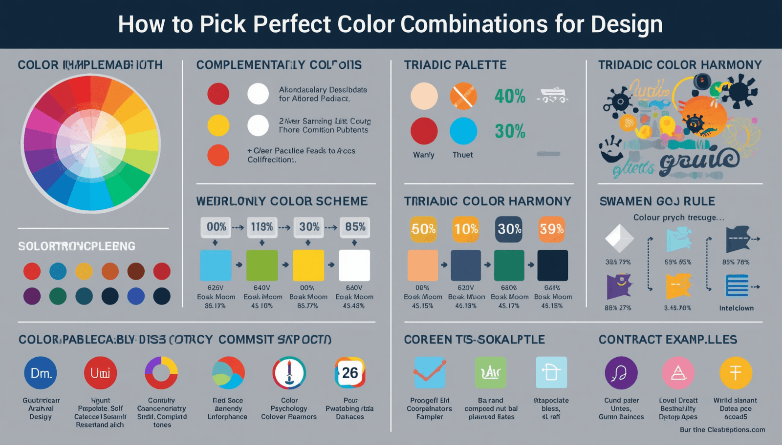
Selecting colors that work well together can be the determining factor between success and failure in design projects. It is critical to know How to Choose Perfect Color Combination when designing websites, branding campaigns, and social media graphics. Besides enhancing visual aesthetics, color combination plays an important role in shaping emotions, actions, and conversion rates, especially in the competitive digital world.
This detailed guide by Coloraccy provides all the necessary tips and tricks to help you come up with amazing color combinations without having to experiment or guess.
Why Color Combinations Matter in Design
Colors are not just for decoration; they have deeper meanings. Research has revealed that as much as 90% of initial judgments are made based solely on color. Consequently, the colors you choose have a direct effect on:
Brand perception and trust
Engagement and retention
Conversions and sales
Emotional response and usability
Global Relevance of Color Design
Since your target audience is worldwide, color selection becomes even more critical. Different cultures interpret colors differently:
Red = passion in Western cultures, but luck in Eastern cultures
White = purity in the West, mourning in some Asian regions
Understanding these nuances helps create universally appealing designs.
Understanding the Basics of Color Theory
Before diving into combinations, you need to understand the foundation.
The Color Wheel Explained
The color wheel consists of:
Primary Colors: Red, Blue, Yellow
Secondary Colors: Green, Orange, Purple
Tertiary Colors: Mixes of primary and secondary
These categories form the basis of all color combinations.
Key Color Relationships
Complementary: Opposite colors (e.g., blue & orange)
Analogous: Neighboring colors (e.g., blue, teal, green)
Triadic: Evenly spaced colors (e.g., red, yellow, blue)
Monochromatic: Variations of a single color
How to Choose Perfect Color Combination (Step-by-Step)
1. Define Your Purpose and Audience
Start by asking:
What feeling would I like to elicit?
Who are my target customers?
What action should the consumer perform?
For example:
Finance site – trust (blue, grey)
Fitness brand – energy (red, orange)
2. Choose a Base Color
Your primary color sets the tone. This should align with your brand identity.
Examples:
Blue → trust, professionalism
Green → growth, nature
Black → luxury, power
3. Build a Balanced Color Palette
Use the 60-30-10 rule:
60% dominant color
30% secondary color
10% accent color
This creates visual harmony and balance.
4. Use Contrast for Readability
High contrast improves usability:
Dark text on light background
Bright CTA buttons
Poor contrast leads to higher bounce rates.
5. Test Across Devices and Platforms
Your colors should look consistent on:
Mobile devices
Desktop screens
Different browsers
Use tools like color contrast checkers for accessibility compliance.
Popular Color Combination Styles (With Use Cases)
Minimalist (Monochrome)
Clean and modern
Used in SaaS websites and portfolios
Example: Shades of gray + white
Vibrant & Bold
High energy and attention-grabbing
Perfect for marketing campaigns
Example: Yellow + purple
Earthy & Natural
Calm and organic feel
Used in eco-friendly brands
Example: Green + brown
Corporate & Professional
Trust-building and neutral
Ideal for business websites
Example: Blue + white + gray
Tools to Create Perfect Color Palettes
You don’t have to guess—use smart tools:
Adobe Color
Coolors
Canva Color Palette Generator
Color Hunt
These tools help generate combinations based on color theory and trends.
The Role of Color Psychology in User Behavior
Color psychology plays a powerful role in influencing how users feel and act when interacting with your design. Different colors trigger specific emotional responses—blue creates trust, red drives urgency, and green promotes calmness. When you understand these psychological triggers, you can strategically guide users toward desired actions like clicking a button or making a purchase. For global audiences, it’s important to balance universal emotional cues with cultural sensitivity to maximize effectiveness.
How Lighting and Screen Types Affect Color Perception
But all viewers may not be viewing your colors the same way. There are different factors such as the quality of screen being used, brightness levels, and lighting that can affect the presentation of a color scheme onscreen. A delicate pastel shade will appear more vibrant on some screens and very subdued on others. You need to take precautions to make sure your design looks good everywhere.
Using Gradients and Modern Color Trends
Current design trends tend to incorporate the use of gradients to increase dimension and interest. By using gradients, it becomes easier to combine various colors effectively, making your design interesting. For example, it is trendy nowadays to combine gradients such as purple and blue in tech-related startups. But remember, trends must be wisely applied; concentrate on practicality, not on aesthetics.
Creating Brand Consistency with Color Systems
Consistent use of color in a strong brand is achieved through the development of a defined color scheme that incorporates primary colors, secondary colors, and accent colors. Consistency creates a sense of familiarity and trust over time. The importance of using the same color scheme in everything you do, whether it is your websites, social media pages, or marketing collateral, cannot be emphasized enough.
Testing and Optimizing Color Performance
Selecting colors is not something that only happens once; instead, it is an ongoing process that involves constant testing and optimization. Use the A/B testing method to find out which combination of colors works better in buttons, backgrounds, and layouts. Evaluate performance parameters such as click-through rate, bounce rate, and conversions.
Practical Tips for Better Color Combinations
Keep It Simple
Avoid using too many colors. Stick to 3–5 maximum.
Use Inspiration
Look at successful brands and designs:
Tech brands → blue dominance
Food brands → red and yellow
Consider Accessibility
Use WCAG guidelines
Ensure readability for color-blind users
Use Neutrals Wisely
Neutral colors (white, black, gray) balance bold palettes.
Common Mistakes to Avoid
Overloading Colors
Using too many colors in a single design creates visual clutter and confusion. Stick to a limited color palette (3–5 colors) to maintain clarity, balance, and a professional look.
Ignoring Contrast
Poor contrast between text and background reduces readability and negatively impacts user experience and SEO. Always ensure strong contrast for better accessibility and engagement.
Following Trends Blindly
Popularity of a color trend does not necessarily imply its suitability for your brand. Select colors depending on your brand personality and audience preferences rather than following short-term design trends.
Not Testing Designs
Without testing, there may be variations in visual appearance due to color. It is always important to test on a range of displays and environments to verify the appearance of your colors.
Real-World Example: Effective Color Palette
Let’s say you're designing an eCommerce site:
Primary: Dark Blue (trust)
Secondary: Light Gray (neutral)
Accent: Orange (CTA buttons)
This combination:
Builds trust
Keeps design clean
Encourages clicks
Related Topics to Explore
If you're building a complete design system, also consider:
Typography pairing
UI/UX design principles
Branding consistency
Visual hierarchy
For deeper insights, explore our internal resources:
Learn more about brand identity design strategies
Explore UI/UX design best practices
Discover modern web design trends
Read our guide on conversion-focused design techniques
Understand visual hierarchy in design
Check out color psychology in marketing
Conclusion: Build Stunning Designs with Confidence
Mastering How to Choose Perfect Color Combination is a game-changer for any designer, marketer, or business owner. A well-crafted color palette enhances user experience, strengthens branding, and drives conversions—especially in a global market.
By applying color theory, understanding audience psychology, and using modern tools, you can create visually stunning and high-performing designs every time.
At Coloraccy, we believe that great design starts with the right colors. Now it’s your turn to apply these strategies and transform your designs.
Ready to elevate your design? Start building your perfect color palette today with Coloraccy and turn clicks into conversions.