There is something about pastels that feels effortlessly right. Soft, luminous, and endlessly versatile, they have dominated digital illustration, UI design, and brand identity work for years — and show no sign of slowing down. But working with pastels is not as simple as picking light colors at random. The difference between a palette that feels dreamy and one that looks washed out often comes down to which specific pastel color combinations you choose and how you pair them.
Whether you are a digital illustrator, a graphic designer, or a hobbyist exploring color for the first time, this guide gives you seven proven combinations to work from — along with the reasoning behind why each one works.
What Are Pastel Color Combinations?
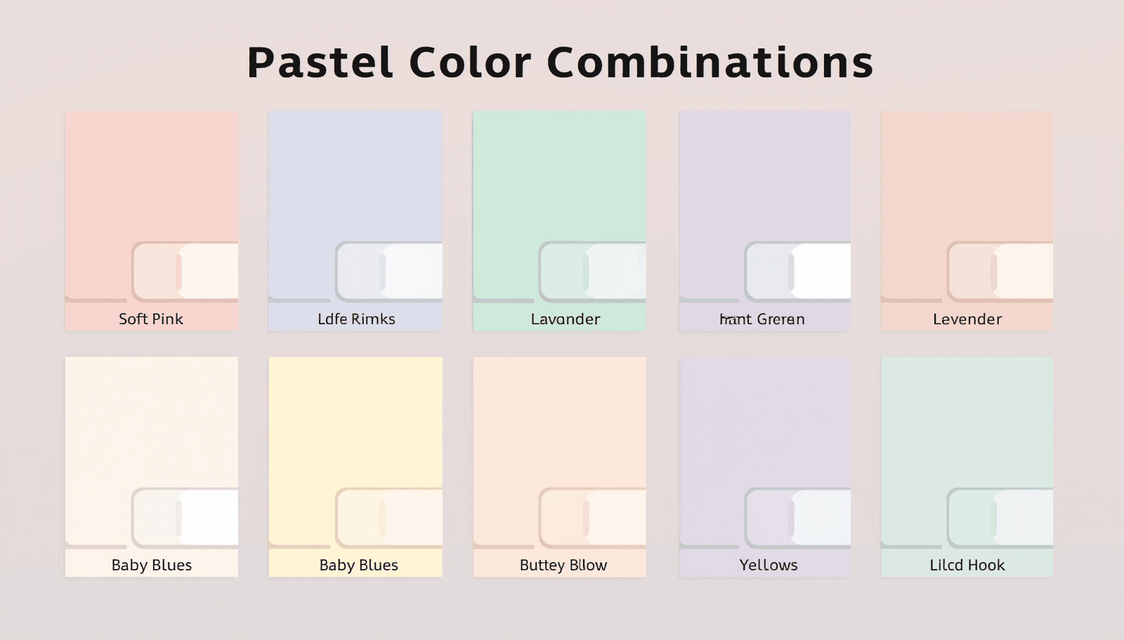
Pastel color combinations are pairings or groupings of colors with high lightness values and low-to-medium saturation — in practical terms, colors that appear soft, muted, and light rather than bold or vivid. They sit in the upper range of the value scale, typically achieved by mixing a pure hue with a significant amount of white.
What makes pastels distinct in digital art is their ability to create atmosphere without aggression. They suggest softness, warmth, nostalgia, and calm. In color theory terms, they occupy the tint end of the value scale, making them naturally harmonious with each other because they share similar lightness levels.
Research from the Pantone Color Institute consistently identifies pastel palettes as dominant in lifestyle, wellness, and consumer product design — reflecting a broader cultural preference for approachable, calming aesthetics in visual communication.
For digital artists and designers building pastel-based workflows, the Coloraccy pastel color palette generator is one of the most practical starting points available.
Why Pastel Palettes Work So Well in Digital Art
Pastels thrive in digital contexts for a few specific reasons that go beyond aesthetics.
They pair naturally with white space. Pastel hues sit close to white on the value scale, so they integrate seamlessly with negative space. This makes them ideal for clean, editorial-style digital illustration and UI work.
They photograph and render consistently. Unlike saturated colors, which shift dramatically across monitor calibrations and printing setups, pastels maintain their character across most output environments.
They communicate approachability. Brands and creators who want to feel friendly, non-threatening, and inviting consistently reach for soft color schemes. From wellness apps to children's book illustration, pastel palettes signal accessibility.
They layer well. In digital painting tools, pastel tones blend predictably. Artists working in Procreate, Photoshop, or Clip Studio Paint find that pastel layers produce smooth gradients and subtle shadows without muddying.
For artists working across digital media, the Procreate color palette ideas guide on Coloraccy explores how pastel combinations translate into tablet-based illustration workflows specifically.
7 Pastel Color Combinations for Digital Art
1. Blush Pink and Powder Blue
This is the quintessential pastel pairing — two complementary temperature opposites at the same lightness level. Blush pink brings warmth and softness; powder blue adds a cool, airy counterpoint. Together, they create a balanced tension that feels both gentle and complete.
Best for: Character illustration, beauty branding, greeting card design, and dreamy landscape work.
How to use it: Let blush pink dominate backgrounds and large areas. Use powder blue for highlights, secondary elements, and sky tones. Add a warm cream or ivory neutral to ground the combination and prevent it from floating.
Explore the full range of aesthetic combinations like this one in the aesthetic color palette collection on Coloraccy.
2. Mint Green and Soft Lavender
Mint and lavender sit near each other on the cool side of the color wheel, making this an analogous-inspired combination with just enough variation to feel interesting. Mint reads as fresh and slightly energetic; lavender is dreamy and calm. Together they evoke spring, wellness, and soft fantasy.
Best for: Wellness app UI, botanical illustration, packaging design, and editorial layouts.
How to use it: Use mint as an accent for growth-related elements or highlights. Lavender works beautifully as a background tone or for typography areas. A light warm gray or pale peach prevents the palette from reading as too cold.
This combination aligns well with the soft palettes explored in the Coloraccy elegant minimalist colors guide, which covers how to apply restrained hues in layout-driven design.
3. Peach, Butter Yellow, and Soft Coral
This three-color warm pastel combination is pure energy without aggression. Peach serves as the neutral anchor, butter yellow introduces light and optimism, and soft coral adds just enough vibrancy to create visual interest. All three hues share warm undertones, making them naturally harmonious.
Best for: Children's illustration, food and lifestyle branding, summer-themed campaigns, and social media content.
How to use it: Layer these colors in an illustration using the peach as your mid-tone skin or background wash. Butter yellow works for light sources and highlights. Soft coral defines focal points and detail areas.
Use the Coloraccy shade and tint generator to build out a full scale for each of these hues, giving you controlled shadow and highlight variants for digital painting.
Pros and Cons
Strength | Watch Out For |
Naturally warm and inviting | Can read as juvenile without careful application |
Works across print and screen | Peach and coral can blur together without value contrast |
Versatile for seasonal campaigns | Butter yellow can disappear on white backgrounds |
4. Sky Blue, Pale Rose, and Ivory
This three-color combination draws from the classic pastel palette of romantic illustration and vintage editorial design. Sky blue and pale rose share the same soft, low-saturation character while sitting on opposite temperature sides. Ivory ties them together as a warm neutral that prevents the palette from feeling clinical.
Best for: Wedding and lifestyle branding, book cover illustration, fashion editorial, and soft UI design.
How to use it: Ivory as the dominant background tone anchors the palette immediately. Sky blue works for large mid-ground areas. Pale rose functions as an accent for warmth and softness in focal elements.
For artists who want ready-made combinations in this register, the acrylic palette collection on Coloraccy includes several pre-built options that translate directly into digital workflows.
5. Lilac, Sage Green, and Warm White
This is one of the most sophisticated pastel color palette ideas in contemporary digital design. Lilac brings quiet luxury; sage green contributes an organic, grounded quality; and warm white serves as the breathing space that allows both hues to exist without competing.
Best for: Interior design visualization, wellness branding, editorial illustration, and abstract digital art.
How to use it: Use warm white generously — this palette needs space to breathe. Sage green works for large background areas or environmental tones. Lilac functions best as an accent or secondary element. Avoid equal distribution; let one color lead.
The abstract palette series on Coloraccy includes combinations in this mood that work particularly well for non-representational digital art.
6. Dusty Mauve and Champagne
Dusty mauve is the understated anchor of this pairing — a pinkish-gray that bridges warm and neutral. Champagne adds a golden warmth that elevates the combination into something that reads as refined and contemporary. Both hues share a slightly desaturated, mature quality that distinguishes them from brighter pastels.
Best for: Luxury branding, high-end fashion illustration, minimalist UI design, and corporate digital design with warmth.
How to use it: Champagne reads as white in many layouts, making it an excellent background tone that adds warmth without visible color. Dusty mauve then becomes your primary surface and text-adjacent color. Add a deep charcoal sparingly for hierarchy.
This combination suits commercial design contexts where softness is needed without sacrificing sophistication — including hotel interface design and office-facing digital branding in corporate environments. The Coloraccy brand color kit can help you systematize this pairing for multi-touchpoint brand applications.
7. Rainbow Pastel — The Full Spectrum Soft Palette
The full-spectrum pastel approach uses all six major hues — red, orange, yellow, green, blue, and violet — in their pastel forms, arranged with deliberate attention to value consistency. When all hues sit at the same approximate lightness level, the result is a rainbow palette that feels cohesive rather than chaotic.
Best for: Children's content, festival and event branding, playful UI design, and expressive digital illustration.
How to use it: The key is value consistency. Use the Coloraccy color picker to check that all hues sit at a similar lightness level before committing. Vary saturation slightly across hues to create interest without disrupting harmony.
The Coloraccy palette showcases features of many full-spectrum pastel arrangements across styles and moods, organized for easy browsing and direct application.
Applying Pastel Palettes Across Design Contexts
Pastel color palette ideas translate beyond illustration into every area of visual design.
Digital UI and Apps. Pastel surfaces reduce eye strain in consumer-facing apps, particularly for wellness, lifestyle, and children's categories. The monochrome color palettes for minimalist UI guide on Coloraccy shows how single-hue pastel systems create clean, scannable interfaces.
Brand Identity. Pastel palettes signal approachability and creativity. For e-commerce brands, Shopify color palettes on Coloraccy demonstrate how soft color schemes drive customer engagement on product pages.
Commercial Environments. In hospitality and retail design — hotel lobbies, mall wayfinding, office interiors — pastel palettes create welcoming, low-stress atmospheres. Soft color schemes in these spaces have been shown to reduce perceived wait times and increase dwell duration.
The academia palette series on Coloraccy and the African palette collection both offer culturally grounded pastel references for designers working on international projects.
Practical Tips for Working with Pastel Combinations
Add one darker anchor. Pure pastel palettes can lack grounding. Including a single charcoal, deep navy, or warm brown as a text and shadow color prevents the design from floating.
Check for sufficient contrast. Pastel-on-white combinations often fail WCAG contrast requirements. Use the Coloraccy color format converter to verify hex values and run contrast checks early in the design process.
Extract from photography. Some of the best soft color schemes come directly from photographs — overexposed sunsets, foggy landscapes, or soft interior shots. The image color extractor on Coloraccy pulls pastel palettes from any uploaded image in seconds.
Generate unexpected pairings. When your usual combinations feel stale, the random color generator on Coloraccy can introduce unexpected pastel hues that spark new directions.
Study natural references. The most enduring pastel color palette ideas come from nature — cherry blossoms, morning fog, shallow tropical water, dried wildflowers. These color relationships have evolved over millennia and carry inherent harmony.
The Coloraccy guide on how to work with color palettes is essential reading for anyone who wants to move beyond single-image inspiration into systematic palette building.
Common Mistakes to Avoid
Treating all pastels as interchangeable. Warm and cool pastels behave very differently in composition. Mixing them without intention creates muddy, unresolved palettes.
Forgetting value contrast within the palette. Pastel combinations need internal contrast — a lighter tint and a slightly deeper tone — to create hierarchy. A flat palette where everything sits at the same value level lacks depth.
Using pastels without structure. Soft color schemes need compositional discipline. Without clear dominant, secondary, and accent color roles, even beautiful pastels produce cluttered, undirected designs.
Ignoring the complementary color finder. The complementary color finder on Coloraccy identifies the exact complement of any pastel hue — useful for creating subtle, high-harmony accents that energize without disrupting softness.
Limiting yourself to clichéd combinations. Blush and gold is everywhere. Explore more unexpected pairings using the Coloraccy color palette library to find soft color schemes that still feel fresh and original.
Conclusion
Pastel color combinations are among the most versatile and enduring tools in a digital artist's palette. The seven combinations in this guide — from the classic blush-and-blue to the sophisticated lilac-and-sage to the expressive rainbow spectrum — each solve specific creative problems and suit distinct contexts and audiences.
The key is moving beyond instinct and building palettes with intention: understanding temperature, value, and role before committing to a combination. That discipline transforms pleasant colors into powerful visual systems.
Coloraccy provides every tool you need to research, build, and refine pastel palettes — from the pastel palette generator and shade and tint generator to the full color palette library organized by mood and style.
Start building your pastel palette today. Explore the complete suite of color tools at Coloraccy and bring your creative vision to life.