There is a reason the world's most respected digital products — from Notion to Linear to Apple's native apps — lean heavily on restrained, single-hue color systems. Monochrome color palettes are not a compromise or a shortcut. They are a deliberate design decision that communicates precision, confidence, and clarity.
For UI designers working in minimalist contexts, the challenge is never about adding more. It is about doing more with less. A carefully constructed monochromatic system gives an interface visual hierarchy, tonal depth, and emotional coherence — all without the complexity of managing multiple competing hues.
This guide presents ten carefully selected monochrome color palettes for minimalist UI design, along with the principles and tools you need to apply them effectively. Whether you are designing a SaaS dashboard, a luxury hotel booking interface, or a corporate productivity app, these palettes offer a starting point that is both strategic and immediately usable.
What Are Monochrome Color Palettes?
A monochrome color palette is a color system built entirely from variations of a single base hue. By adjusting the shade (adding black), tint (adding white), and tone (adding gray) of that hue, designers create a full spectrum of related values that feel visually unified.
The result is a palette where every color belongs. There is no tension between competing hues, no risk of accidental clashing, and no need for complex color harmony calculations. The cohesion is built in by definition.
Monochrome palettes differ from grayscale in one important way: grayscale uses neutral tones with no chromatic base, while monochromatic systems carry a distinct hue identity — a warm gray, a cool blue-gray, a greenish white — that gives the interface a subtle but deliberate character.
For a comprehensive library of professionally curated palette options spanning every aesthetic, the Coloraccy color palette collection is an excellent reference point for building and comparing monochromatic systems.
Why Monochrome Works So Well in Minimalist UI Design
Minimalist UI design is built on a set of principles: reduce visual noise, communicate hierarchy through spacing and scale, and let content be the focal point. Monochrome color systems align perfectly with each of these values.
Here is why monochromatic palettes consistently outperform multi-hue systems in minimal interface contexts:
Hierarchy through value, not hue. In a monochromatic system, lighter values naturally recede, and darker values come forward. This creates a depth hierarchy that guides the user's eye without requiring color contrast between competing hues.
Easier accessibility compliance. When all colors share the same hue, contrast ratios are easier to manage systematically. Meeting WCAG 2.1 accessibility standards becomes a more predictable process.
Faster design decisions. With only one hue to manage, decisions about which color to apply to which element become significantly simpler and more consistent across a team.
Timeless visual quality. Trendy multi-color palettes date quickly. Monochromatic systems — particularly those built on neutral or near-neutral hues — retain their sophistication across design cycles.
Research published in the Journal of Business Research found that visual simplicity in interface design increases user trust scores by measurable margins, particularly in financial and professional service contexts. Monochrome palettes are one of the most direct ways to achieve that simplicity.
The Coloraccy palette showcase demonstrates this principle across dozens of real-world-ready collections, organized by mood and application context.
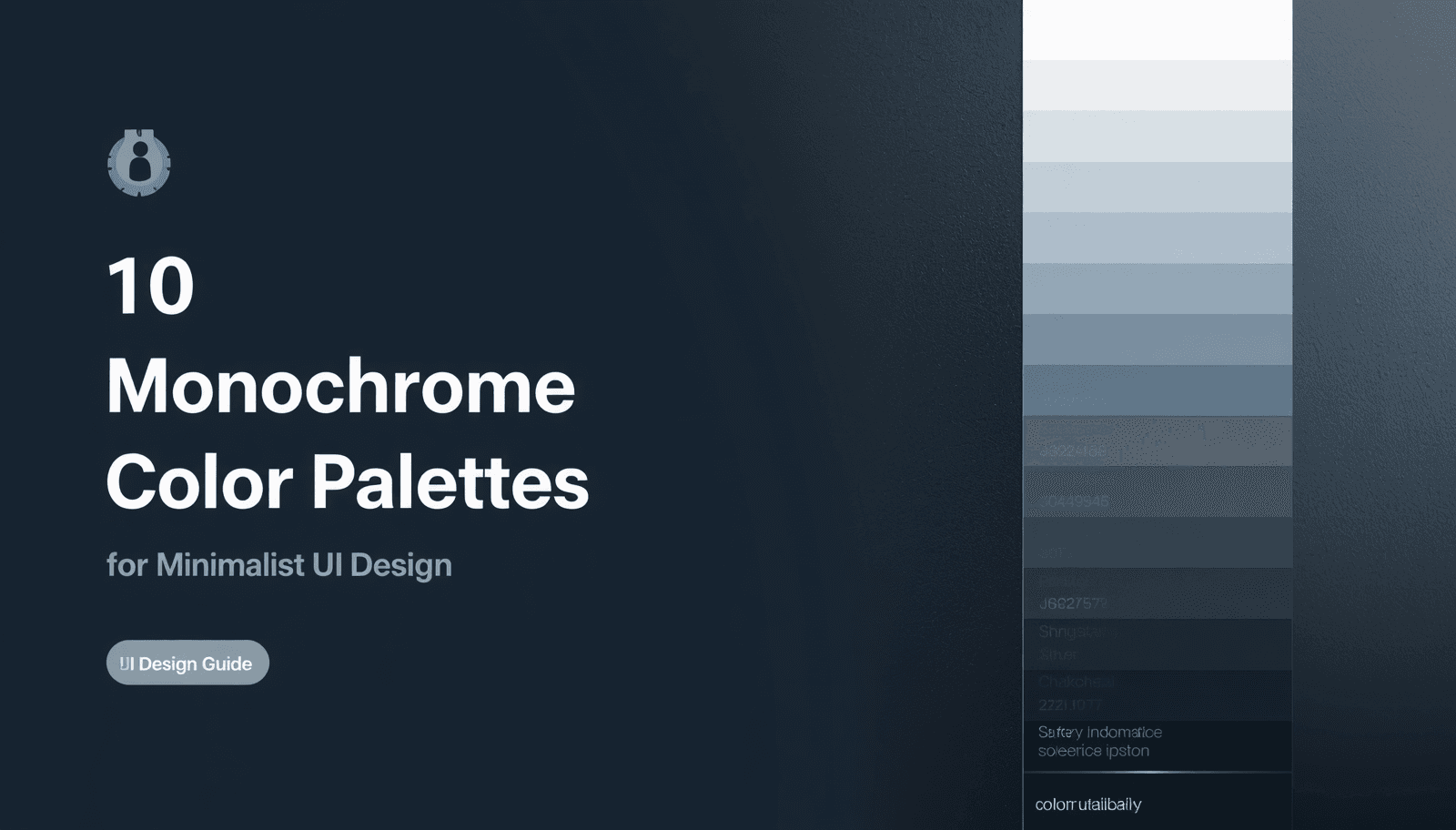
The 10 Monochrome Color Palettes
1. Slate Gray System
Base hue: Cool blue-gray Best for: SaaS dashboards, productivity tools, corporate applications
The slate gray system is the workhorse of minimalist UI design. Built on a blue-gray base, it reads as authoritative and focused without feeling cold or clinical. A typical slate palette runs from a near-white #F8F9FA through mid-range values like #6C757D down to deep charcoal #212529.
This palette is particularly effective for data-heavy interfaces where visual fatigue is a concern. The cool undertones reduce eye strain during extended use, making it a strong choice for enterprise tools.
2. Warm Ivory Gradient
Base hue: Yellow-white Best for: Editorial platforms, content-first apps, reading environments
Warm ivory monochrome palettes bring humanity to minimalist interfaces. The base hue sits at a warm #FEFAE0, stepping through golden-toned midranges to a deep warm brown near #3B2F2F. The result feels editorial, comfortable, and premium.
This palette works exceptionally well for platforms where long reading sessions are expected — documentation tools, publishing platforms, and newsletter interfaces. Pair it with a clean serif typeface and the result feels almost print-like in its refinement.
3. Neutral Stone Progression
Base hue: Warm gray (greige) Best for: E-commerce, luxury retail, hospitality, digital products
Stone monochrome palettes occupy a fascinating middle ground between warm and cool. The base is a greige — a neutral that carries just enough warmth to feel inviting without sacrificing the restraint of a true gray.
For hotel booking interfaces, property platforms, and luxury retail experiences, this palette communicates quality without ostentation. It is the digital equivalent of travertine marble — natural, refined, and universally tasteful.
Designers building hospitality or commercial applications — including hotels, office spaces, and premium retail environments — will find the Coloraccy aesthetic palette collection a useful companion resource for palettes in this tonal family.
4. Ink and Paper
Base hue: Near-black with warm undertone. Best for: Developer tools, technical documentation, code editors
Ink and paper is a high-contrast monochromatic system that inverts the standard light-background assumption. The dominant tone is a deep, warm near-black #1A1A2E or similar, with lighter values used for text and interactive elements.
This system is prevalent in developer tools and terminal interfaces precisely because it communicates technical precision. The monochromatic approach keeps the interface from feeling decorative — every element is there for a reason.
5. Mist and Fog
Base hue: Cool light gray. Best for: Healthcare applications, wellness platforms, clean SaaS tools
Mist palettes use an extremely light cool gray base — almost white but with enough chroma to avoid the clinical harshness of pure #FFFFFF. The tonal range is compressed, with most values clustering in the upper half of the lightness scale.
This creates interfaces that feel airy and unhurried. Healthcare platforms benefit from this palette's calm authority. Wellness apps and mental health tools use it to signal safety and openness.
6. Charcoal Architecture
Base hue: Neutral dark gray. Best for: Architecture and design portfolio sites, high-end professional services
The charcoal architecture palette is the most dramatically structured of the ten. Built around a neutral dark gray anchor at approximately #333333, it uses strong contrast between near-black and near-white with minimal midrange values.
The effect is bold and directional — content feels deliberately placed within the interface rather than floating on it. This palette works brilliantly for portfolio platforms, architecture firms, and professional service brands that want to communicate confidence.
For professionals exploring structured, high-contrast approaches, the abstract palette library on Coloraccy contains several palettes in this register.
7. Silver Gradient
Base hue: Cool silver-gray Best for: Technology products, fintech interfaces, premium app design
Silver monochrome palettes carry a slightly metallic quality that communicates technological sophistication. The base sits around #C0C0C0 silver, with values extending both toward a cool white and a dark steel gray.
Fintech dashboards and premium mobile applications use this palette to signal quality and precision. It reads as modern without being aggressive, and it ages well — the same palette that felt current five years ago in this family still feels current today.
8. Cream and Linen
Base hue: Warm off-white. Best for: Fashion brands, lifestyle platforms, artisan and craft marketplaces
Cream and linen palettes are soft, tactile, and distinctly human. The base is a warm off-white with a slight yellow or peachy undertone, stepping down through warm beiges to a soft, medium brown.
Fashion brands, boutique e-commerce platforms, and artisan marketplaces gravitate toward this palette because it suggests warmth, care, and physicality — qualities that offset the coldness of digital interfaces in product-focused contexts.
Designers working in this space will find relevant inspiration in the Coloraccy acrylic palette collection, which explores rich, warm-toned combinations with strong tactile associations.
9. Graphite Spectrum
Base hue: Blue-black Best for: Media platforms, entertainment apps, streaming interfaces
The graphite spectrum uses a blue-black base — around #0D1117 or similar — to create deep, immersive interfaces. Unlike pure black, the subtle blue undertone prevents the interface from feeling flat, giving depth and a slight cinematic quality.
Streaming platforms, music apps, and digital media tools benefit from this palette's ability to make content imagery pop against dark backgrounds. The monochromatic discipline of the interface keeps focus firmly on the content itself.
10. Pearl and Ash
Base hue: Neutral white with gray undertone. Best for: Productivity applications, note-taking tools, minimalist mobile apps
Pearl and ash is perhaps the most universally applicable palette in this list. Built on a cool, slightly grayish white, it uses gentle tonal steps to create distinction between interface layers without ever drawing attention to the palette itself.
This is the palette that disappears into the background — and in interface design, that is often the highest compliment. When users do not notice the color system, it means the system is doing its job perfectly.
For immediate exploration of tonal variations within any of these palettes, the Coloraccy shade and tint generator produces precise lightness progressions from any base hex value in seconds.
Grayscale UI vs. Monochromatic UI: Understanding the Difference
The terms "grayscale UI" and "monochromatic UI" are often used interchangeably, but they describe meaningfully different approaches.
Aspect | Grayscale UI | Monochromatic UI |
Hue | None (neutral only) | One consistent hue throughout |
Warmth/coolness | Perfectly neutral | Carries hue-based temperature |
Visual character | Clinical, stark | Subtle personality, more warmth |
Best use case | Wireframing, prototyping | Production interfaces, brand design |
Accessibility | Easiest to manage | Straightforward with planning |
Emotional range | Limited | Broader, hue-dependent |
Grayscale is the appropriate choice for wireframes and structural design work where color should not influence decisions. For production UI work, a true monochromatic system — with its embedded hue character — almost always produces a more refined and emotionally resonant result.
Designers building out minimalist UI colors for production environments should start with a defined base hue rather than a neutral gray, then use tools like the Coloraccy color picker to identify and lock in that base before generating the full value spectrum.
Building Your Own Monochrome Palette: A Practical Process
Creating a production-ready monochromatic palette from scratch follows a clear sequence:
Choose your base hue. Select the hue that best fits your brand personality and use context. Use the Coloraccy color picker to identify the exact hex value.
Generate the value scale. Use the shade and tint generator at Coloraccy to create 8–10 evenly spaced steps from near-white to near-black within your hue.
Assign roles to values. Map each value to a specific interface role: background, surface, border, secondary text, primary text, interactive state, and so on.
Verify contrast ratios. Every text-on-background combination must meet WCAG 2.1 minimum contrast ratios (4.5:1 for normal text, 3:1 for large text).
Convert to all required formats. Use the Coloraccy color format converter to generate RGB, HSL, and CMYK equivalents for cross-platform use.
Document the system. Store all values and their assigned roles in a shared reference. The Coloraccy brand color kit tool is useful for organizing this documentation in a professional format.
Following this process produces a palette that is systematic, accessible, and immediately deployable across a design system.
Applying Monochrome Palettes in Real-World Contexts
Digital Interfaces
For web and mobile UI, the value scale should be applied with clear intent. The lightest values handle backgrounds and surfaces. The darkest values handle primary text and key interactive elements. Midrange values serve borders, disabled states, and secondary content.
One of the most common structural patterns in minimalist UI is the "card on surface" hierarchy: a slightly elevated surface color sitting above a slightly darker background. This two-step tonal distinction — often just 5–10% lightness difference — creates depth without relying on shadows.
For further reading on elegant minimalist color applications in digital contexts, the Coloraccy blog on elegant minimalist colors provides in-depth examples and practical recommendations.
Commercial and Physical Environments
Monochrome palettes are not limited to screens. Commercial design environments — hotel lobbies, office interiors, shopping mall wayfinding systems, and retail fit-outs — frequently use monochromatic color strategies to create visual coherence across physical space.
A five-star hotel might use a warm ivory monochrome system across its digital booking platform, printed collateral, and interior signage simultaneously. The single-hue discipline creates a unified brand experience that guests perceive as quality and intentionality.
Designers working on Shopify or e-commerce platforms where physical and digital brand touchpoints intersect will find the Coloraccy guide to Shopify color palettes an immediately practical reference.
Illustration and Digital Art
Monochromatic approaches in illustration produce dramatic, mood-driven work. A single-hue sketch or digital painting communicates atmosphere in ways that full-color work sometimes cannot, because the viewer's attention is undivided.
For digital artists working in apps like Procreate, Coloraccy's guide to Procreate color palette ideas explores how monochromatic and near-monochromatic approaches translate into illustration workflows.
Expanding the System: When to Add a Single Accent
A strict monochromatic palette occasionally benefits from a single accent color — one value drawn from a complementary or analogous hue used exclusively for primary calls to action, alerts, or critical interactive states.
This approach is sometimes called a "near-monochrome" or "monochrome-plus-one" system. The discipline is in the restriction: the accent must be used sparingly and consistently, or the system collapses into a multi-hue palette.
To identify a well-chosen accent hue, the Coloraccy complementary color finder calculates the complementary, triadic, and analogous relationships for any base color — making it easy to find an accent that reinforces rather than disrupts the monochromatic base.
For teams exploring adjacent color directions — including pastel-tinted versions of a monochrome system — the Coloraccy pastel color palette generator shows how soft chromatic variations can coexist with a predominantly neutral system.
Avoiding Common Mistakes in Monochrome UI Design
Even experienced designers make predictable errors when building monochromatic systems. These are the ones worth guarding against most carefully.
Insufficient contrast between values. When values are too close together in lightness, the interface loses its hierarchy. Users cannot tell which elements are interactive, which are primary, and which are secondary. Always verify perceptual contrast, not just numeric lightness distance.
Choosing a base hue without context. A cool blue-gray that looks sophisticated on a design tool's screen may read as clinical or cold on a consumer product. Always test the base hue in context — on the target device, against the actual typography, and within the actual template or layout.
Ignoring the impact of dark mode. A monochromatic system designed for light mode often cannot simply be inverted for dark mode. The value assignments need to be reconsidered entirely. The emotional qualities of values shift when the dominant background shifts from light to dark.
Treating all neutrals as identical. #808080 and #7F8C8D look similar in isolation but can create subtle clashing in large surfaces. Use a systematic generator rather than visually estimating values. The Coloraccy random color generator can introduce unexpected tonal variations when systematic generation feels too predictable.
Neglecting color in imagery. If a monochromatic UI includes photographs or illustrations, those assets introduce color whether intended or not. Filter or treat imagery to align with the palette's hue temperature, or frame it deliberately so the contrast reads as intentional.
For teams drawing inspiration from cultural and globally diverse color traditions — including palettes informed by African design heritage — the Coloraccy African palette collection offers starting points that challenge conventional monochrome assumptions in productive ways.
Academic and Research Contexts
Monochromatic color systems are particularly well-suited to educational platforms, research tools, and academic publishing interfaces. The visual restraint signals seriousness and intellectual focus, while the tonal hierarchy supports the reading-heavy layouts common in scholarly contexts.
The Coloraccy academia palette collection provides thoughtfully assembled combinations for precisely this category of design project. These palettes balance authority and accessibility in proportions that digital research tools demand.
For designers who want to explore the full range of available palette directions before committing to a monochromatic system, the Coloraccy image color extractor can derive a monochromatic-leaning palette from any reference photograph — a useful method for grounding digital work in real-world visual reference.
Conclusion
Monochrome color palettes are among the most powerful tools available to minimalist UI designers — not because they are simple, but because they demand a level of precision and intention that produces genuinely refined results. From slate gray SaaS dashboards to warm ivory editorial platforms, the ten palettes in this guide represent the full breadth of what a single-hue system can achieve.
The principles covered here — value hierarchy, tonal consistency, accessible contrast, and the strategic use of a single accent — give you a complete framework for building monochromatic systems that hold up under real-world conditions.
Coloraccy provides the color tools and curated palette libraries that make this process faster and more reliable. From the color palette explorer to the brand color kit, every tool on the platform is designed to support serious color decisions for serious design work.
Visit Coloraccy today to explore the full collection of monochromatic palettes, generate your own value scales, and build the color system your next UI project deserves.