Most designers pick colors once and move on. But modern interfaces live across dozens of contexts — dark mode, light mode, high-contrast accessibility settings, mobile screens, large monitors, and everything in between. A single static palette cannot serve all of them well.
That is where an adaptive color system UI approach changes everything. Instead of choosing individual colors, you build a system — a structured set of palettes that shift, scale, and respond to context without losing visual coherence. The result is a UI that feels intentional at every breakpoint, in every environment.
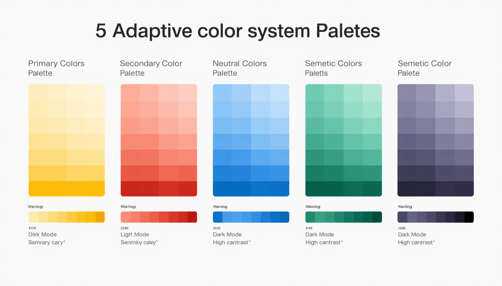
This guide walks through five adaptive palette approaches that work across real modern products, with practical insight on how and when to apply each one.
What Is an Adaptive Color System in UI Design?
An adaptive color system is a structured framework of color tokens, roles, and relationships that adjusts automatically based on environmental or contextual variables — such as light or dark mode, user accessibility preferences, device type, or brand theming.
Unlike a static palette, an adaptive system assigns semantic meaning to colors. A "surface" color, a "primary action" color, and an "error" color are each defined as roles. The actual hue fulfilling each role can change based on context, while the semantic structure remains consistent.
Google's Material Design and Apple's Human Interface Guidelines both formalize this approach. Research from the Nielsen Norman Group consistently shows that interfaces with well-defined color roles improve task completion rates and reduce cognitive load for users.
For designers who want to build these systems efficiently, the Coloraccy color palette library provides a broad foundation of curated palettes organized by style and mood, ready to adapt into token-based systems.
Why Adaptive Color Systems Matter More Than Ever
Responsive color design is no longer optional. Several forces have made adaptive thinking essential:
Dark mode adoption has surged. As of recent surveys, more than 80% of smartphone users enable dark mode when available.
Accessibility legislation in the EU, UK, and US increasingly requires WCAG-compliant contrast across all interface states.
Multi-brand and multi-tenant products require systems that can be re-themed without rebuilding the design from scratch.
AI-generated interfaces depend on structured color roles to remain coherent across dynamic content.
For commercial environments — hotels deploying guest-facing apps, office management platforms, or retail mall kiosks — having a responsive color design system means a single codebase can serve both a high-contrast kiosk screen in bright outdoor light and a staff dashboard in a dimly lit back office.
The Coloraccy brand color kit is built for this kind of systematic thinking, letting you define and test color roles before committing to a full design system.
5 Adaptive Color System Palettes for Modern UI
1. The Neutral-First System
Best for: Enterprise software, productivity tools, and SaaS dashboards.
The neutral-first approach anchors the entire UI in grays, off-whites, and near-blacks. One primary brand color — typically a blue, teal, or indigo — serves as the sole accent for actions and highlights. All other UI states use neutral variants.
This system adapts cleanly to light and dark mode because neutral scales are predictable. Swap the surface neutral from near-white to near-black and the entire system inverts with minimal friction. The accent color usually needs only minor saturation adjustments between modes.
How to build it:
Define a 10-step neutral scale from white to black using the shade and tint generator on Coloraccy.
Assign semantic roles: background, surface, border, text-primary, text-secondary.
Choose one accent color and verify contrast ratios in both light and dark contexts.
Document each token with its light-mode and dark-mode value.
The monochrome color palettes guide on Coloraccy explores this approach in depth and is essential reading for anyone building neutral-first systems.
2. The Semantic Role System
Best for: Design systems serving multiple products or brand sub-lines.
In a semantic role system, every color is named by its function, not its appearance. You define tokens like color-action-primary, color-feedback-success, color-feedback-warning, and color-surface-raised. The actual hue assigned to each token changes per theme, per mode, or per product line.
This is the architecture behind Material Design 3's dynamic color engine and behind Shopify's Polaris design system. It scales because a designer or developer can apply color-action-primary anywhere without knowing what color it currently resolves to.
For e-commerce platforms, Shopify color palettes demonstrate how semantic systems function across merchant-facing and customer-facing interfaces simultaneously.
Key benefit: Re-theming requires changing token values only — no component-level edits needed. This makes it the most maintainable adaptive system for large teams.
Use the Coloraccy color format converter to normalize all token values into a consistent format — hex, RGB, or HSL — before documenting your system.
3. The Complementary Contrast System
Best for: Marketing platforms, creative tools, and consumer-facing mobile apps.
This system uses a complementary color pair as its foundation — one warm, one cool — and builds an adaptive palette around the tension between them. In light mode, the cool color dominates surfaces while the warm color drives actions. In dark mode, those roles can reverse or shift in saturation.
The contrast between the two hues creates inherent visual hierarchy without requiring additional colors. It is a bold approach that works particularly well for interfaces where emotional engagement matters as much as usability.
Use the complementary color finder on Coloraccy to identify strong complementary pairs, then test each combination across light and dark backgrounds before committing.
Pros and Cons
Strength | Watch Out For |
High visual energy and memorability | Complementary pairs can clash at full saturation |
Natural hierarchy between warm and cool | Requires careful management in dark mode |
Works well for bold brand expressions | Less suitable for content-heavy or dense UIs |
For artists and illustrators who want to apply this approach in creative software, Procreate color palette ideas on Coloraccy provides adaptation strategies relevant to digital painting contexts.
4. The Pastel-to-Vivid Scale System
Best for: Wellness apps, education platforms, and consumer lifestyle products.
This system builds adaptive palettes by creating a full scale from pastel to vivid for each primary hue. Light mode uses pastel backgrounds with vivid accents. Dark mode uses deep, muted backgrounds with mid-scale tones for accents. The scale provides all the intermediate values needed to maintain contrast and hierarchy across both modes.
It is softer and more approachable than the neutral-first system, making it ideal for audiences who respond better to warmth and friendliness in the interface. The pastel color palette generator on Coloraccy is a practical resource for generating these scales efficiently.
Building a pastel-to-vivid scale:
Start with the target vivid hue at full saturation and medium-high value.
Use the Coloraccy shade and tint generator to generate ten steps from pastel to deep.
Assign light-mode roles to the top three steps (pastels) and dark-mode roles to the bottom three steps (deeps).
Use the vivid mid-point as the universal action color.
5. The Extracted Palette System
Best for: Brand-driven products, travel platforms, and hospitality interfaces.
Rather than constructing a palette from color theory principles alone, the extracted palette system begins with a source image — a brand photograph, an architectural reference, or a product shot — and derives the color system from it. This approach produces palettes that feel inherently connected to the brand's visual world.
The extracted colors then go through the same adaptive processing as any other system: contrast-checking, semantic role assignment, and light/dark variants. The result is a color system that feels human and contextual rather than engineered.
The image color extractor on Coloraccy automates the extraction step, pulling dominant and accent colors from any uploaded image. From there, you build the adaptive layer on top.
This approach is especially effective for hotel apps, resort booking platforms, and mall directory interfaces where brand photography already defines the visual language. The aesthetic color palette collection on Coloraccy shows how extracted palettes can feel polished and deliberate.
For further exploration of how extracted palettes apply to abstract and unconventional brand references, the abstract palette series on Coloraccy offers an excellent range of starting points.
Practical Tips for Building Adaptive Systems
Working with dynamic UI colors requires a few habits that static palette work does not.
Always define tokens, not values. Document color-surface-default: #F8F8F8 (light) / #1A1A1A (dark) rather than using hex values directly in components. This is what makes the system truly adaptive.
Test every palette in both modes simultaneously. Side-by-side comparison of light and dark renders reveals contrast issues that sequential review misses. The Coloraccy color picker lets you preview colors across backgrounds rapidly.
Audit with real content. Test your adaptive palette with actual interface content — not placeholder text. Long-form text, data-dense tables, and image-adjacent layouts stress-test your color decisions in ways that empty wireframes cannot.
Consider motion and transition. When the user switches modes, the palette transition should feel smooth. Colors that are too far apart in value can cause jarring switches. Use the random color generator on Coloraccy to explore unexpected mid-transition states that feel cohesive.
Explore cultural context. For global products, color associations vary significantly. The African palette series on Coloraccy and academia palette collection offer culturally grounded references that inform adaptive palettes for diverse audiences.
For a broader strategic grounding in palette-building methodology, the Coloraccy guide on how to work with color palettes is the most complete starting point available.
Common Mistakes to Avoid
Building light mode first and dark mode as an afterthought. Dark mode is not an inverted light mode. It requires its own surface hierarchy, adjusted saturation levels, and separate contrast checks. Design both modes from the start.
Using pure black and white. True black (#000000) and pure white (#FFFFFF) create excessive contrast that feels harsh. Use near-black and off-white as your endpoint neutrals.
Ignoring intermediate states. Hover, focus, selected, and disabled states all need color definitions. An adaptive system without intermediate state colors is incomplete and will produce inconsistencies in implementation.
Overlooking the elegant minimalist colors guide. Restraint is one of the hardest things to design into an adaptive system. Using too many colors within a system defeats its purpose.
Skipping the Coloraccy palette showcase. Before building from scratch, reviewing curated palette systems often reveals ready-made solutions that need only light adaptation.
Conclusion
A well-built adaptive color system UI does more than look good — it scales with your product, serves your users across every context, and reduces design debt over time. The five palette approaches covered here — neutral-first, semantic role, complementary contrast, pastel-to-vivid scale, and extracted — each solve different design problems and suit different product categories.
The common thread is intentionality: defining colors by their role and function, not just their appearance. That shift in thinking is what separates a color palette from a color system.
Coloraccy provides every tool you need to research, build, test, and document adaptive palettes — from the color palette explorer and brand color kit to the image color extractor and complementary color finder.
Build your adaptive color system today. Start with the tools at Coloraccy and design interfaces that work beautifully everywhere.